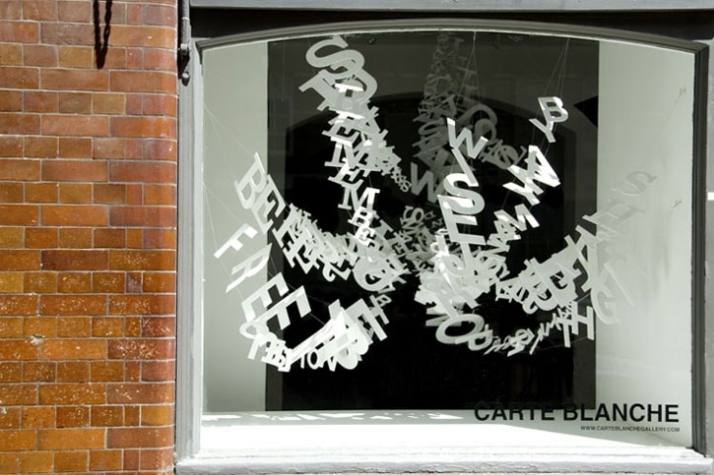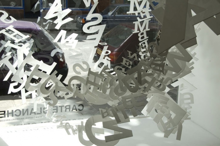
The popular song goes that words don’t come easy, and, ironically enough, this is exactly the sense one has when trying to express himself in front of Ebon Heath’s typographic mobiles. Heath is one of the most promising artists of the moment and his take on typography is pure visual poetry. Words never looked more astonishing, they form their own structures in a short of a rebellion, they dance and move and yet they stand still. In Heath’s universe, words go out of their suffocating homes, they become alive and they tell us their amazing stories.
Having Brooklyn as the quarters of his inspiration, Heath is contaminating his students with his enthusiasm and passion. With his work he is trying to visualize the invisible, to put a form to the surrounding sounds of the every day life and to inject fantasy into reality. Inspired traveller and rhythm lover, Heath is revealing us all the details hidden behind his outstanding work in an exclusive interview for Yatzer.
portrait of Ebon Heath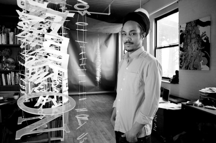
Your sculptures give me the impression of being crystalized words turned into frozen flowers. I connect this with your quote about perceiving words as a living, corporal being. Would you like to explain me the origins of this idea and the way it is resembled in your art?
This visual journey began as a love affair with letters and a question: how do we fuse our typographic language with the physicality of our body language? I want our type to jump, scream, whisper and dance, versus lay flat, dead and dormant, to be used and discarded with no concern for its intricate beauty of form, function, and meaning. We use type daily yet rarely appreciate the form of a letter. By liberating type from the confines of the page we not only free the words to express the content in a new dimension of scale, volume, and movement, but also force the reader to become a viewer. This process reveals the form of our letters while creating a new relationship to our language in our ability to feel versus only read the content.
I love the visual of "crystalized words as frozen flowers". This is clear on a visual level, yet also the form of the flower has evolved to fulfill a specific function. All the subservient smaller bio chemical reactions that make up its structure on a molecular level, all co-operating to create a living organism. The form of my type structures are also made to fulfill a specific goal to express the content of words, while made up of smaller ingredients of letters that collectively form our language. The prints do have a frozen quality, since the original works are mobiles that move and can be seen from multiple perspectives in a space. It also is ironic that when these structures are documented they are flattened into 2-dimensional planes, the very antithesis of my initial goal.
portrait of Ebon Heath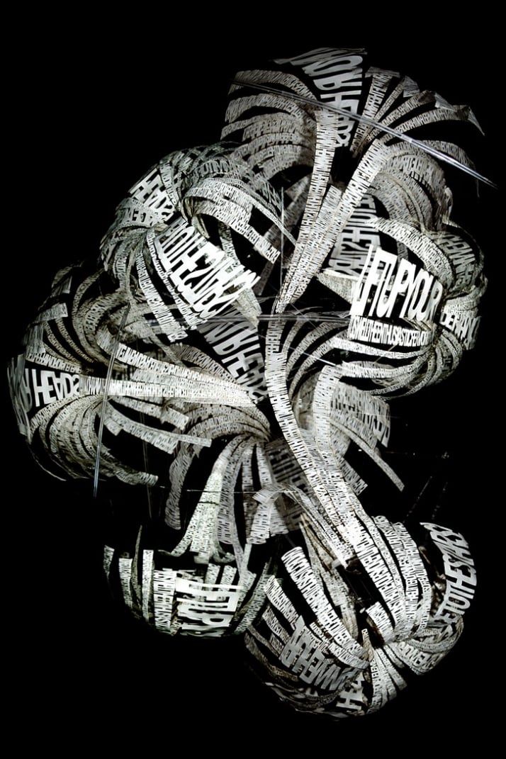
You mention that your sculptures are a kind of a visual noise. One might interpret them like a representation of every day conversations or even like lyrics of songs. Is there any influence of hip hop music and its rhyming to your work?
The structures are a physical representation of our language as object. This "visual noise" permeates all aspects of modern culture, especially urban living. From the signs, billboards, stores, and t-shirts that yell with type for attention as you walk down any high street. All the audio and verbal noise, from music we plug our ears with to the din of countless conversations, screams and whispers. With new media of texting, online, and transmitted technology there is even invisible noise silent to the eye surrounding us all. It is this cozy womb of information, data, or chorus of cacophony that my mobiles hope to represent as well as reveal. Making the invisible visible.
The lyrical qualities of hip hop highlight this connection of the liberated language. When a MC rides a beat the words become a fusion of song, noise, rhythm, melody and meaning all at once. This synthesis between words and sounds was the first investigation i had undertook to help me understand this conceptual process. When I close my eyes i can see the words of great poets like Rakem or Tupac flying thru the air and dancing with the same physicality my body instinctually feels. In the content of hip hop is a verbal dance between the MC and words, my work hopes to capture that dynamic flexibility found in bending, twisting, and chopping the language to reflect its content. This wrestling with language is also reflected in the visual poetry of more formal graffiti that transforms each letter into interlocking shapes that are unique in its form and identity of the author.
As in all good poetry, the skilled MC uses rhythm more then rhyme to express the message, my mobiles attempts to create a visual sense of rhythm and flow that is alive, not contained, or able to be seen/ read/ understood from one angle.
portrait of Ebon Heath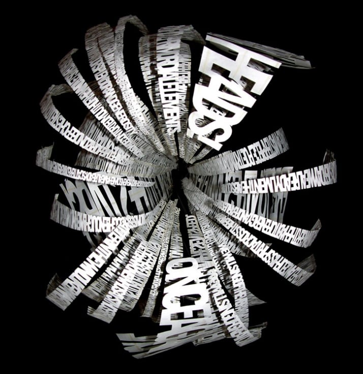
The stereo.type project, expressing the interaction between the traditional language of typography and the physical language of the body, consists of three parts. Could you give us some information about the ones that are about to come?
The first part was a process of research and development. Creating countless drawings, computer renderings, and three dimensional models to find the desired structural frame work for this new physical typographic language. The visual inspiration for these structures has varied from fishing nets to animal vertebrae, puppets to kites, feathers to scales, domes to parachutes, classical lace to high end couture fashion, traveling from Brooklyn to Andalusia, Berlin to Marrakech, to Carnival in London and Trinidad. The final product of this phase is a process journal that documents all the steps leading to the establishment of the final four grid structures.
The current second phase is exercising the established grids, to learn how many different kinds of content can be expressed in these structures. This phase is also about creating mobiles and site specific installation for exhibit to share with the public, and learn from their reactions. This also extends to more couture mobiles that are created for a specific person based off their relationship to the content of the mobile.
A seasonal collection of mobiles, prints, lights, and jewelry are being developed for release in the summer of 09. Each season will focus on a different theme and execution method.
The third stage is incorporating the body into a performance piece of type dancing a duet with its author. The goal is to create a ballet of people dancing with their liberated language, as if the body was shedding its accumulated stories physically, as well as amplifying the content of our inner soul for the world to see in its dynamic dance. This event will combine aspects of carnival, circus, choreography, kinetic body sculpture, music, and the Greek chorus.
portrait of Ebon Heath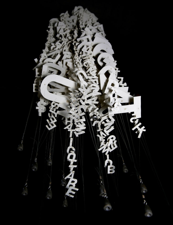
Could you describe the process that is hidden behind your installations? Do you base them on previous drawings or is it all about inspiration “in situ”?
I have developed four 3-d grid systems that, like traditional type design, provide an underlying foundation for type to be anchored to. These grids are malleable and do not limit the form as much as create a support skeleton. These 4 grids are based off the basic shapes of the cone, stripe, line, and circle. To establish these systems there has been countless drawings and models created to establish structural integrity and functionality. The quantity of letters, typeface, and scale all determine the final form. Unlike traditional type design there is the third dimension, an additional perspective outside of the page which allows the movement of the structures and your eyes positions to them. The tools and components I use come from a wide range of crafts, including: fishing tackle, jelwery elements, kite pieces, laser cut acrylic and tyvek. My working process has a specific set of steps that collectively create these expressive typographic mobiles as if solving an equation, rather then from some cosmic inspiration.
portrait of Ebon Heath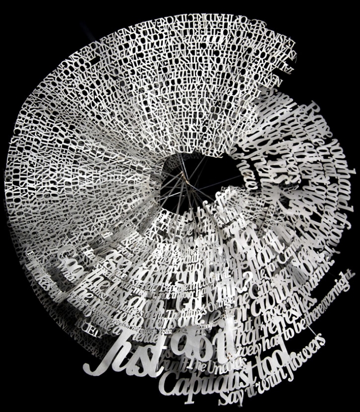
You teach graphic design in Lehmann College. Is teaching a way of keeping in touch with fresh ideas? Do you learn things from your students?
Yes, teaching should also be learning for the teacher. I teach at a City University in the Bronx (New York, USA), which gives me access to students that are fully engaged in life and do not take their education for granted. This role allows me to inspire young people to see type and design as a career choice and/ or a way to express themselves visually. By highlighting the analytical nature of design and importance of paying attention to details, I am also able to give the students a new way of seeing their surroundings. With design software and computers being mainstream, new media literacy is expected of all students. Yet knowing how to operate a computer does not make you a designer. I feel all professionals have a responsibility to share their knowledge, while also staying open to learn more. The students keep me informed on the latest ideas of youth culture that my growing age makes harder to recognize. I am also writing course curriculum which enables me to map out my method of teaching and how it stays relevant to students lives or current trends.
portrait of Ebon Heath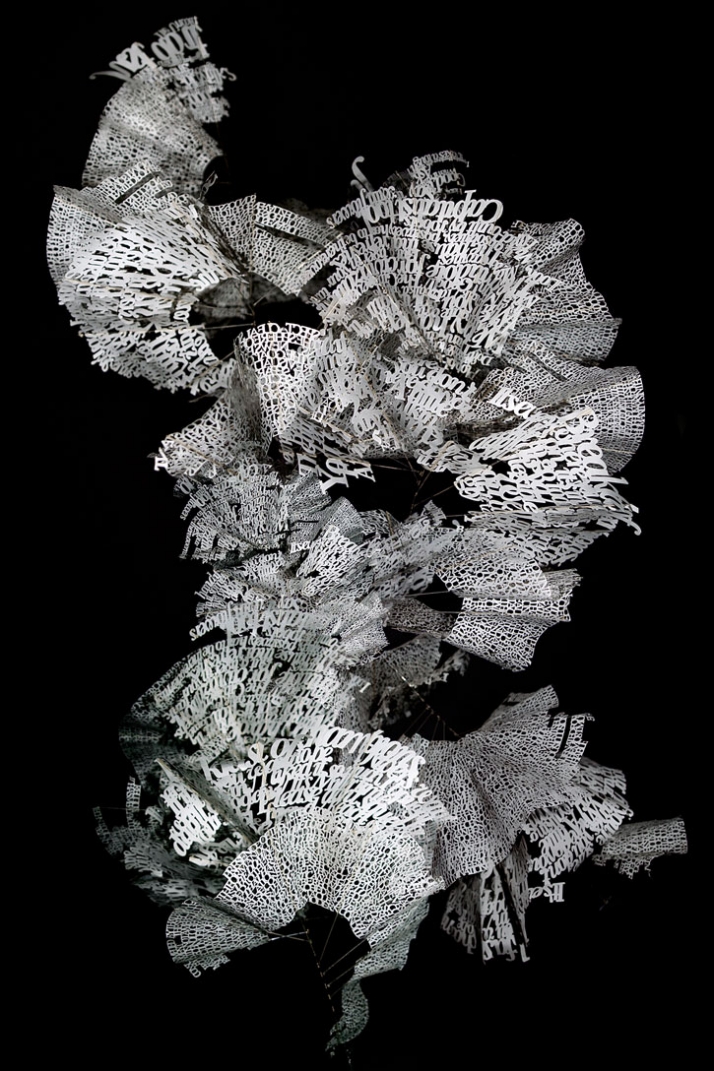
You mention Andy Warhol, Basquiat, Calder and Stuart Davis among your admired artists. Have they influenced in any way your art?
Calder has been one of the most influential artists in my life, at a very young age i saw his circus and was mesmerized. That same day i began drawing and have not stopped. Only recently did i notice the parallel of my typographic ballet and the performance element of his circus. I am also inspired by his ability to play with simple forms and materials to create a new visual vocabulary that blurs the lines between art, design, function and expression (from his mobiles, and stables to his jewelry and wire portraits). He was also one of the first American artists to be an international globe trotter, hanging out in Europe and the states crossing the Atlantic regularly by boat. (Warhol for making the common into art, Basquiat for burning so fast and so bright, and Stuart Davis for American abstraction in the modern flat world of color.)
I was introduced to the rich culture of Carnival from the Caribbean island of Trinidad, by another admired living artist and mentor, Peter Minshal. Minshal is the founder of Callaloo Company, which has been producing the avant-garde carnival bands of kinetic body sculpture for the last 30 years. He shared his knowledge of the intricate craft of constructing physical sculpture that amplifies the human gesture into a grand scale with an individual or collective of people. Next thing you know i am watching 20 foot skeletons he has made grinding with the Rockets on stage at Radio City Music Hall (in NYC).
portrait of Ebon Heath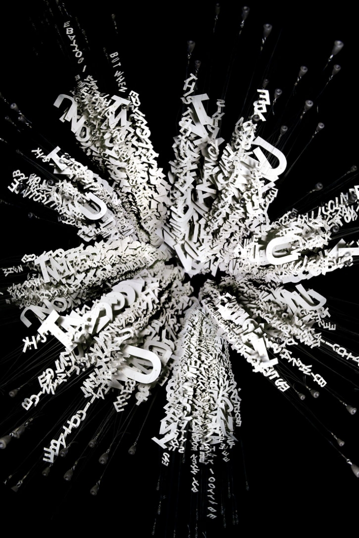
Could you describe us the purge project? Is there any connection between this and the stereo.type project?
Purge is quite similar conceptually yet utilizing images rather than purely type.
It is an answer to the question: How can we reveal the abundance of visual information we mentally accumulate? The aim is to purge all the influence we receive from media stimulation and liberate our mind to a less polluted place. It’s about reclaiming our mental environment, killing the television, cellphone suicide, unplugging our addiction for constant entertainment. I felt engorged by all the information my eyes have eaten and needed to purge, a visual vomit. This process began with classifying logos, languages, images of mass culture from my travels, all as recipe ingredients for collage. Then I draw the found media, like a painter would draw a still life, or a musician might sample a beat. All these "sample drawings" become the raw materials for a lengthy process of digital deconstruction and analog reconstruction, resulting in paintings, mobiles, and drawings. These visual mash ups allows the viewer to navigate ones own narrative in the channel surfing barrage of exploding familiar faces, logos, and contrasting color and form. I am currently completing a series of large scale paintings that are cutting and masking paint into sharp graphic compositions.
Although Purge and stereotype are made of and result in very different outcomes, there is many similarities in conceptual goals and values.
Both:
-are made of elements with an individual and collective form and meaning
-are hand crafted, yet integrate technology into the production process
-seek to cleanse or release content contained inside us
-experiment with establishing new expressive yet logical visual languages
-have a visual rhythm and relate to music in structure, content and form.
portrait of Ebon Heath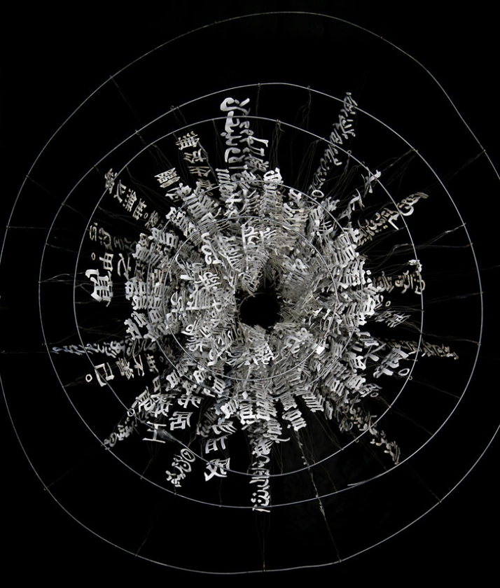
You are currently using laser-cut technology to create your sculptures. Does technology give you more freedom as far as creativity is concerned?
Technology gives me the ability to be more efficient and more precise in my craft, yet not necessarily more freedom to create. Cutting by hand is very time intensive compared to the speed and accuracy of lasers. Laser also gives me the ability to cut multiples at once out of materials I am unable to be cut by hand. It also creates an easier manageability of scale. However, cutting is only one step, the hand assembly is still quiet labour intensive and is not made simpler or more dynamic by technology. In fact much of this work makes a statement that supports the traditional craft of analog construction versus containing all living things into pixels, trying to duplicate reality instead of truly living in it. Since much of my professional graphic design work is dictated by technology, it is refreshing to use my fingers to actually build instead of a virtual illustration.
portrait of Ebon Heath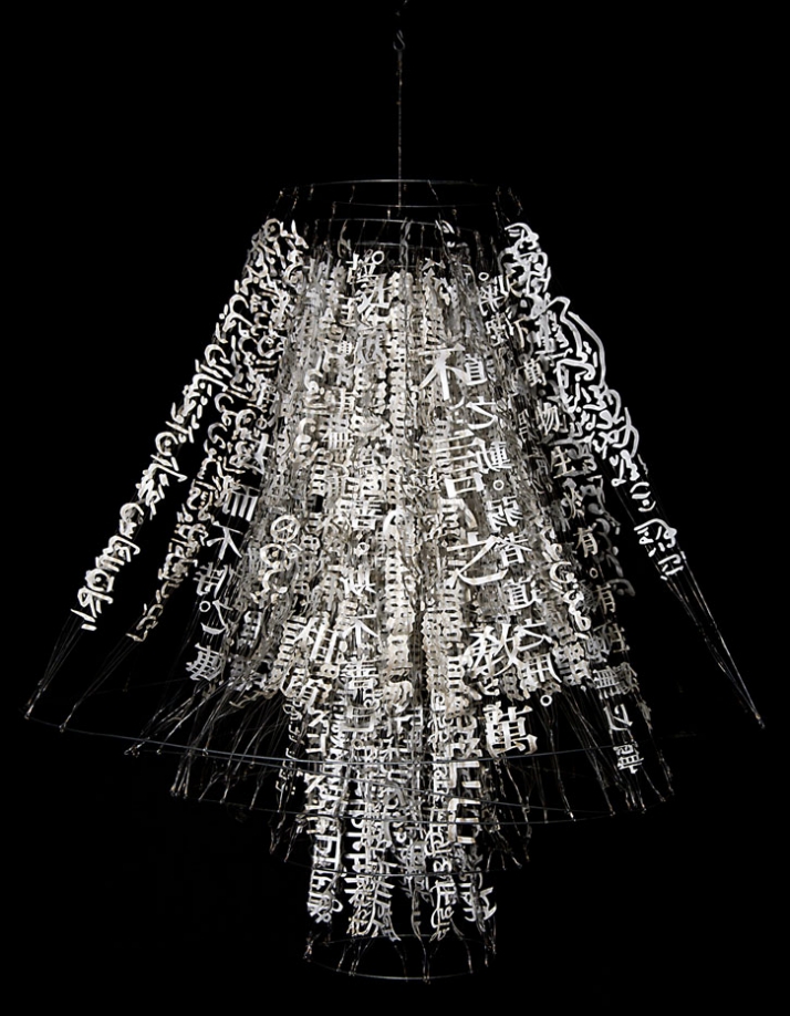
portrait of Ebon Heath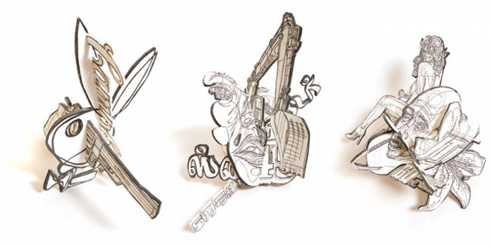
portrait of Ebon Heath