Letraset typefaces // Three examples from an extensive series of posters promoting Letraset typefaces. Each image reflects the name and character of the specific typeface. 1981.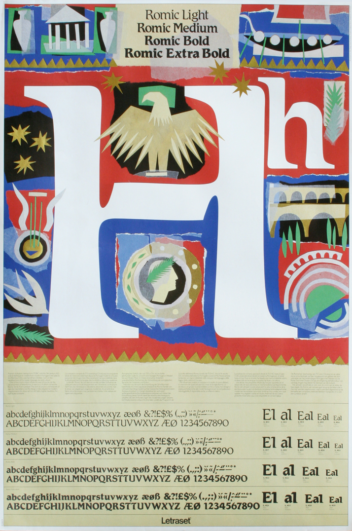
Image Courtesy of John Lloyd Archive
Having the chance to go through and sum up a graphic designer’s career, especially if he is one of the key members of British design, is a very emotional task. Looking back at one’s career is like looking back at one’s personal life since it is very hard sometimes to differentiate between matters in terms of intensity, passion and devotion. John Lloyd’s career is not any kind of career; it is a rare combination of creative thinking and imaginative design both way ahead of their times. A lot has changed since this talented graphic designer and creative director began his design career in 1960 as a lithographic artist in the printing industry. That which has stayed intact is his work’s remarkable ability to perfectly combine aesthetics and functionality. After all, John Lloyd is considered as one of the fathers of corporate design, one of the most challenging design fields, where each decision counts and the designer-client relationship is more than demanding. Lloyd Northover // Invitation: An evening of cocktails. 1984.
In 1975, together with Jim Northover, Lloyd co-founded an international design consultancy, under the name Lloyd Northover, the aim of which was to provide the most effective identity and design services for the world's most significant companies, organizations and entrepreneurs. Lloyd Northover enjoyed enormous success and soon John Lloyd became a reference in the design industry, winning many awards, amongst them the Grand Prix in the International Design Effectiveness Awards and the International Gold Award at the New York Art Directors Club. Lloyd has also been a teacher and examiner at the London College of Printing (now the London College of Communication), an examiner at Nottingham Trent University, a D&AD jury member and the Chairman of the British Design Export Group from 1983-85. He has worked around the world and has spoken at various conferences in Europe, North America and Asia. 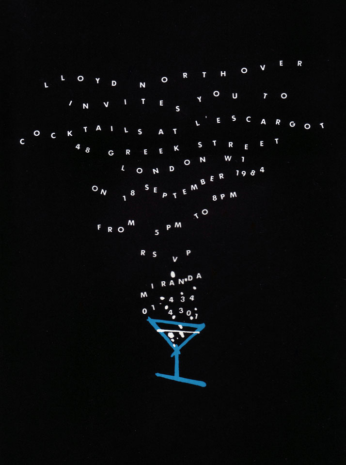
Image Courtesy of John Lloyd Archive
John Lloyd, left, with Jim Northover at the foundation of Lloyd Northover in 1975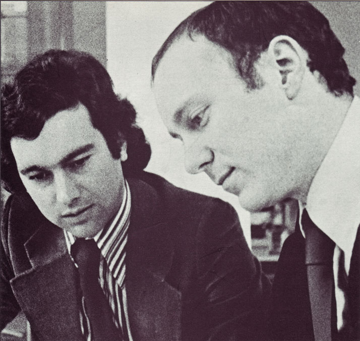
Image Courtesy of John Lloyd Archive
right: John Lloyd and Jim Northover, 1978, left: These silhouettes of John Lloyd and Jim Northover have been used over the years to identify Lloyd Northover's promotional material. The first dates from 1979 and the second from 2005.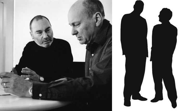
Image Courtesy of John Lloyd Archive
Image Courtesy of John Lloyd Archive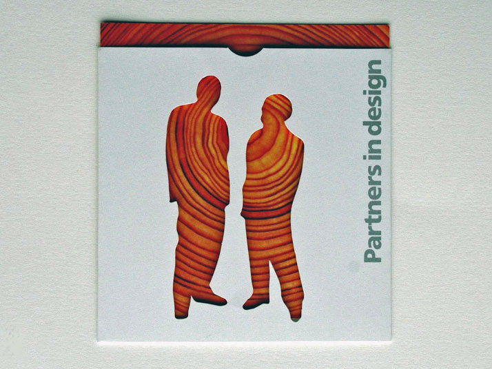
Image Courtesy of John Lloyd Archive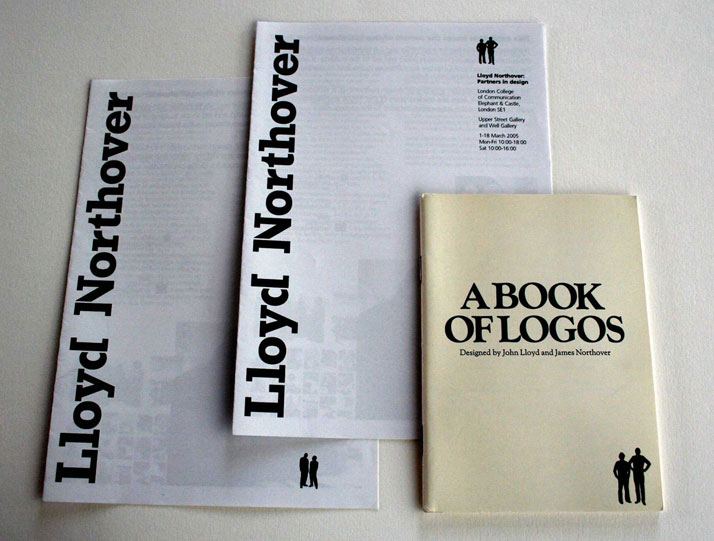
Lloyd’s work has always been so fresh and inspiring that it's hard to believe time has passed at all since its inception. But then, that’s what good design is supposed to be about, isn’t it? Today, John Lloyd works as an independent design consultant, artist and writer. Recently he inaugurated his first website that hosts his archive, giving a broader audience the chance to get in touch with a selective record of his work. Lloyd’s archive has a great educational value, apart from its artistic merits, since it serves, in fact, as an extensive journey through the history of British graphic design. Yatzer found John Lloyd for an exclusive interview, in an attempt to sum up 50 years of success and celebrate the inspiration behind a truly creative mind. We hope that it will cast a light on his incredible career and his charming personality whilst prompting further investigation on his amazing work. Enjoy! D&AD Annual // The famous yellow pencil is deconstructed and rearranged to create a series of abstract images for use on the book's cover and section dividers. 1984.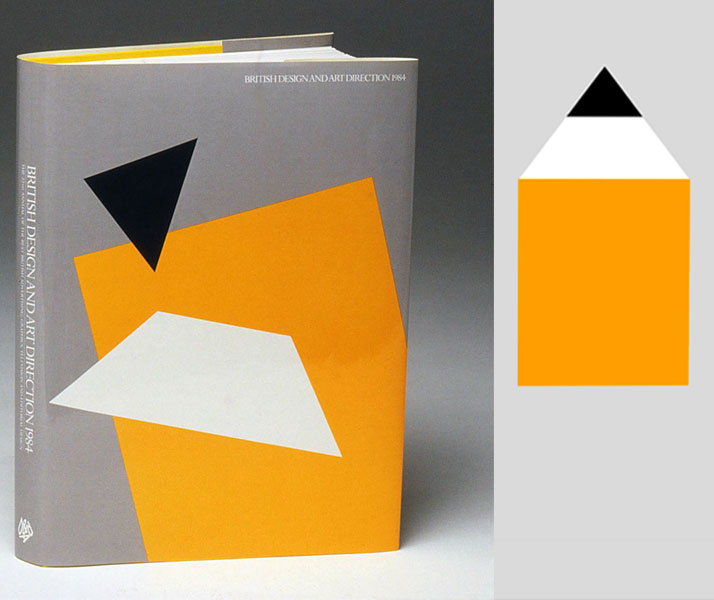
Image Courtesy of John Lloyd Archive
D&AD Annual // The famous yellow pencil is deconstructed and rearranged to create a series of abstract images for use on the book's cover and section dividers. 1984.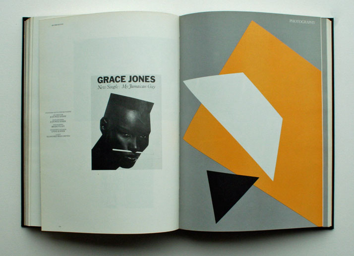
Image Courtesy of John Lloyd Archive
How did your adventure start? When was the first time you were attracted to the world of graphic design? How has this relationship evolved over the years? John Lewis Partnership, Design Week cover, June 1990
As a child I was always attracted to the creative arts; I enjoyed writing, drawing and painting. But, I was also fascinated by science and technology. My Grandfather worked in the printing industry and when I discovered that printing was an amalgamation of visual art and industrial production, I was captivated as it seemed to be a perfect blend of creativity and technology. So, on leaving school in 1960 at the age of 16, I became an apprentice lithographic artist in a printing company. This gave me a wonderful grounding in design for print and the full spectrum of printing technology.
As my love of design grew considerably, in 1964, I left the apprenticeship and enrolled as a full-time graphic design student. It was at the London College of Printing that I met fellow design student, Jim Northover, who was to become my future business partner in Lloyd Northover, the design company we jointly founded in 1975. We started by doing a lot of print design but quite soon the emphasis shifted to corporate identity, where it has remained ever since.
Over the years I have maintained a close connection with the London College of Printing (now called the London College of Communication) as a visiting teacher and external examiner.
Graphic design is, of course, no longer just about printing; it now embraces the full range of digital and online media, and environmental graphics. And the use of computers has radically changed the way we work. My relationship with the practice of graphic design has, out of necessity, evolved to accommodate these changes. But, for me, the fundamentals of what makes good and effective corporate design remain the same.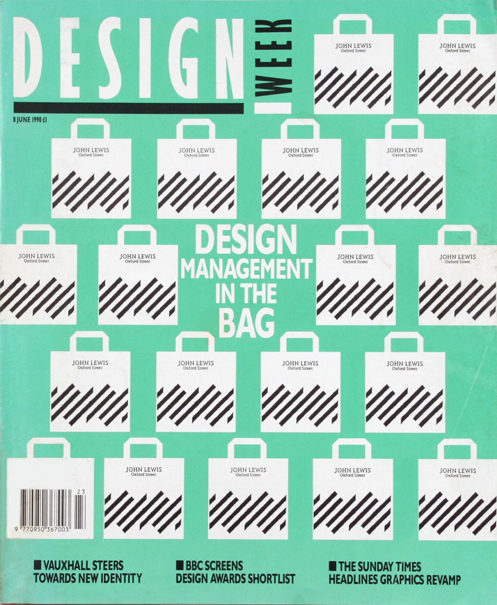
Image Courtesy of John Lloyd Archive
Alphabets for Designers // John Lewis (1912-1996) was a typographer, graphic designer, and writer. This cover design for one of his books was a college project, conceived at the London College of Printing in 1965. 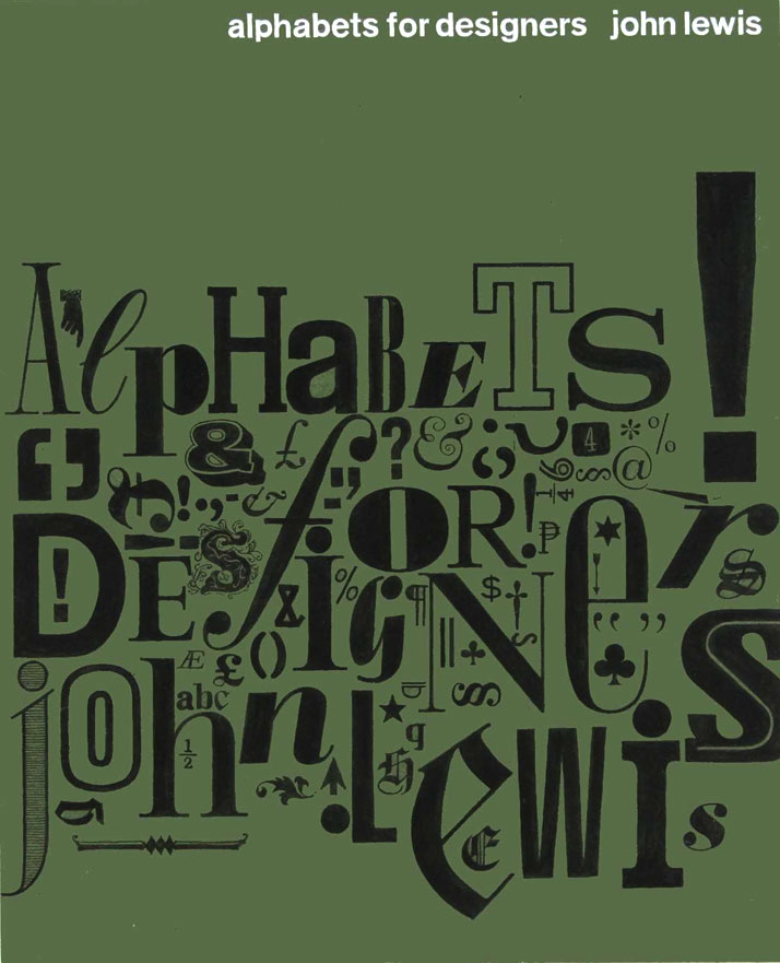
Image Courtesy of John Lloyd Archive
You have had an amazing career, having been one of the pioneers in corporate design. I was always curious about the interaction with the client and the relationship between creative freedom and commercial appeal. Over the course of your career, can you pinpoint which was your greatest challenge and which your greatest fear? The list of participating artists provides the image for the promotion of an exhibition at London's Hayward Gallery. Arts Council, 1977.
I have always believed that the nature of a relationship between designer and client should be one of partnership and trust. To be a successful corporate designer, you need to be a very good listener; you need to get very close to the client organization and to understand fully what makes it special and different. Only then can you identify the unique positioning of the company and give full and distinctive expression to the corporate personality. Successful corporate identity design is all about expressing the identity of the client organization; it has absolutely nothing to do with the pre-occupations and self-expression of the designer. Designers who take an arrogant stance, who insist that they know best without fully engaging with the client organization, and without appreciating its special characteristics, never produce effective or lasting results.
Throughout my design career I have focused on achieving measurable results for clients rather than seeking approval from peers. I was and am particularly proud of my design consultancy, Lloyd Northover, being awarded the first ever Design Effectiveness Award for our corporate identity programme for Courtaulds in 1989. Since then we have won many more International Design Effectiveness Awards – indisputable proof that the right approach to corporate identity research, strategy development, and design really does bring measurable benefits to clients. We have also received purely creative awards, including an International Gold Award from the New York Art Directors Club. So I have always maintained a self-imposed balance between creative freedom and commercial objectives.
The greatest challenge over the years has been to continue to produce work that is both creative and effective, whilst at the same time enjoying the process and having fun. The greatest fear has been that, one day, commissions would dry up but, fortunately, that has never happened.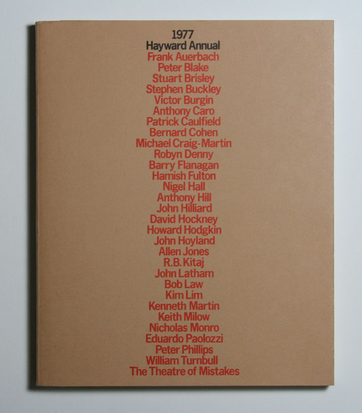
Image Courtesy of John Lloyd Archive
National Rail identity // Gatwick Airport: A new identification and sign system for use at Britain's major rail stations. Each station has its own symbol that reflects either the station architecture, the vicinity, or historical associations.1999.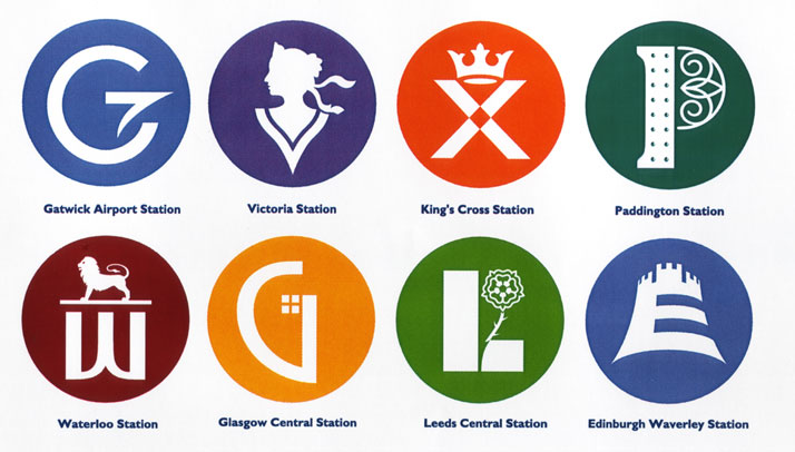
Image Courtesy of John Lloyd Archive
National Rail sign system // An identification and wayfinding system for use at Britain's major rail stations. The system includes a new family of pictograms, a custom-designed typeface, and new formats for each type of sign.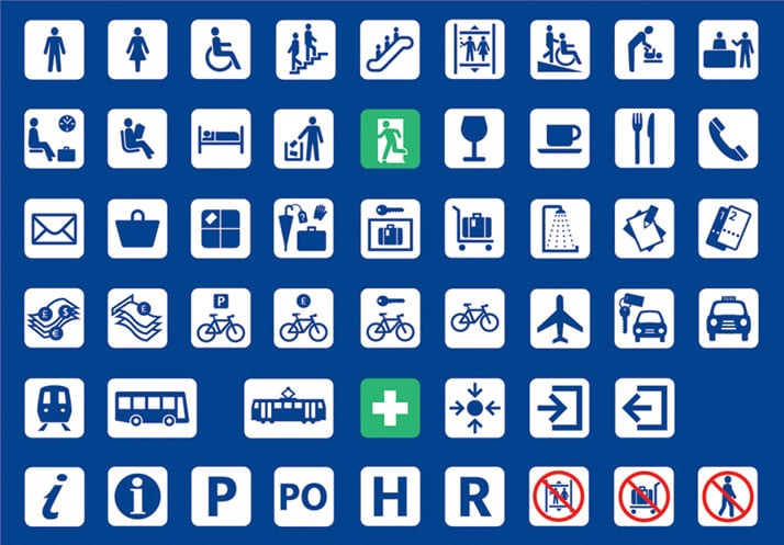
Image Courtesy of John Lloyd Archive
LCP Staff News // A newsletter for College staff,1965. 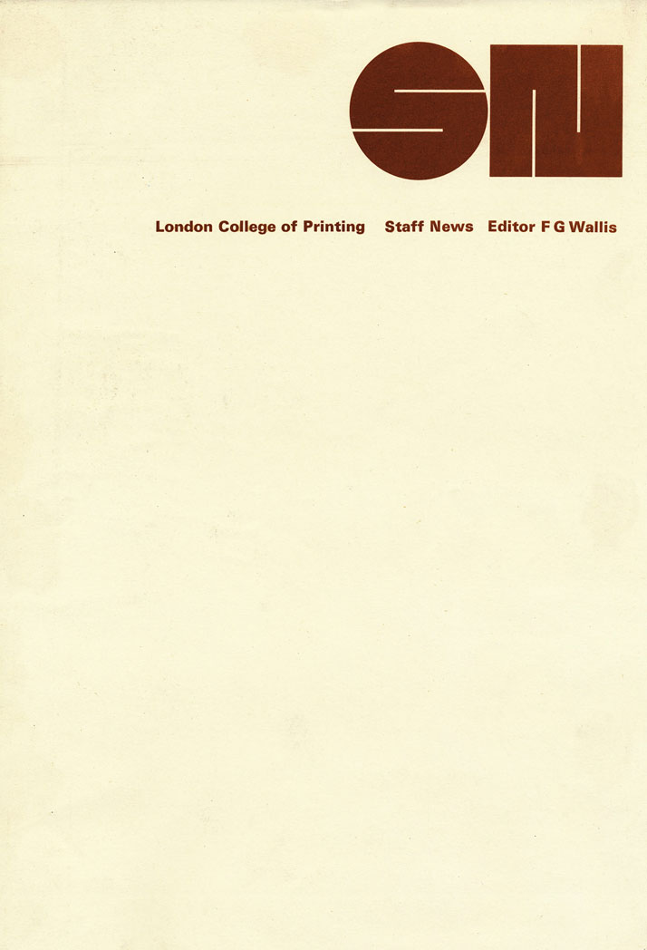
Image Courtesy of John Lloyd Archive
City University // The University is located in the heart of the City of London. The logotype, which appears in a number of variants, is constructed from signs found in the immediate vicinity. The aim is to reflect the diverse nature of the City environment, as well as the University's wide range of activities. 1999.
Image Courtesy of John Lloyd Archive
British Medical Association // The BMA is the trade union that represents general practioners and hospital doctors in the UK. The identity utilises a redrawing of the serpent device that has for a long time been associated with the organisation and the profession. 1995.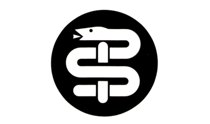
Image Courtesy of John Lloyd Archive
Creating a logo as a part of a brand identity is to me like giving a name to a baby, an identity that will affect him during his life even though at first he is not aware of it. How do you cope with this responsibility? Since a lot of things have been said about what a good logo should be about, I would like to ask you about the variables one should have in mind when designing one.
A logotype is, of course, only a small part of a branding system. Typefaces, colours, formats for communications materials, liveries, buildings, interiors, signs, packaging, and product designs all provide expressions of a corporate or product brand. But it is the logo that sits at the heart of the visual identity system and expresses the essence of the organization at a glance. Products come and go with increasing rapidity; advertising and promotional campaigns have limited life spans, house styles and formats change, but the logo continues year after year and provides continuity. When a designer creates a logo a number of objectives have to be borne in mind.
A logo must be appropriate (it must, of course, suit the character of the organization); it must be unique (in order to achieve clear differentiation from competitors); it must be timeless (a successful logo must last and transcend fads and fashions); it must be defendable (a logotype is a trade mark and must be capable of legal registration and protection); it must be versatile (a logo has to be capable of expression in all contexts and media: on signs, in print, on-screen, on products) and finally, it must be memorable (the most enduring logos tend to be those that are very simple and easy to recall).
Cyrano de Bergerac // Royal Shakespeare Company, 1983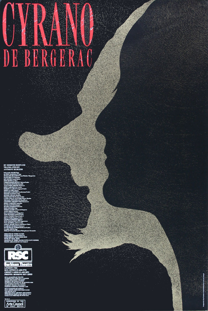
Image Courtesy of John Lloyd Archive
A View from the Bridge // The Young Vic, 1984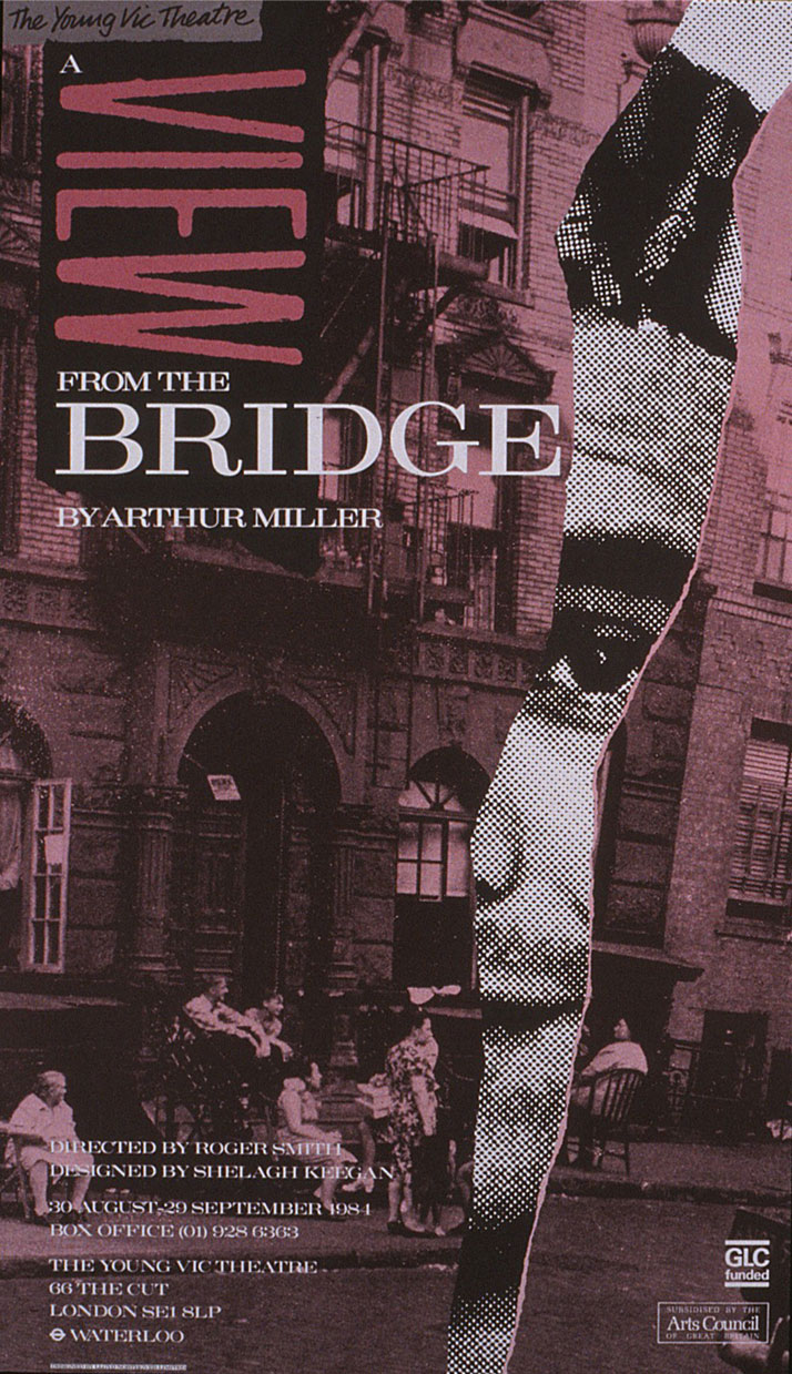
Image Courtesy of John Lloyd Archive
Beethoven Festival // An identity for a Beethoven music festival at London's Barbican Centre. The portrait of the composer is created from one of his scores. 1983.
Image Courtesy of John Lloyd Archive
Do you believe that the rise of the Internet has changed the way that we perceive graphic design and branding? Has it made it easier for good design to stand out? Much Ado About Nothing // Royal Shakespeare Company, 1982
You could take the view that a website is simply an additional medium that should express a product or a corporate identity, much as a printed brochure, poster or advertisement might do. Or, you could conclude that the website is fast becoming the most powerful and influential medium of them all. In the past, potential customers visited a shop to look at a product, now they may first assess it online; whereas before they might have gone to a store or showroom to buy a product, now they are likely to make the purchase online; where once they might have been tempted by a product on a supermarket shelf, now they will see it on a website; where they might have obtained a brochure or been attracted by a magazine advertisement, now they may consult online reviews and will be subjected to online advertising. All this means that, without the old physical expressions of identity (actual products, packaging, environments, literature) as a first experience of a brand, a brand identity has to work much harder to attract customers and achieve differentiation; and, it has to do this primarily in an online context. In effect, the website has to be a number of things; it has to be a store, a sales person or service adviser, a product display, a brochure, a catalogue, an advertisement and an after sales service – all in one place, on-screen. The Internet has not made it easier for brands to stand out. Within the confines and limitations of a small screen, brands have to work exceptionally hard to achieve recognition and differentiation. These are exciting challenges for corporate designers.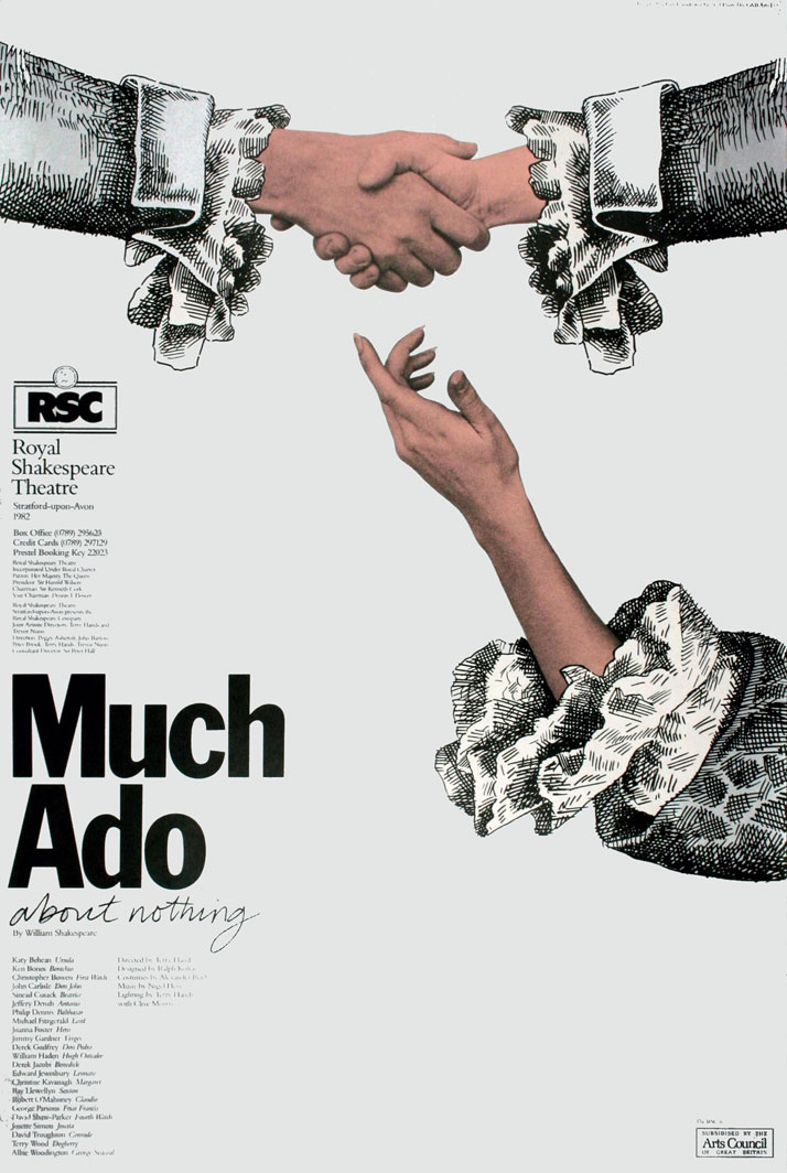
Image Courtesy of John Lloyd Archive
You retired recently, leaving behind 50 years of success. You’ve also your site so that a broader public can discover your archive and obtain a detailed view of your work, thereby offering a valuable educational opportunity. How do you feel looking back upon all of those years of creativity? What inspired you the most? How can one continue being creative even during hard times?
Being creative is all about doing new things and you can do that just as well in hard times. In my design career I have experienced many financial crises and recessions but they have never impeded my creative thinking. Jim Northover and I launched our design consultancy in 1975 in the middle of a significant recession in the UK. In many ways, it was a good time to start a design business as many of the larger design consultancies in London were struggling with high overheads and falling revenues. As a start-up, we were able to be very competitive and flexible in the way we worked and the prices we charged. So, hard times can provide opportunities and can be advantageous if you think positively and creatively.
The great thing about being a graphic designer is that each day is different and each new assignment presents a new learning experience and a new creative challenge.
As I look back over 50 years as a designer, I feel very lucky and privileged to have been able to work for so many significant, different and interesting organizations. As a corporate designer you are not restricted to designing for a specific type of company or industry. In a typical week, I might find myself providing design services for retailers, utilities, transportation systems, universities, arts organizations, government bodies, financial institutions and manufacturing businesses. And, these projects have taken me all over the world. There are very few careers that can offer such variety, interest and creative satisfaction.
What are your future plans? What is left for you to explore?
There is still a huge amount to explore. Since retiring from full-time work as a graphic designer, I have focused more on painting and writing and there is much more to be done in those fields. I am also keen to maintain my involvement with graphic design education. So, my future plans are concentrated on those activities.
BAA // Guidelines that explain how the BAA identity should be used in printed communications. 1998.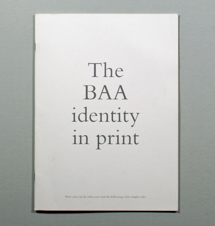
Image Courtesy of John Lloyd Archive
BAA // Guidelines that explain how the BAA identity should be used in printed communications. 1998.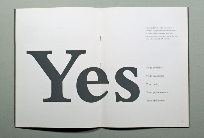
Image Courtesy of John Lloyd Archive
Own-brand packaging for one of the UK's major supermarket groups. Winner of the Gold Award for Packaging at the New York Art Directors Club. 1989.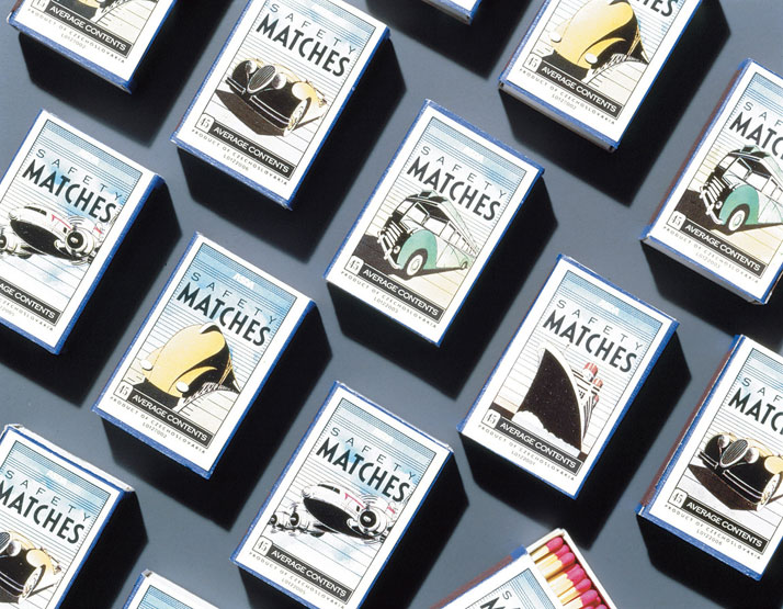
Image Courtesy of John Lloyd Archive
Department of Energy // Part of an integrated range of brochures, designed to promote the UK's offshore oil and gas exploration capabilities to the Chinese market. 1989.
Image Courtesy of John Lloyd Archive
