


In 2007, CheBanca! gave Crea International the task to design a brand new concept of branches in banking sector.
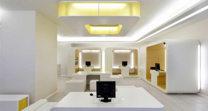
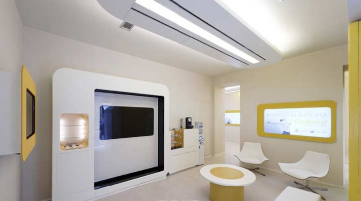
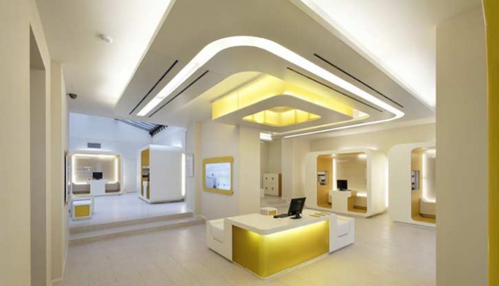
Crea design concept for CheBanca! is “natural tech”.
The leading design idea is that the things that surround us have to get back to essential: the warmth and light of the sun, of a technological but friendly one. A special sun that wraps us around through technology and its light. The layout of CheBanca! is organized so to remember the logical organization of the solar system with the client ideally at the centre of it. The natural tech of Che Banca! means ethic and transparency of a world that does not deceive. A technological world that is able to give space to people and their power to choose.

text by Tuija Seipell for the cool hunter
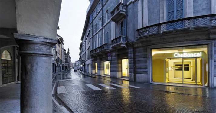
In most cities, strategic downtown street corners are flanked by enormous, old banks, the ornate cathedrals of capital designed to impress and intimidate. With the massive changes in real estate values and consumer banking habits, such monuments to Mammon are no longer smart or necessary. But what amazing opportunities such massive commissions must have been for the architects of the day! And what depressing alternatives we’ve experienced since! Luckily, online banking has made a bank visit almost obsolete, but when you must visit, most of the time you’ll find a boring, convenience-store-type standardized box — retail banking in the worst meaning of both words.
But we are starting to see a change. Several new bank design concepts are in the works, and some have been launched recently, including CheBanca! in Milan by Crea International. The concept for CheBanca! (translation: What a bank!) reflects the brand’s simplicity, transparency and innovation. When Crea International co-founder Massimo Fabbro will speak at POPAI Italia in November on the power of physical brand design to bring to life a brand's language, spirit and values, he will no doubt mention CheBanca!


