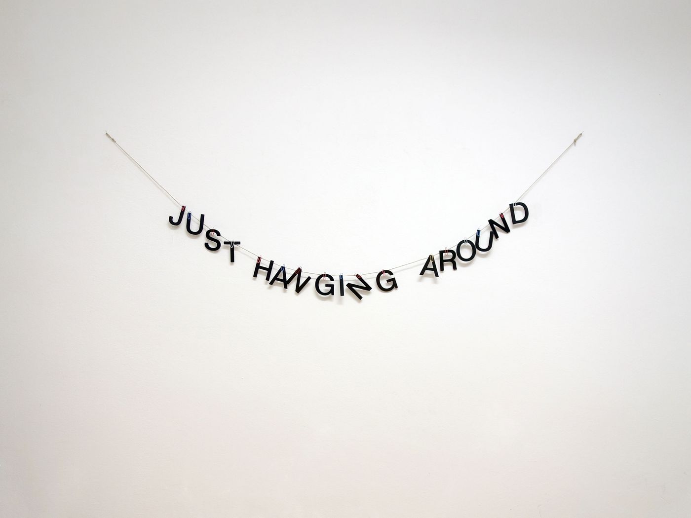
Whimsical & Incisive: The Visual Poetry of Anatol Knotek
Words by Eric David
Location
Whimsical & Incisive: The Visual Poetry of Anatol Knotek
Words by Eric David
While being colour blind may seem like a great disadvantage for a visual artist, it can in fact also be an impetus to creativity. Such is the case for Austrian text-based artist Anatol Knotek who instead of colours uses letters, words and minimalistic visual elements to create simple yet powerful works of visual poetry. As E. B. White said, “A poet dares be just so clear and no clearer... He unzips the veil from beauty, but does not remove it”, and Knotek does exactly that. Using only a handful of letters or words, stripped of linguistic baggage, grammatical decorum and excess noise, he visually arranges them – bending, skewing, scratching and even setting them aflame – into minimalist compositions that are simultaneously clear-cut and incisive, obvious and profound. For Knotek, words are a malleable material whose linguistic meaning is equivalent to its visual resonance. Full of wit and ingenuity, his typographical wordplay is imbued with the kind of acerbic humour that belies reflection, light-heartedly drawing you in only to reveal fundamental truths or question preconceived certainties. Yatzer recently caught up with Knotek to talk about his work, his creative process and his passion for poetry.
(Answers have been condensed and edited for clarity.)
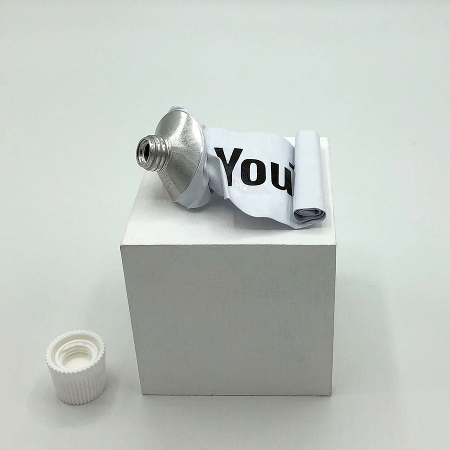
Anatol Knotek, expressed. © 2012.
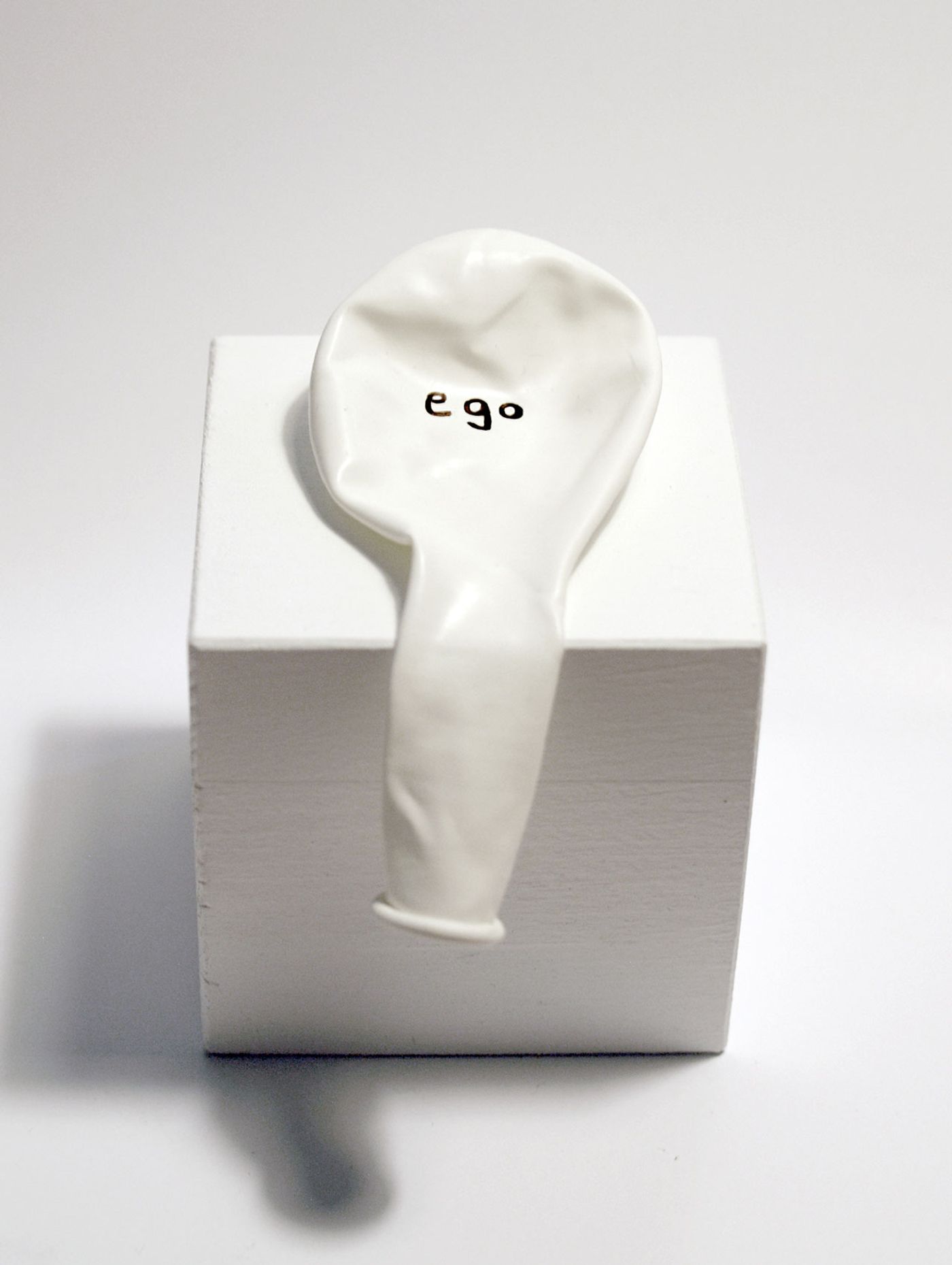
Anatol Knotek, ego (geht eh), permanent marker on balloon, wooden base © 2012.
What inspired you to introduce text into your artwork? Did your preoccupation with writing precede your artistic inclination or was it the other way around?
It was actually the other way around. I started painting as a teenager – back then my idols were the painters from the turn of the 19th century – but over time, because of my insecurity in choosing colours (I am red-green colour blind), I started to gradually reduce the colour palette in my paintings. At some point, the idea arose to replace colours with words, and I began to collect newspaper articles and headlines, which I arranged in collages in such a way that I used text lines instead of drawn lines and instead of colour areas I used articles and poems. It was always important to me that the text fitted the picture theme and was not set arbitrarily. This is how I created pictures that could be read as well as viewed, a good example of which is my work “dance of life 2”.
How do you come up with the visual puns that so wittily characterize your work? Is it more a spontaneous process or the outcome of brainstorming and experimentation?
It’s both. I first write my ideas in my notebook and then, depending on my confidence in the idea or my current mood, I continue working on it, transferring it to the computer to continue experimenting, or, which is more often the case, I close the notebook and wait. After some time, if I still like the idea, I go on and work on it again. So I’d say that constantly revising my work and trying to improve it in different versions is typical for my working process.
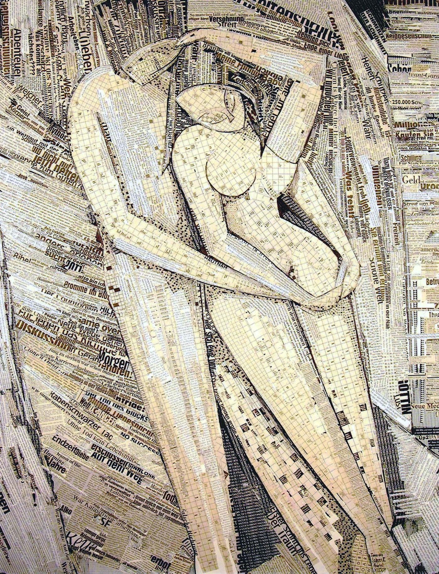
Anatol Knotek, dance of life 2, 100cm x 80cm, text-collage on canvas © 2000, private collection.
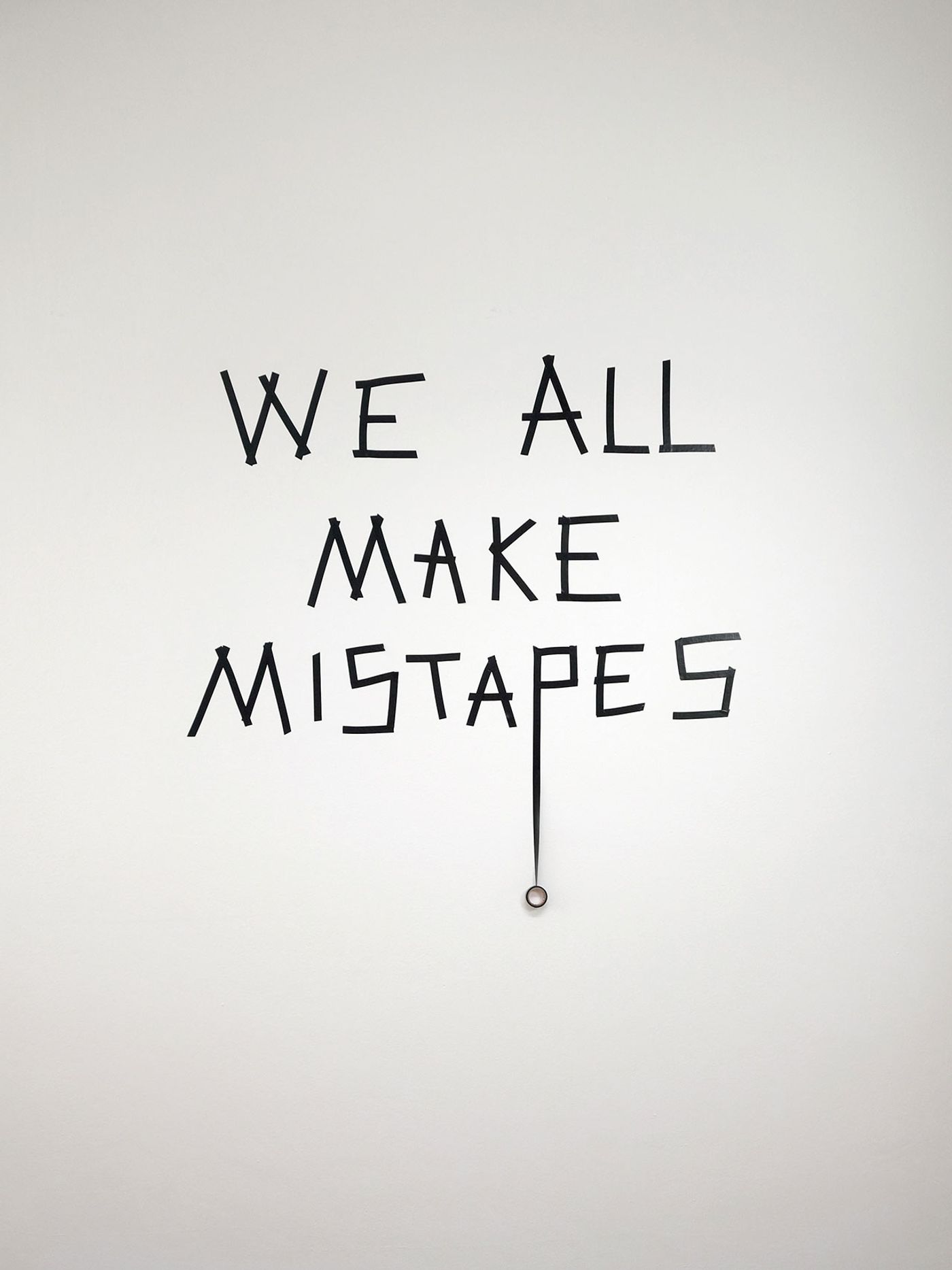
Anatol Knotek, mistapes, text-installation © 2014, town hall gallery.
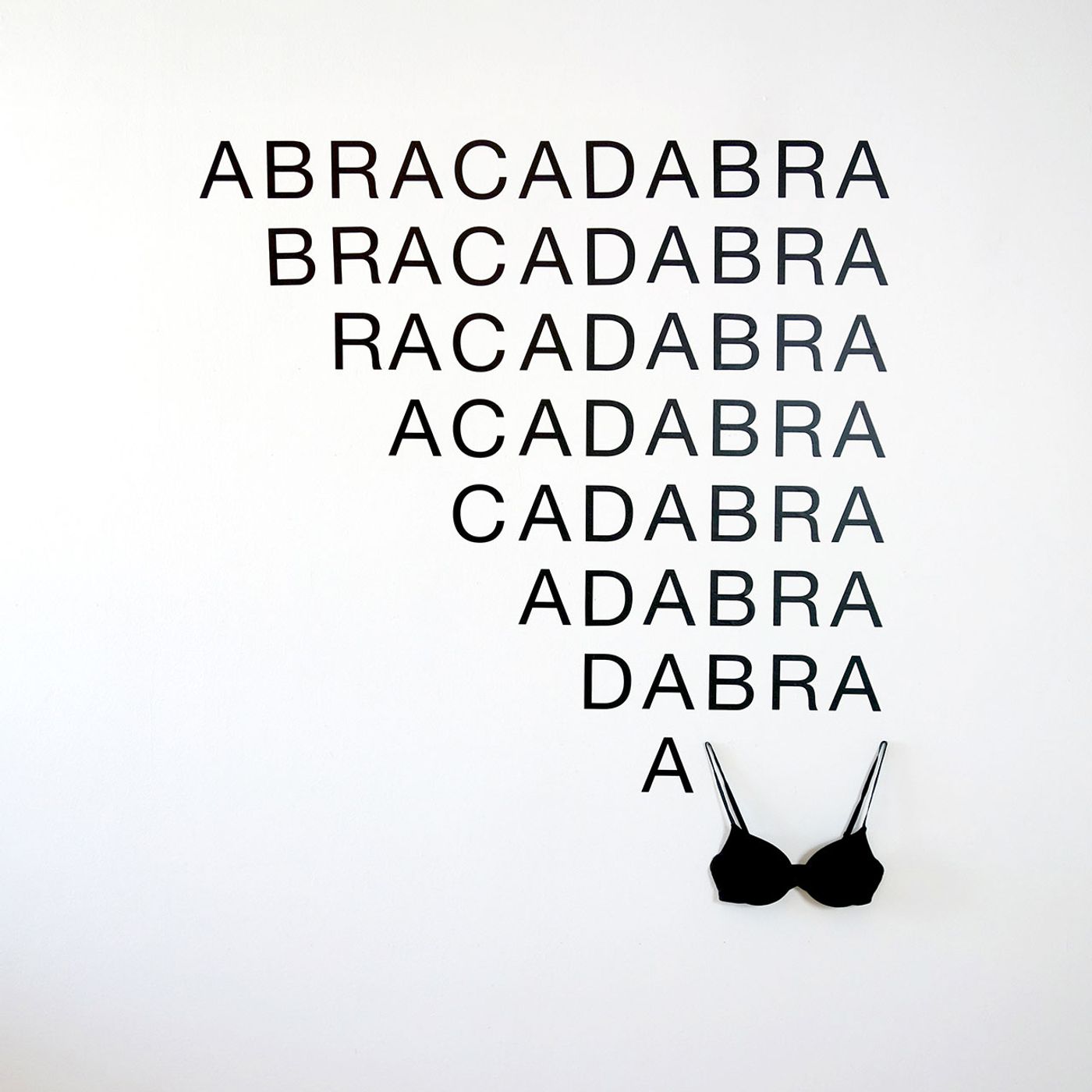
Anatol Knotek, a bra, vinyl-letters, bra © 2016.
What is the primary reaction that you’re looking to elicit with your work? Amusement, puzzlement, contemplation or all the above?
It depends on the work. I try to make the viewers conversant with the fascination and power of words, language and art. If that puts a smile on their faces, it also makes me happy!
Your work is characterized by a subversive sensibility. Is your underlying intention to make the viewers re-calibrate the way they think about the world?
In a certain way yes but I would also have to say that I don’t usually have the potential viewer in mind when creating my works.
What are the criteria for selecting fonts for each artwork? Do you have a favourite font?
Most of the time I use “Helvetica Neue” because in my opinion it’s neutral and beautiful – and I usually don’t want the typeface to stand out, because the focus should be on the content. But I also work with my typewriters a lot. I love their monospaced fonts which also help me a lot in the development and creation of my works.
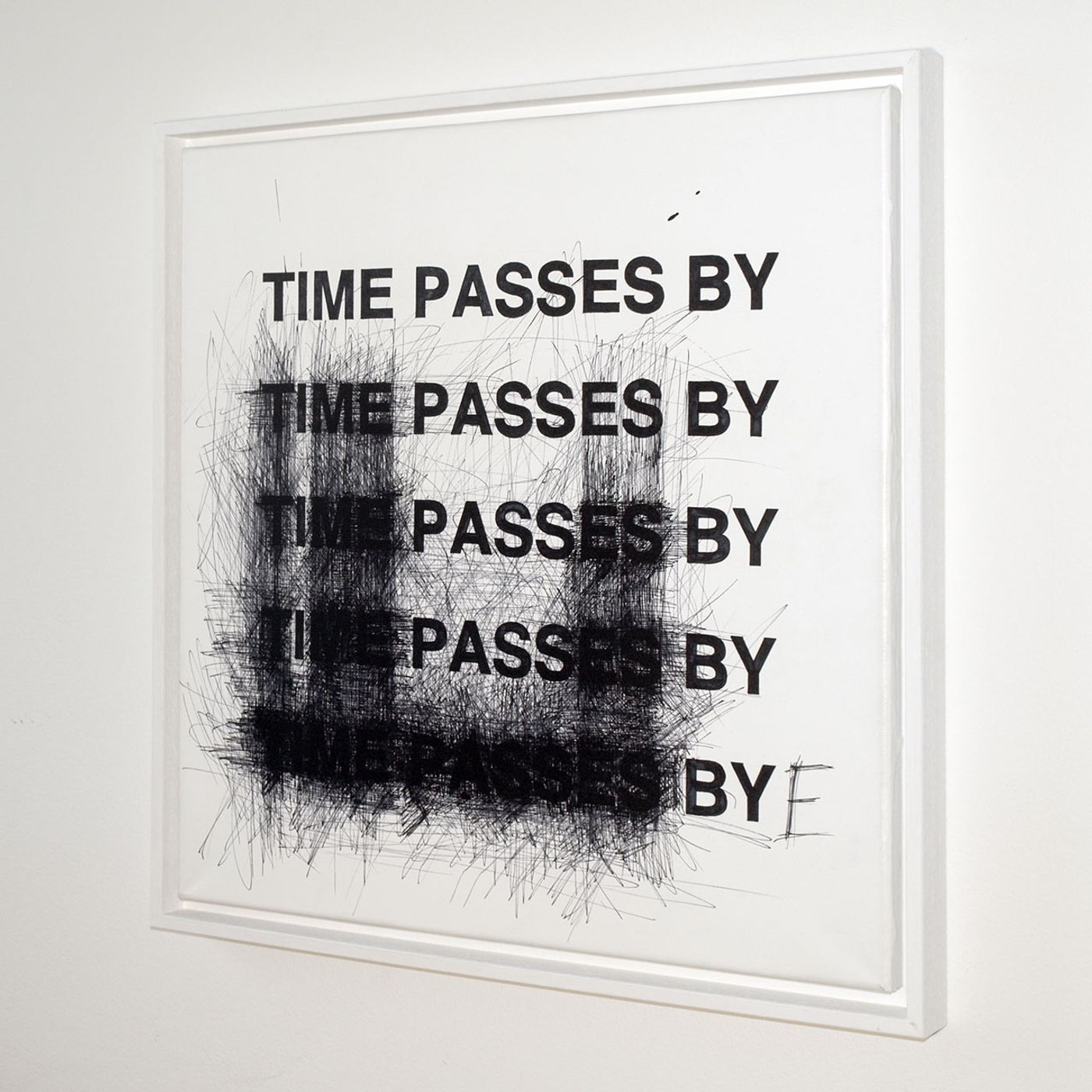
Anatol Knotek, bye, 50 cm x 50 cm, acrylic and permanent marker on canvas (framed) © 2011, private collection.
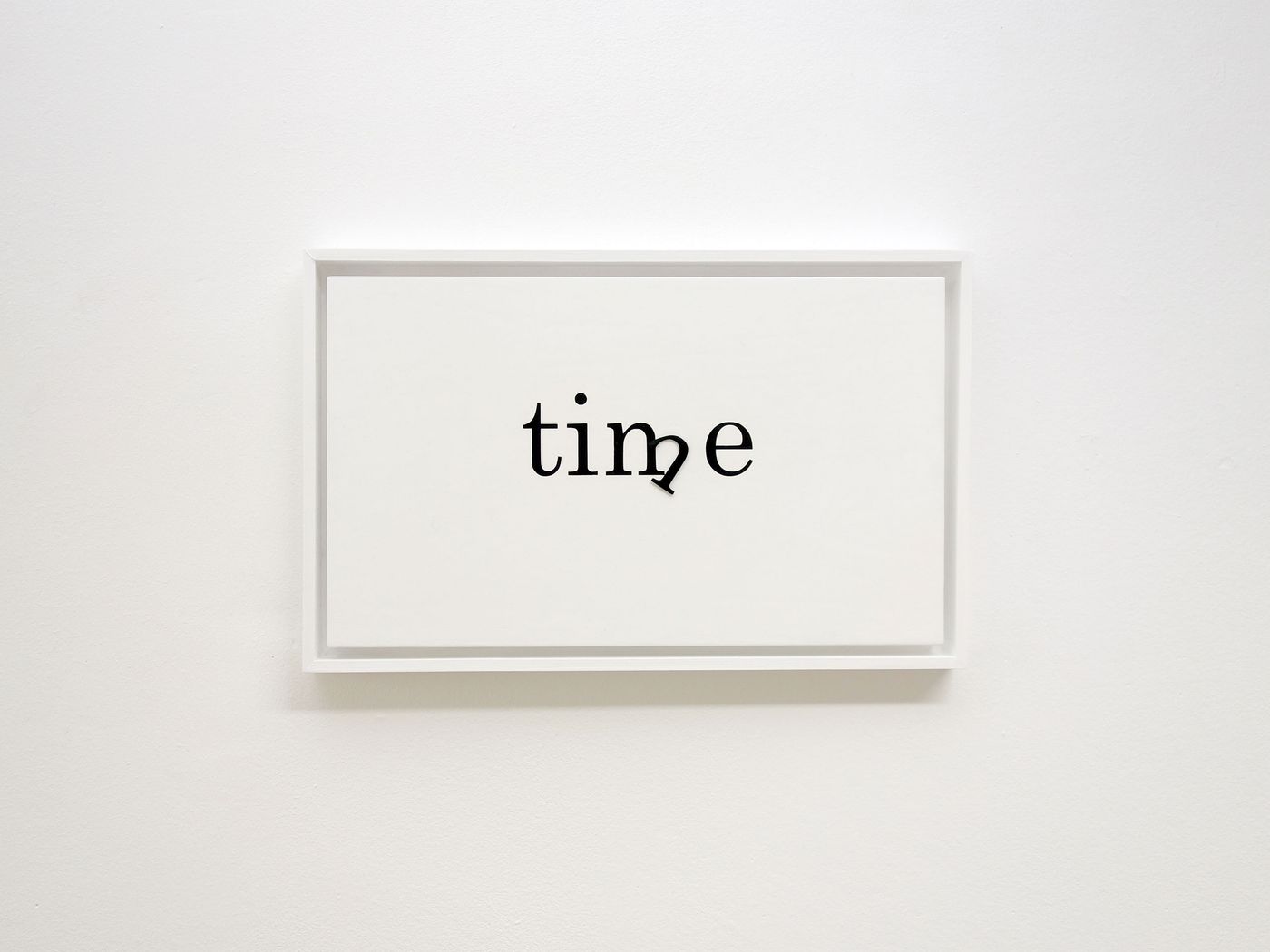
Anatol Knotek, just in time, 30 cm x 30 cm (framed: 50 cm x 50 cm), acrylic on wood, clockwork © 2011.
Most of your work embraces a monochromatic palette that reflects the black and white tones of the written page. In which instances do you use colour?
Mostly I only use black and white. Sometimes I use red, the colour of emotion, passion, blood, life and death etc., but I try to use it sparingly and only if “necessary”. I sometimes also use other colours but only to make words “visible”.
Do you believe that a more creative approach to poetry such as yours can attract a wider audience, especially at a time when social media has reduced our attention span and conditioned us to focus only on “catchy” content?
Yes, I think so! I already had a love for poetry during my childhood, especially Goethe and Schiller, but I only started to be really enchanted when I came across the concrete poetry movement of the fifties and sixties! I see the concrete and visual poets as my “ancestors” and inspiration.
How do you navigate between using your native German language versus relying on English as a way to reach an international audience?
That’s not easy because most of my works that are “only” in German are not visible on the internet. I mainly only show them at exhibitions in German speaking countries, most recently at Museum Villa Rot in Germany. I often try to realise my ideas in both languages. Of course this doesn’t always work, but the results are sometimes quite fascinating!
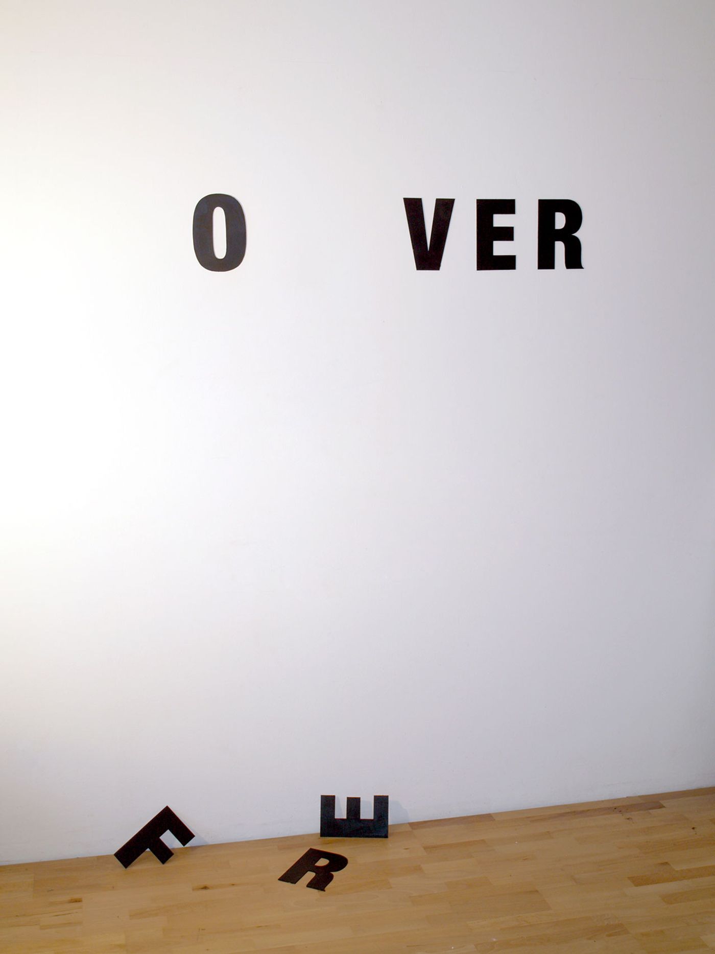
Anatol Knotek, nothing lasts forever, text-installation © 2009/2016, xpon-art gallery.
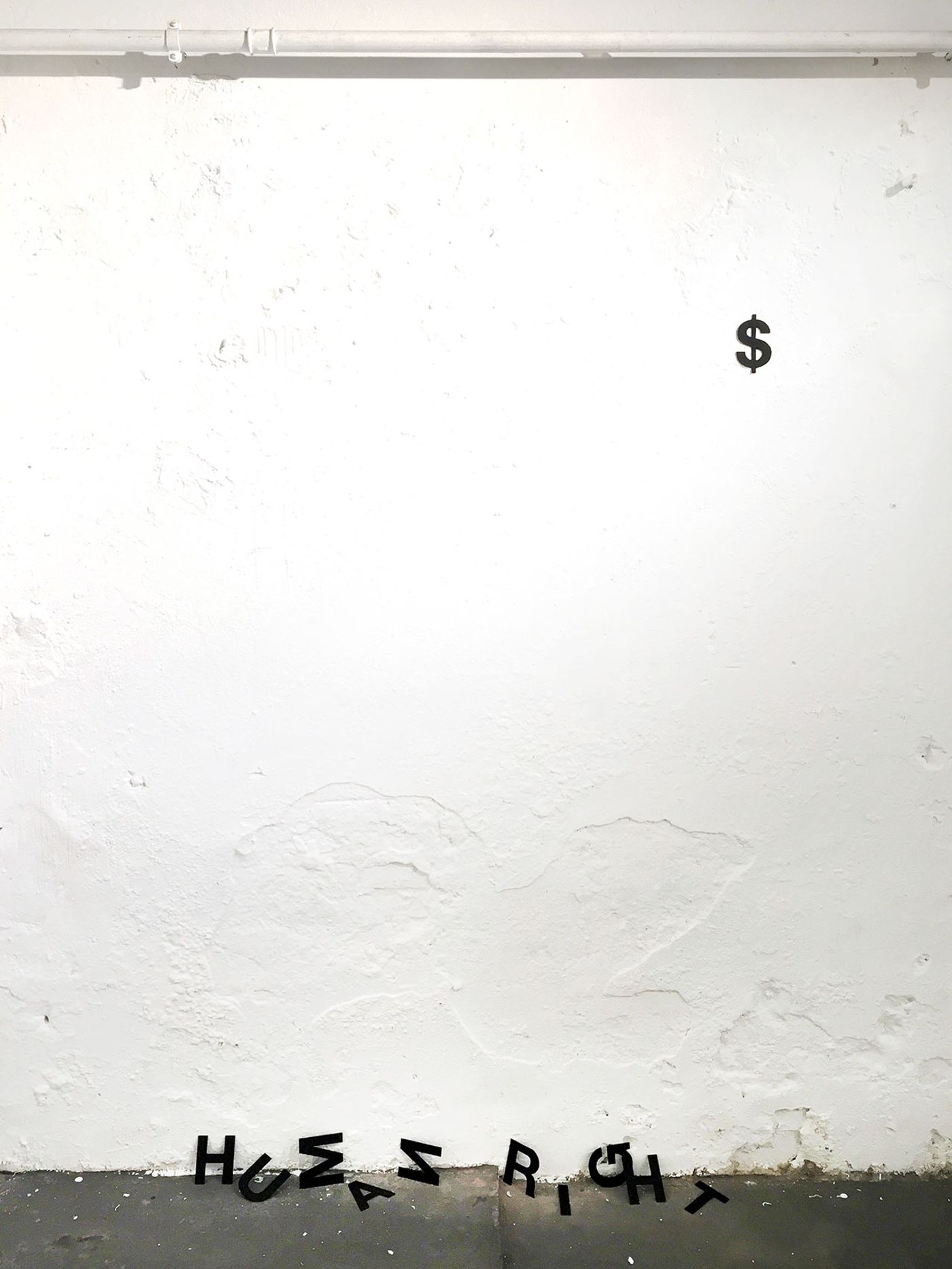
Anatol Knotek, human right$, text-installation
© 2012-2016.
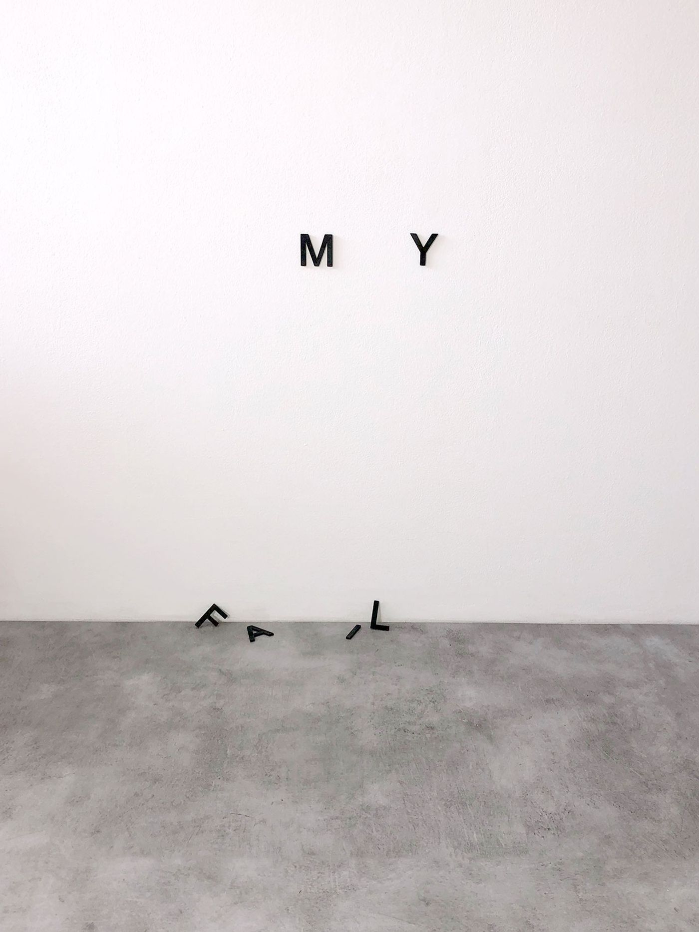
Anatol Knotek, family, text-installation
© 2013/2016.
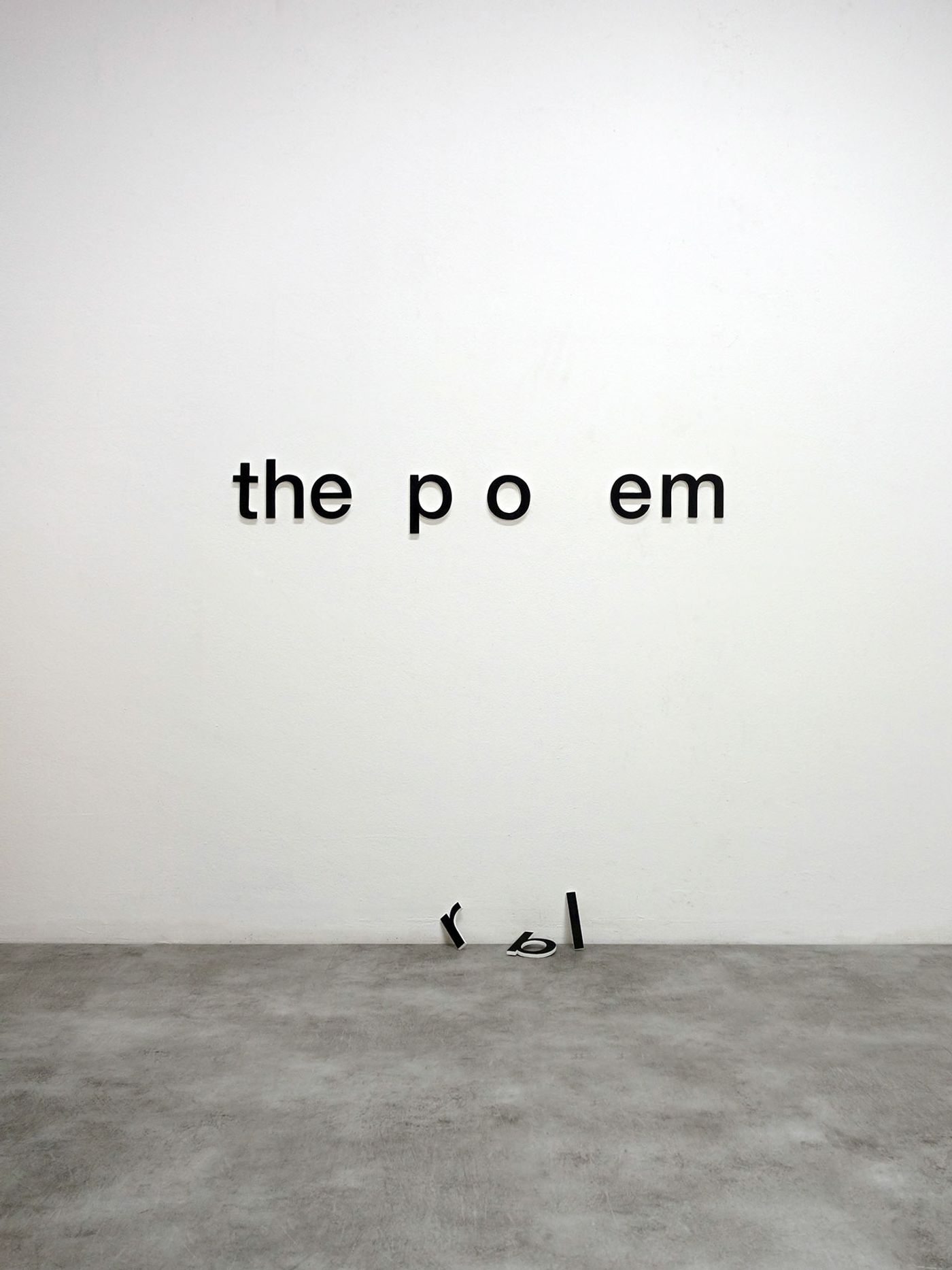
Anatol Knotek, the solution, text-installation © 2009/2016.
Do you primarily consider yourself a poet or an artist? Or is there really no difference when it comes to expressing yourself?
I generally have difficulties with terms like "artist" or "poet”, but maybe I’m something in between? I really don’t know…
What are you working on right now? Any exhibitions on the horizon?
As always I’m working on several things at the same time. At the beginning of 2020 I will take part in a visual poetry exhibition at the Viennese gallery "Wechselstrom".Lately I had a lot of fun and inspiration working with my typewriters again – the result will probably be new typewriter works and maybe even a new book. Last but not least, there will be a publication of a book about poets on Instagram by Laurence King publishing, which I’m glad to be participating in.
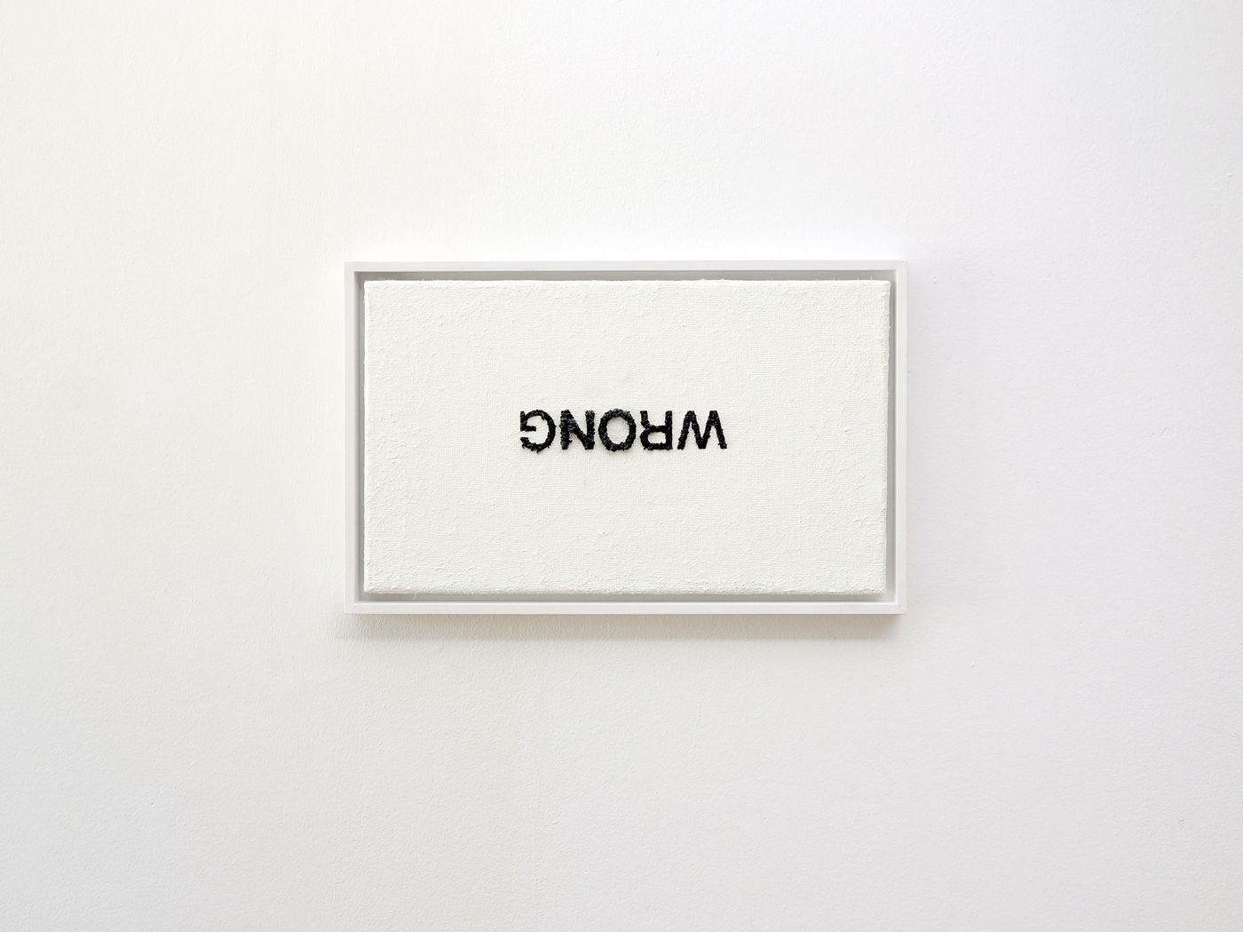
Anatol Knotek, no, 30 cm x 50 cm, acrylic on canvas (framed) © 2014.
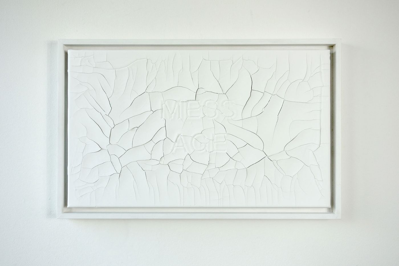
Anatol Knotek, we live in the mess age, 30 cm x 50 cm, acrylic and dispersion on canvas (framed) © 2014, private collection.
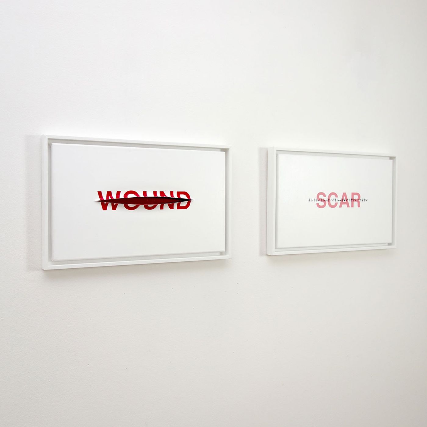
Anatol Knotek, (from left to right) wound, 30 cm x 50 cm, acrylic on canvas, sliced (framed). scar, 30 cm x 50 cm, acrylic on canvas, sliced, stitched (framed) © 2014.