The First Corporate Identity of The Bauhaus-Archiv Museum in Berlin
Words by Kimberly Lloyd
Location
The First Corporate Identity of The Bauhaus-Archiv Museum in Berlin
Words by Kimberly Lloyd
54 years since its inception, the Bauhaus-Archiv Museum in Berlin is set to debut its first-ever corporate identity. Meet Sascha Lobe, creative director of Stuttgart-based design studio L2M3, for a deeper insight into what is his most paramount project.
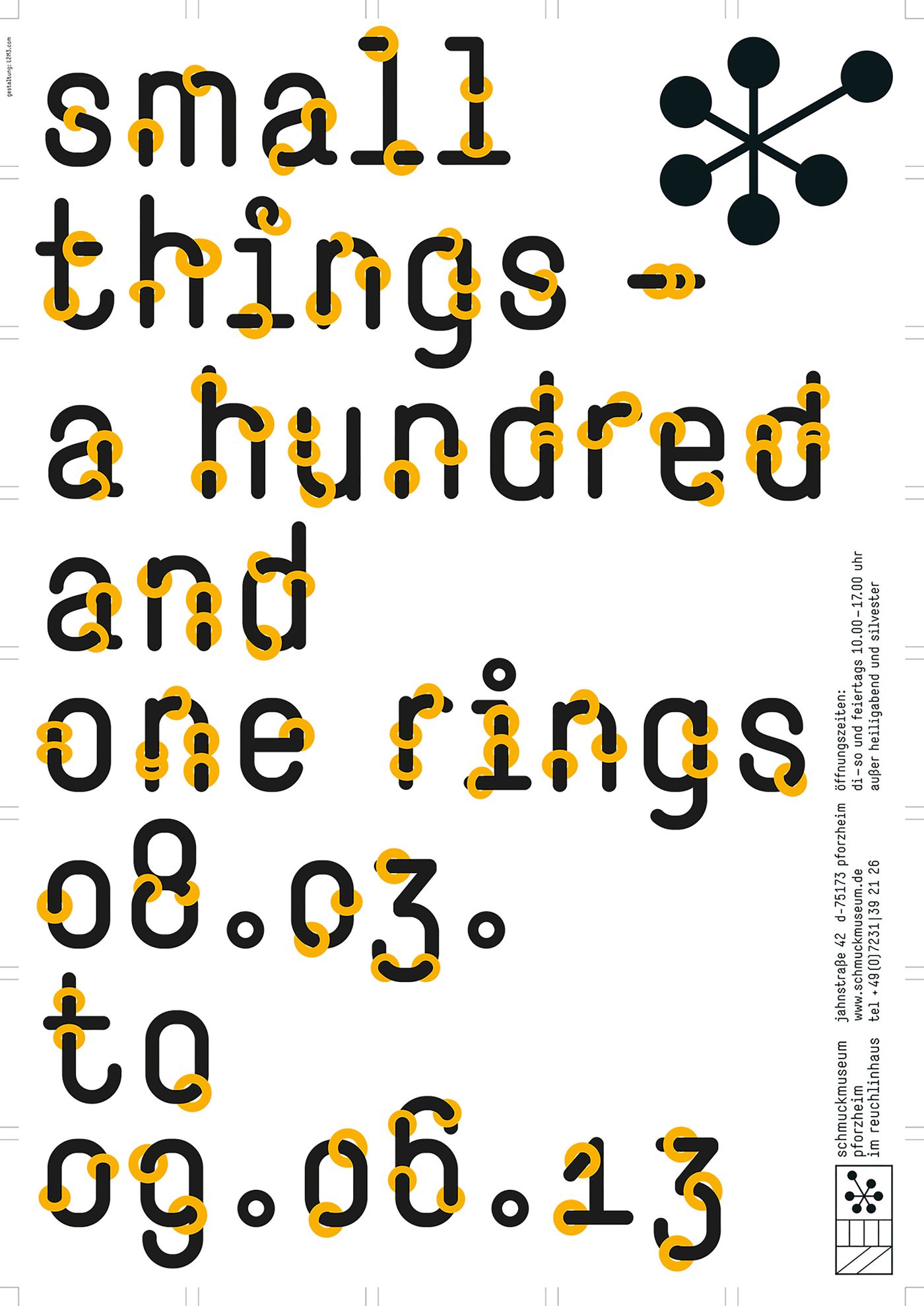
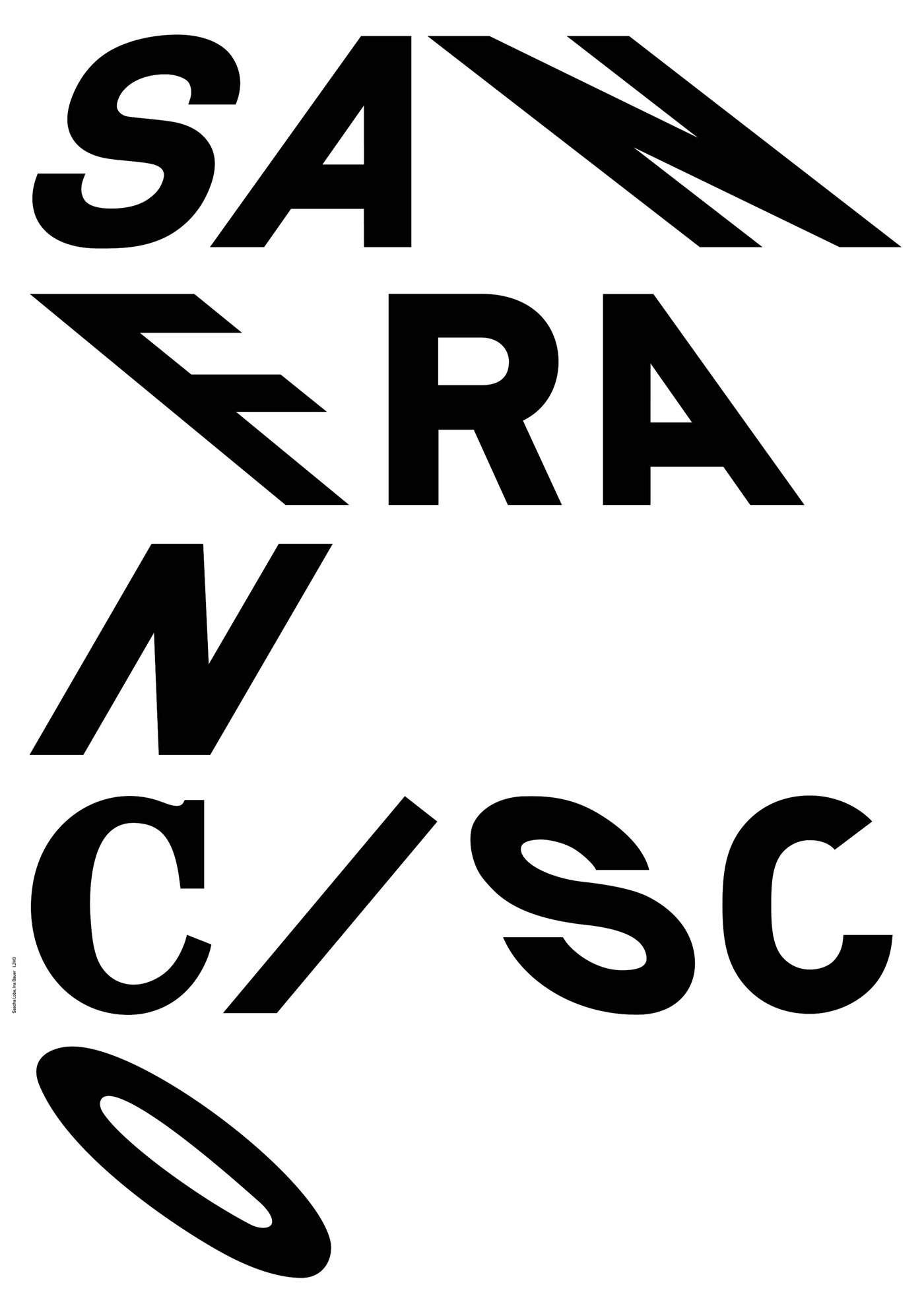
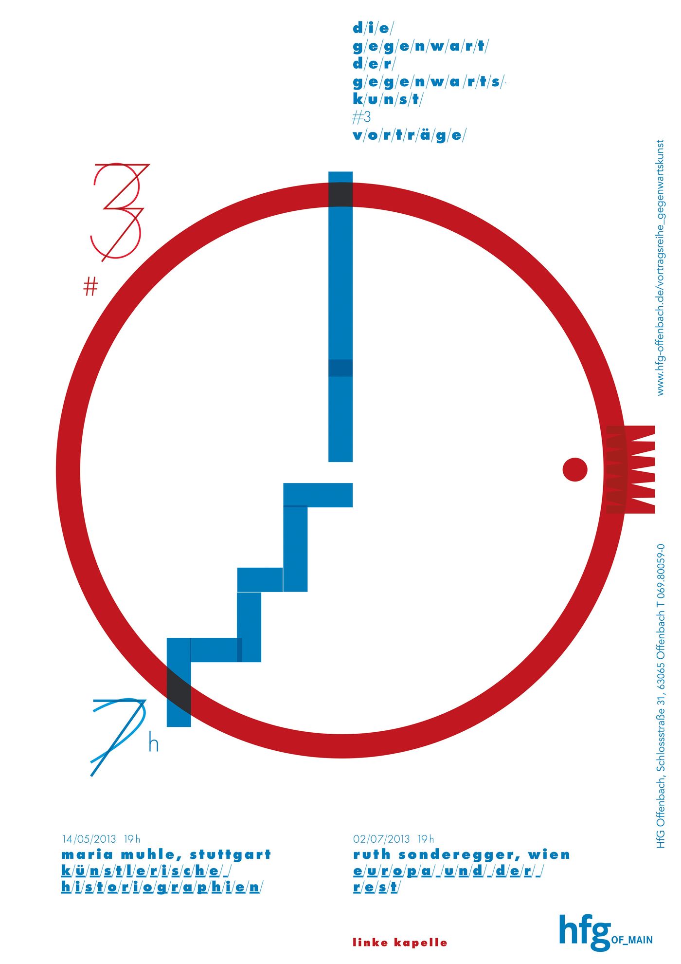
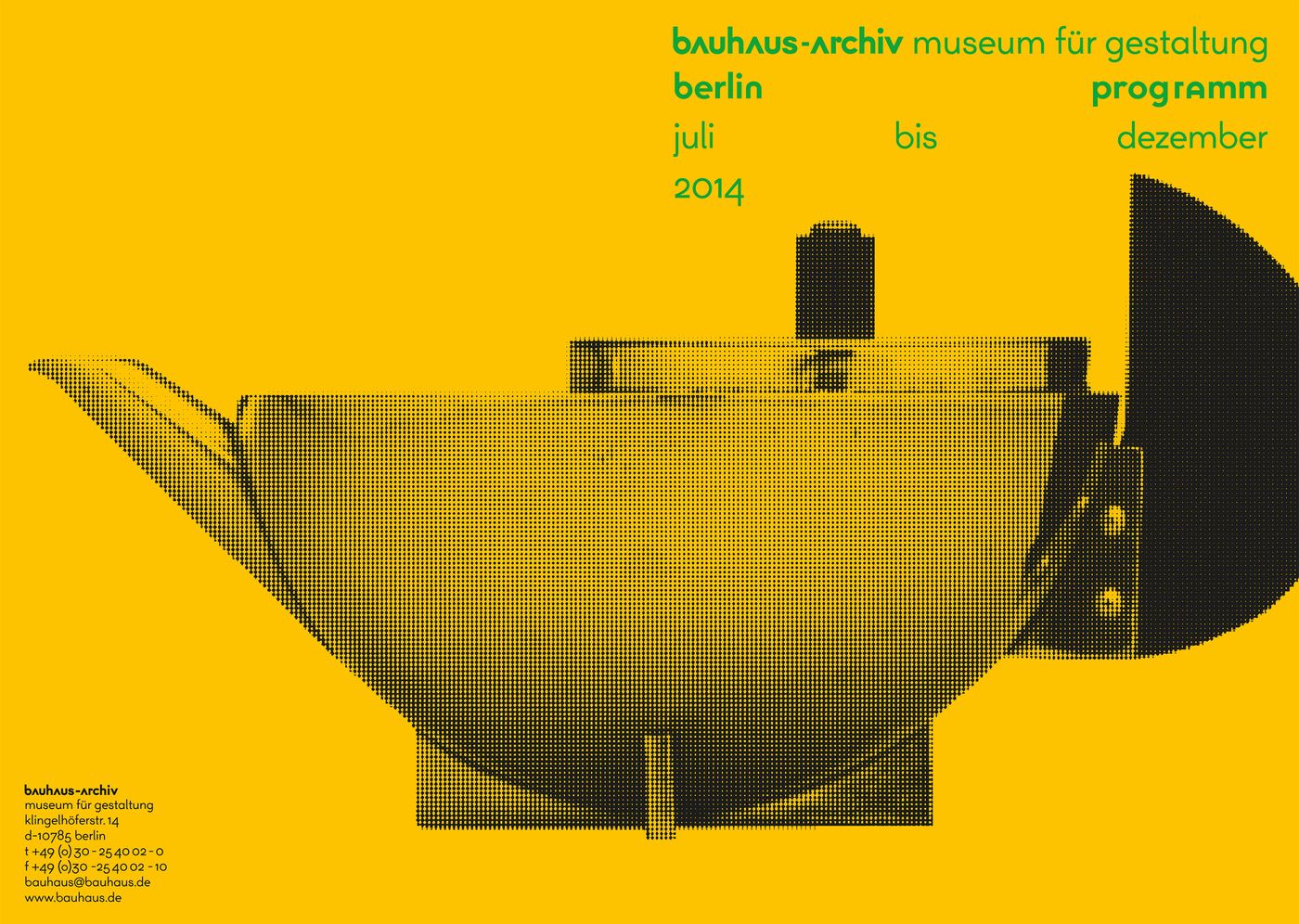
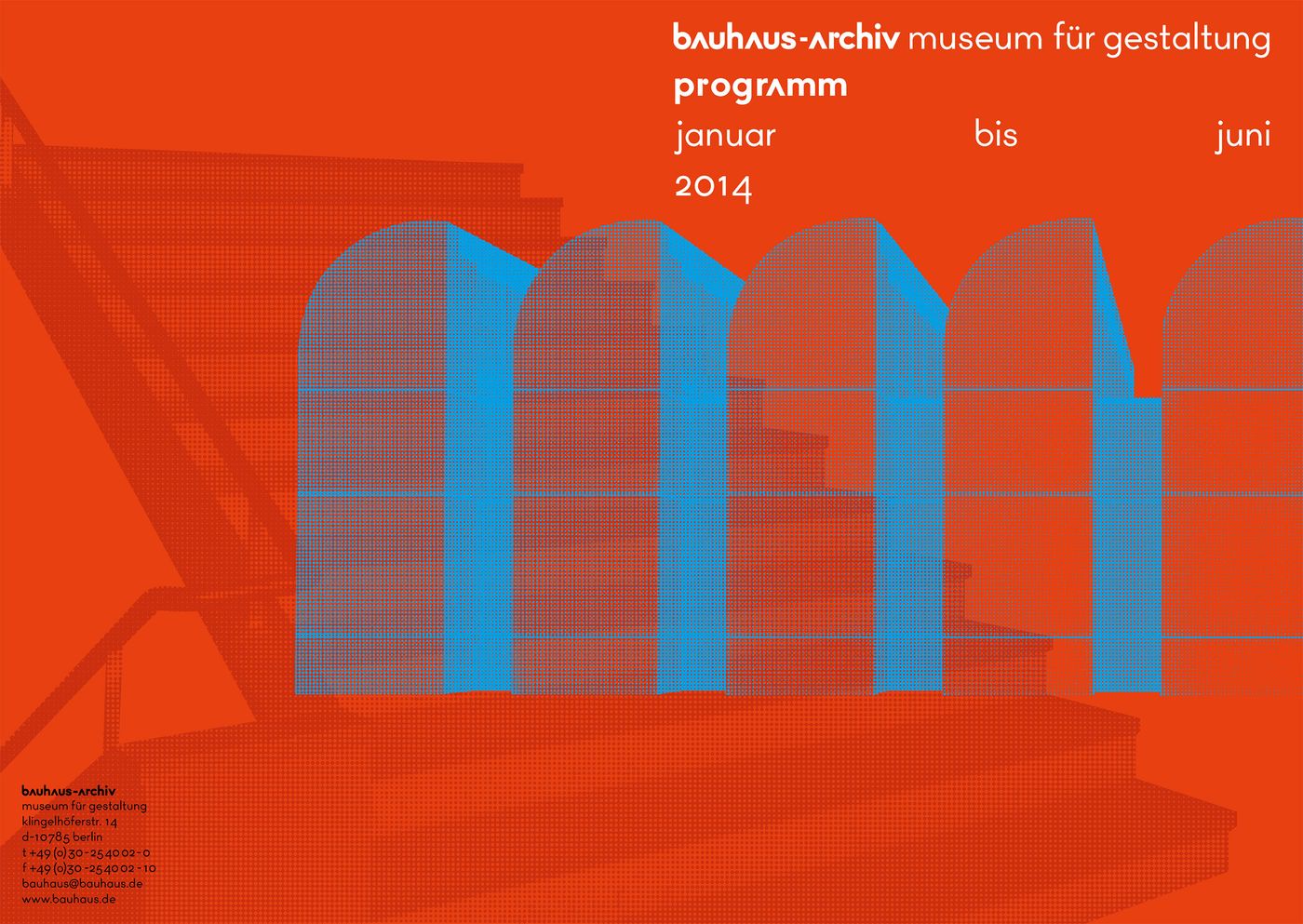
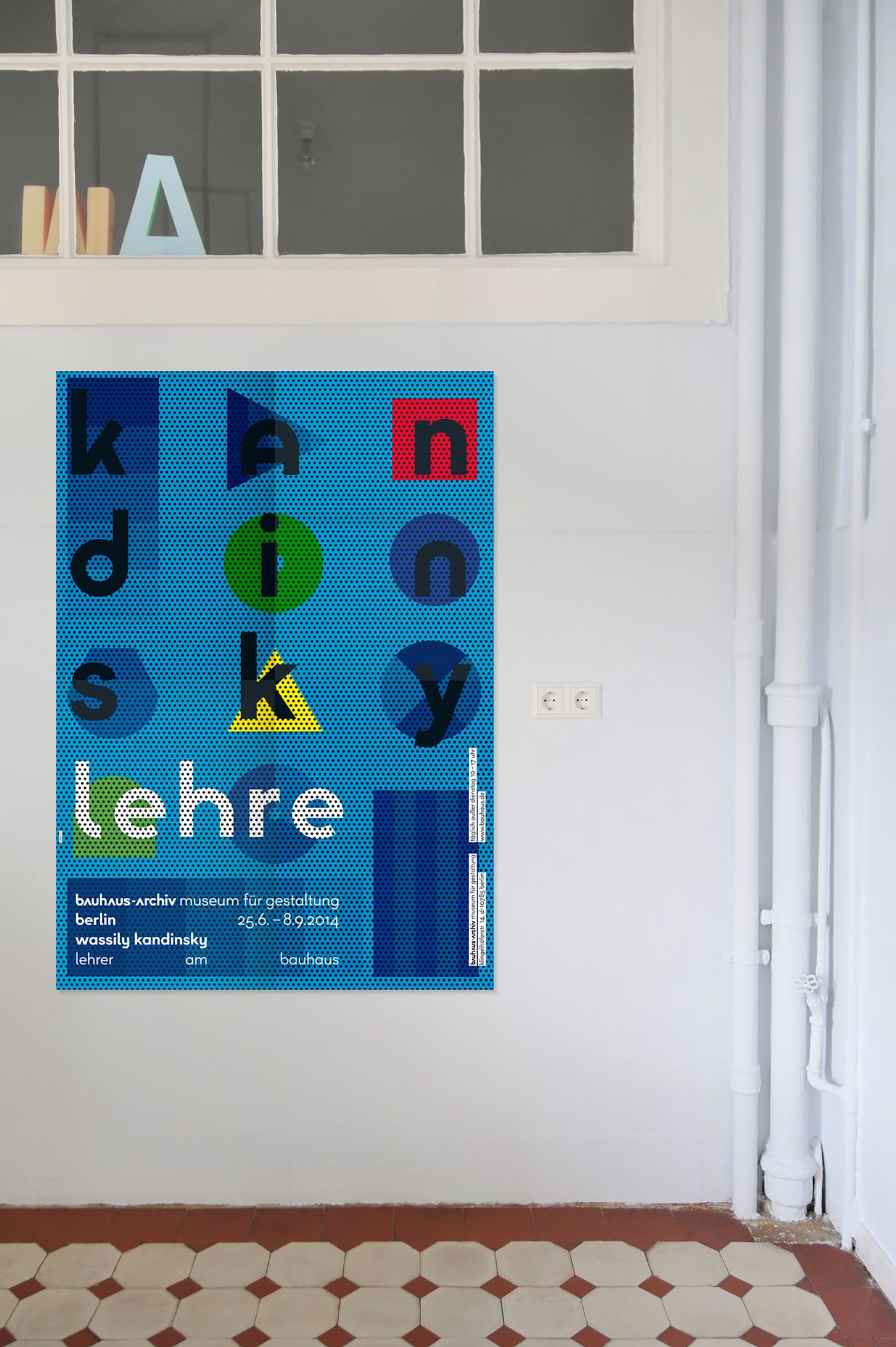
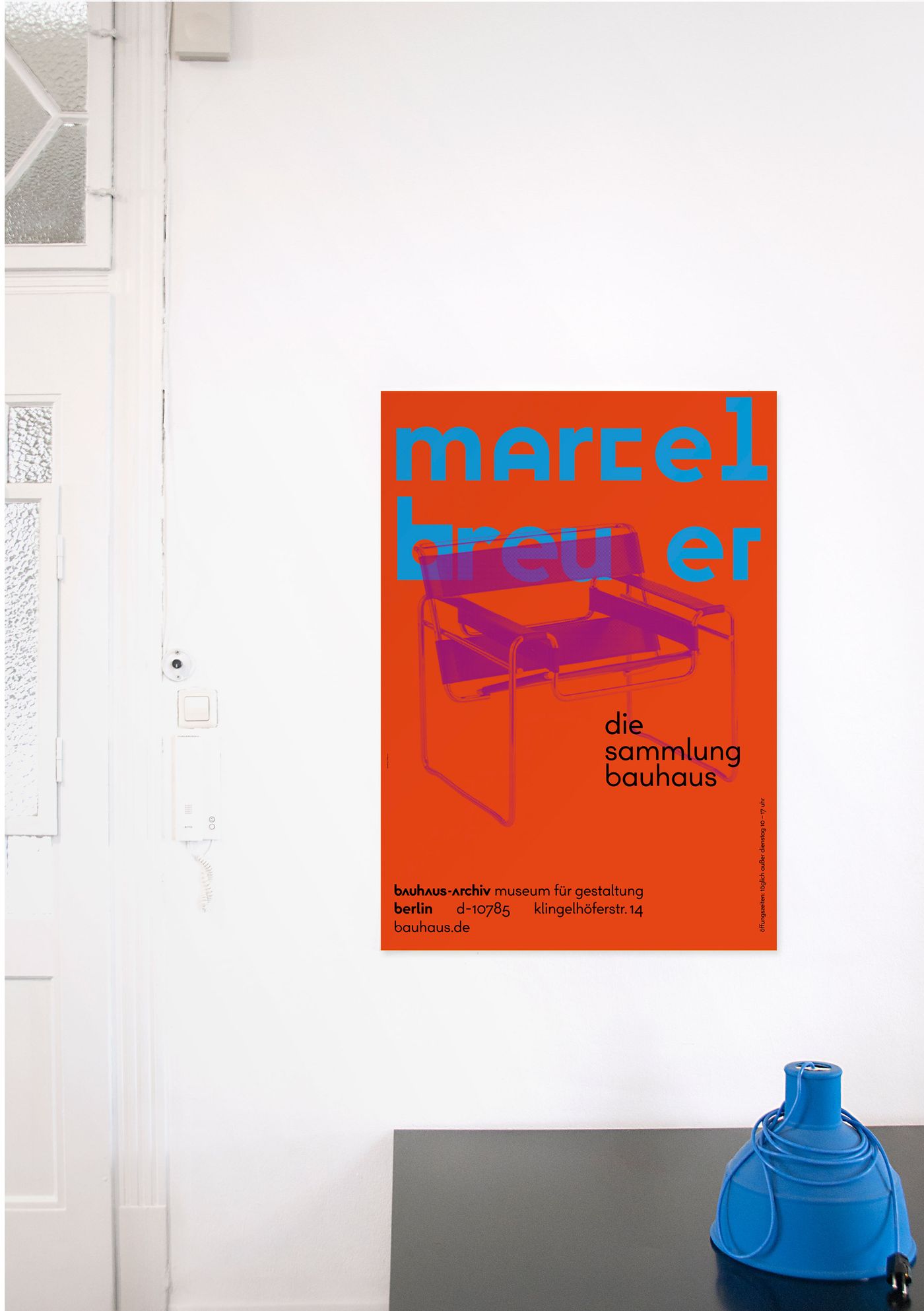
Poster designed by L2M3 for The Bauhaus-Archiv Museum für Gestaltung, © The Bauhaus.

Sascha Lobe, creative director of Stuttgart-based design studio L2M3. Photo by Dominik Gigler.
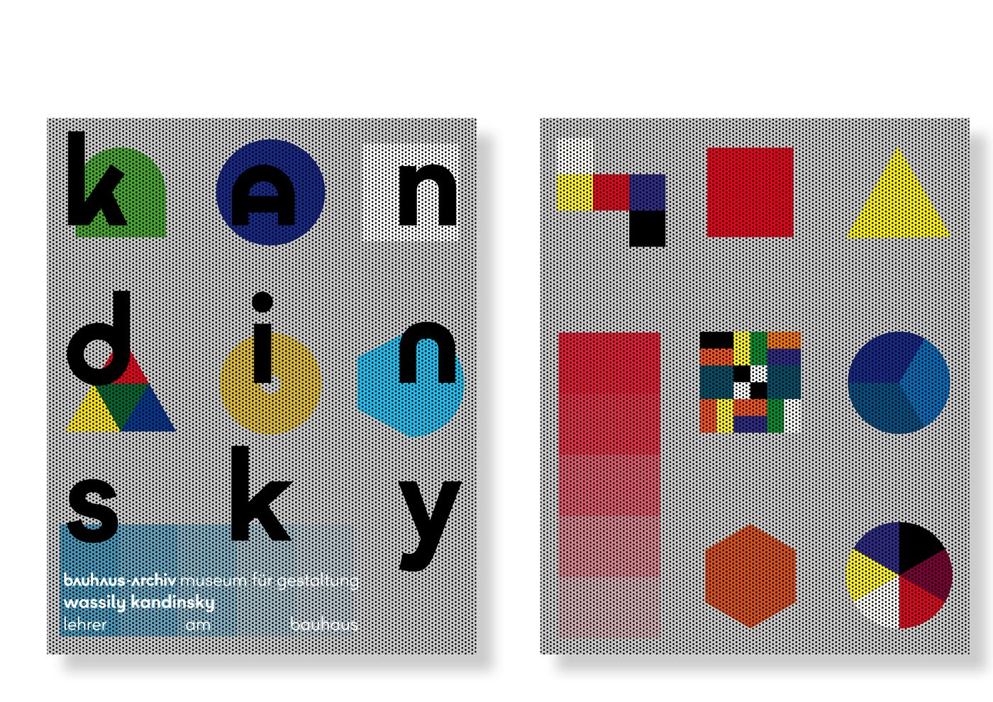
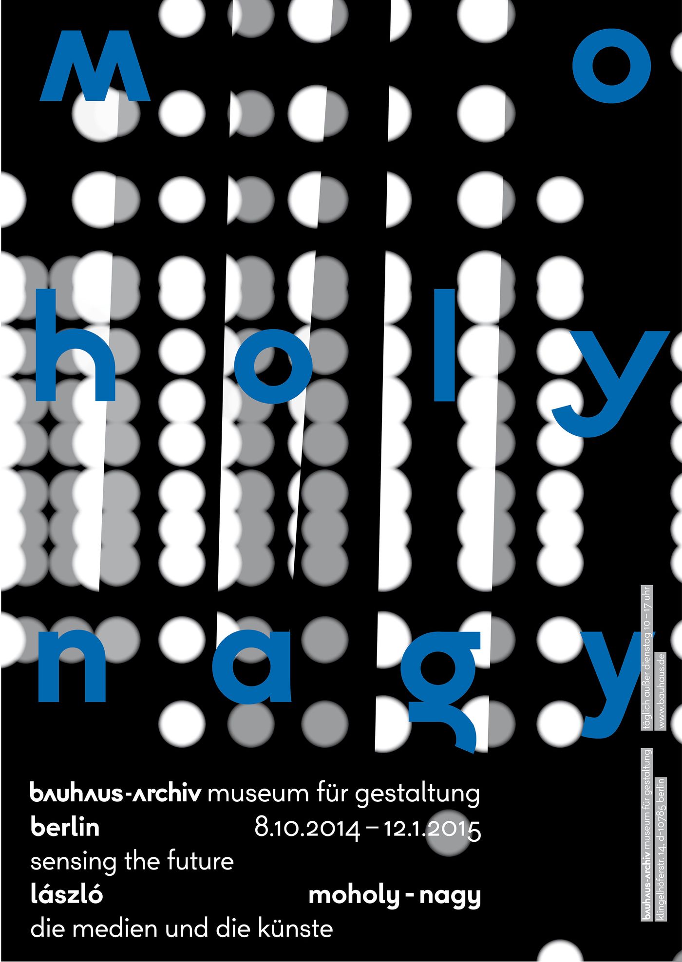
Poster designed by L2M3 for The Bauhaus-Archiv Museum für Gestaltung, © The Bauhaus.
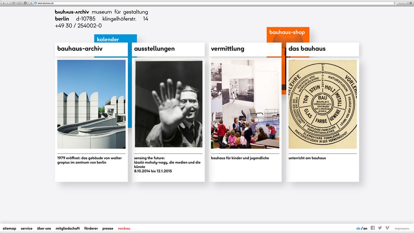
The official website of The Bauhaus-Archiv Museum für Gestaltung, designed by L2M3. © The Bauhaus.
Sascha, you’ve been involved in the design industry for quite a while now – all the way from buying one of the first Apple personal computers in your early twenties to designing for the most prestigious client a designer can imagine today, namely The Bauhaus-Archiv Museum für Gestaltung in Berlin. Having shared your knowledge on stages around the world and witnessed your work become part of important museum collections, could you please elaborate on why the Bauhaus is still so relevant today?
I think the Bauhaus is still an extraordinary subject with a universal influence on all serious designers in all disciplines and their work. No doubt there is a growing trend towards the central tenets of the Bauhaus that emphasize the oft-touted ''LESS IS MORE'' approach with quality craftsmanship, where form follows function and superfluous ornamentation is retracted. This also lines up with the current Slow Movement call-to-action that does away with excess and emphasizes sustainability, local craft, connecting with others, and finding the right pace that maintains quality over quantity. I could actually give you give a huge list of new entrepreneurs with Bauhausian visions. Then there’s the fact that the Bauhaus-Archiv has begun to offer programs and lectures concerning questions in contemporary architecture and design. Additionally, it is the only relevant Bauhaus destination in Berlin. This comes at an auspicious time with the projected 2019 opening of a secondary building in response to increased museum foot traffic.
Why has the museum never had on a single identity before?
Oh, I think there are several reasons for this. First of all, we should not forget the impact of Herbert Bayer and his omnipresence that scares off so many creative minds so easily. Second, certain structural ideas need time to evolve and mature. Third, I think our design studio and the work that we do, ignited a move in the heads of the Directors to do it now and to do it with us. And fourth, as the museum is targeting a new generation, if not now, when?
Give me an insight into how your involvement in the process came about. Did the museum just simply call you out of the blue?
Hahaha! No! My studio L2M3 was invited to pitch on a project which the Bauhaus-Archiv was involved in too. Although we didn’t make it to the final round, apparently they kept our name on their lists. Later on, we were invited to another pitch, won it and were commissioned to work on the Corporate Identity and Design of the museum because the Board of Directors remembered our work. The whole thing didn’t come as that much of a surprise to us, as we knew that there was a special bond right from the beginning.
And the briefing was?
The briefing was the classic one: ''Hey, we need a Corporate Identity and Design. What are your thoughts?''
Can you walk me through your thought process on this project? As you already had the fundamental basics, would you say that your typeface is an update?
Herbert Bayer left us all a legacy. History cannot and should not be ignored. The Bauhaus-Archiv assignment challenged us to go beyond the frontiers that the luminary Herbert Bayer had already explored without losing any of his spirit and vision as an ''imaginary creative director''. I wanted to keep and expand an archive in a dynamic organic process, albeit using a scientific approach. I must correct you, our typeface is not an update; it is, rather, an extension and an expansion, maybe even a small yet important leap in its further evolution.
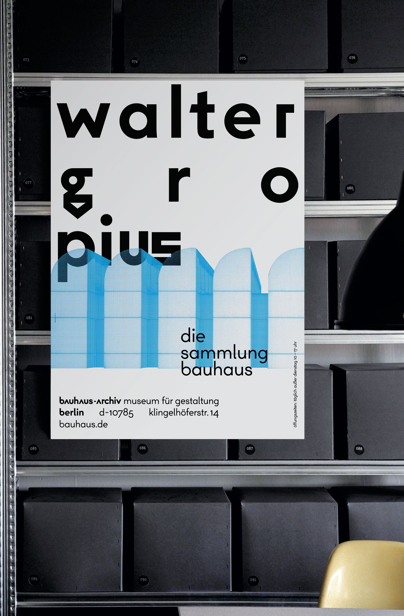
Poster designed by L2M3 for The Bauhaus-Archiv Museum für Gestaltung, © The Bauhaus.
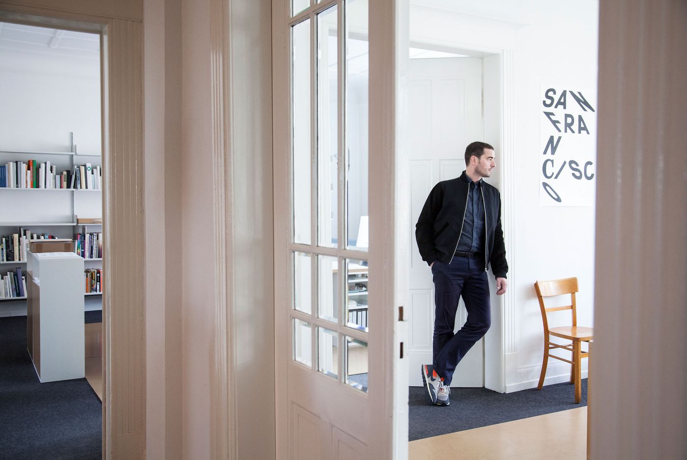
Sascha Lobe, creative director of Stuttgart-based design studio L2M3. Photo by Dominik Gigler.
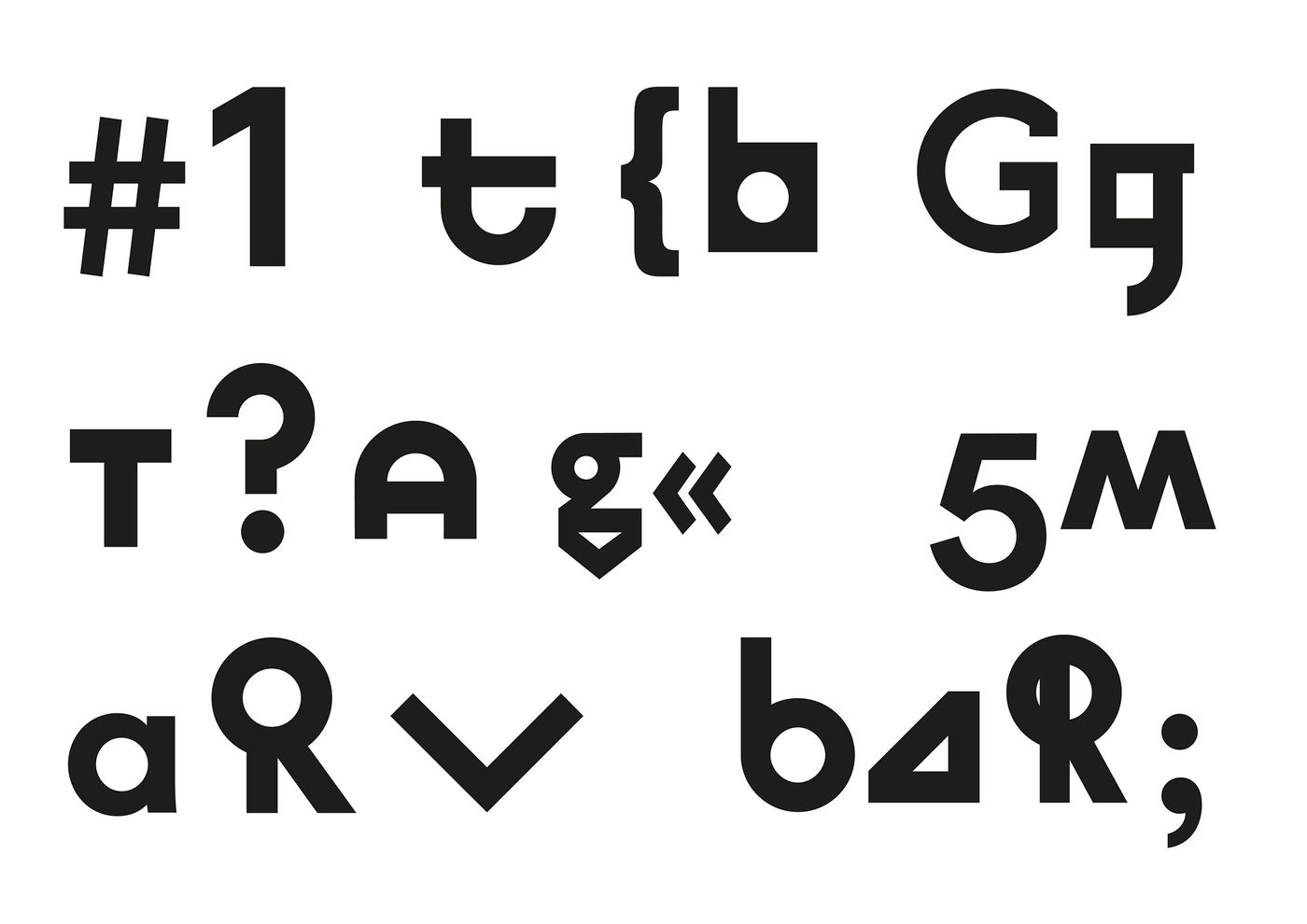
I gather there are numerous versions of letters also called glyphs. Why are there so many?
Like all typographers, our first duty was to create a typeface that kept legibility and readability, functionality and adaptability intact whilst bearing in mind all the necessary weights such as bold, regular and italic - essentially the basics.
With that said, our aim was to deliver a beautiful and complex typeface, combined with an inexhaustible supply of options to evaluate. We wanted peculiarities within the typeface which in turn would give it edge and structure. While experimenting with different ''letters'' we came across many unique glyphs and wanted to add them to our new archive. Parameters such as line width and x-height served very well as a method to unify the glyphs yet in an arranged form the glyphs were made to deliver a multitude of diversity – providing a functional paradox you could say.
Won’t that cause confusion? How exactly has the technology of today served your needs?
No, it won’t. Simply put, the expansion was possible due to the technology and tools that are available today that have enabled us to experiment through myriads of variations for one single letter (we have more than 555 glyphs in our collection). You can’t imagine what an accomplishment that is even though only typographers will most probably understand my enthusiasm on this point.
Are you proud of the outcome?
I am not so proud of the features as much as the mere fact that we have built the fundament for an archive of letters that can be expanded within the visions of Bauhaus (in the context of contemporary use) for the next decade. That in itself is beyond fulfilling.
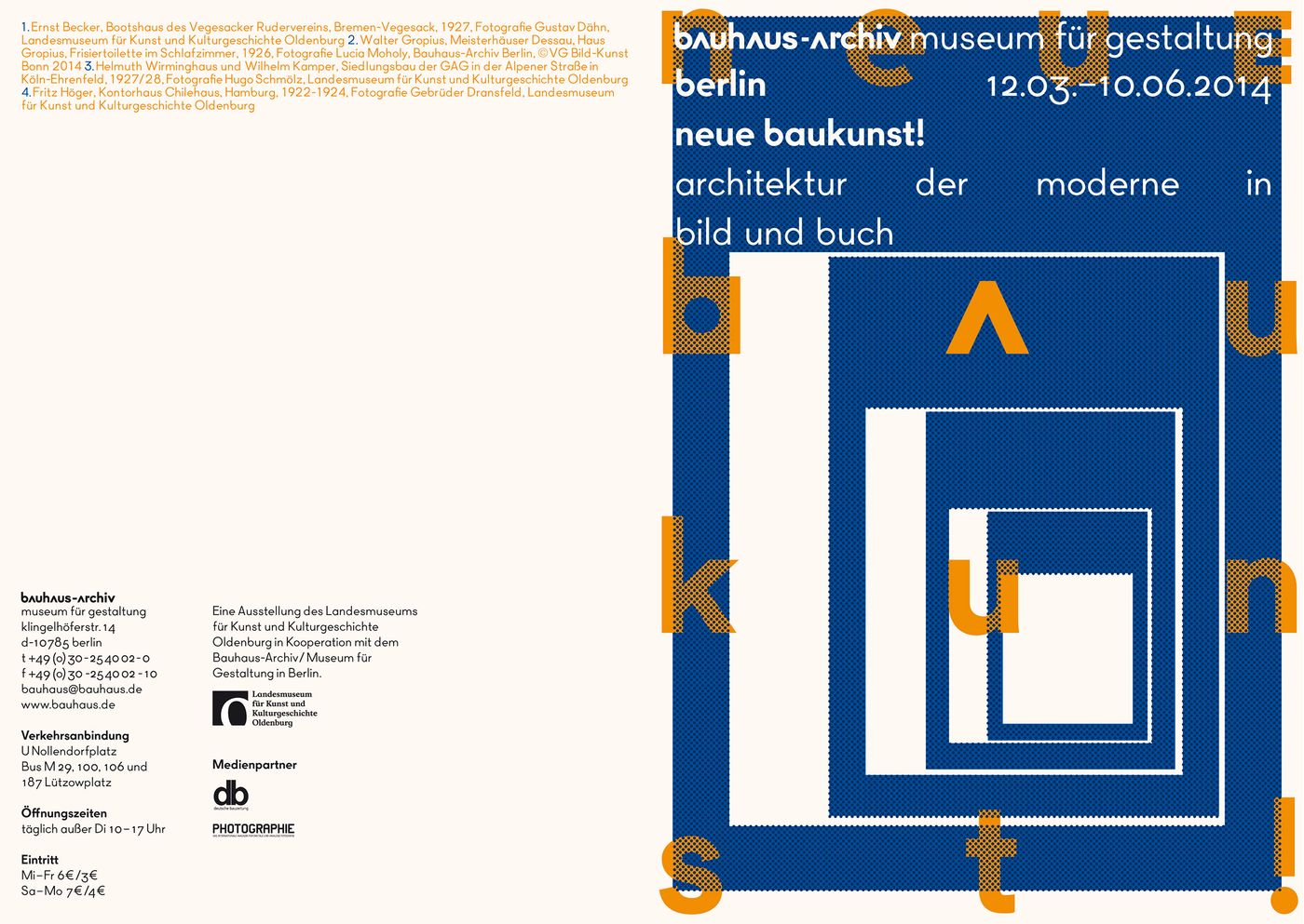
Poster designed by L2M3 for The Bauhaus-Archiv Museum für Gestaltung, © The Bauhaus.
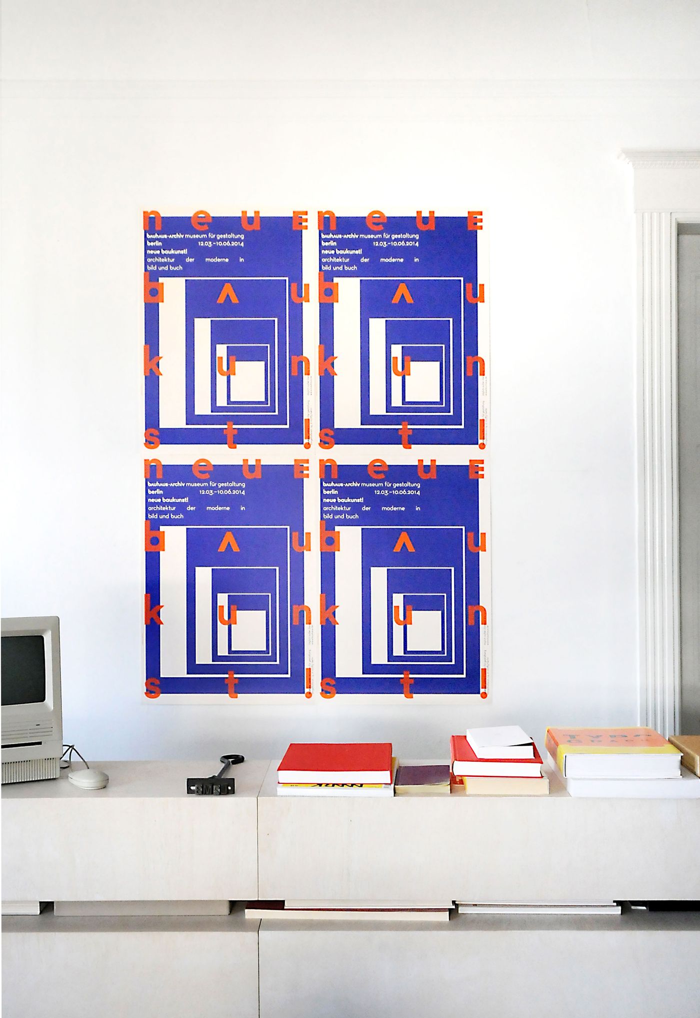
Poster designed by L2M3 for The Bauhaus-Archiv Museum für Gestaltung, © The Bauhaus.
Poster designed by L2M3 for The Bauhaus-Archiv Museum für Gestaltung, © The Bauhaus.
How was it to have Herbert Bayer, figuratively speaking, sitting right next to you?
It actually made me slightly schizophrenic. Jokes aside, this might be sound kitschy, but I’m going to use a Sir Thomas More quote: ''Tradition is the handing down of the flame and not the worshipping of ashes''. For me however, it was important to have a starting point which was very easily found in the tradition of Bauhaus. Seriously, we are quite aware of the impact of this project and that we are mere dwarfs standing on the shoulders of giants. We’re blessed to be able to work on a heritage as huge as this. Although the Board of Directors was skeptical, they gave us the much-needed freedom to create a coherent system that will serve for the next decade if not longer. We did not copy or update, per se. We extended, modernized and built a framework that allows further extensions and provides us with the proper experimental territory.
As you’ve already described, one needs freedom to accomplish such an assignment. Exactly how free were you?
Ha! Nothing is more enjoyable than seeing how opinions can be formed and changed as well as witnessing such a groundbreaking process. In my studio we are fond of dialogues with our clients. In saying that, the Bauhaus Directors were not a piece of cake, they were definitely challenging – and I’m glad to see that their interventions have very often led to fruitful results. But yes, to work for an institution such as the Bauhaus-Archiv (''the Bauhaus''), well it’s like you’re the coach of the German National Soccer Team. All designers know how to do it better, at least in Germany, and that’s when you need a stronger nervous system to cope...
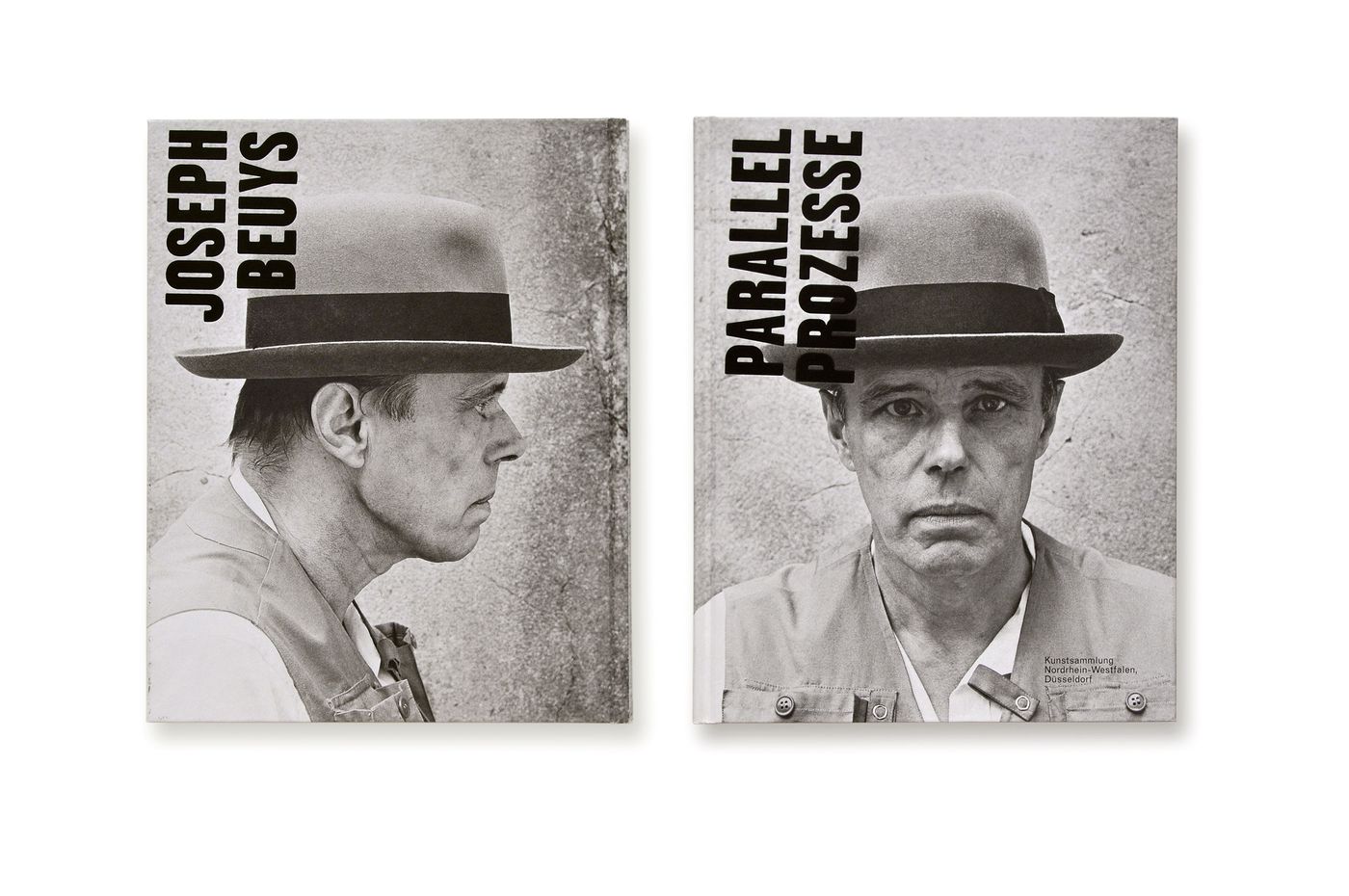
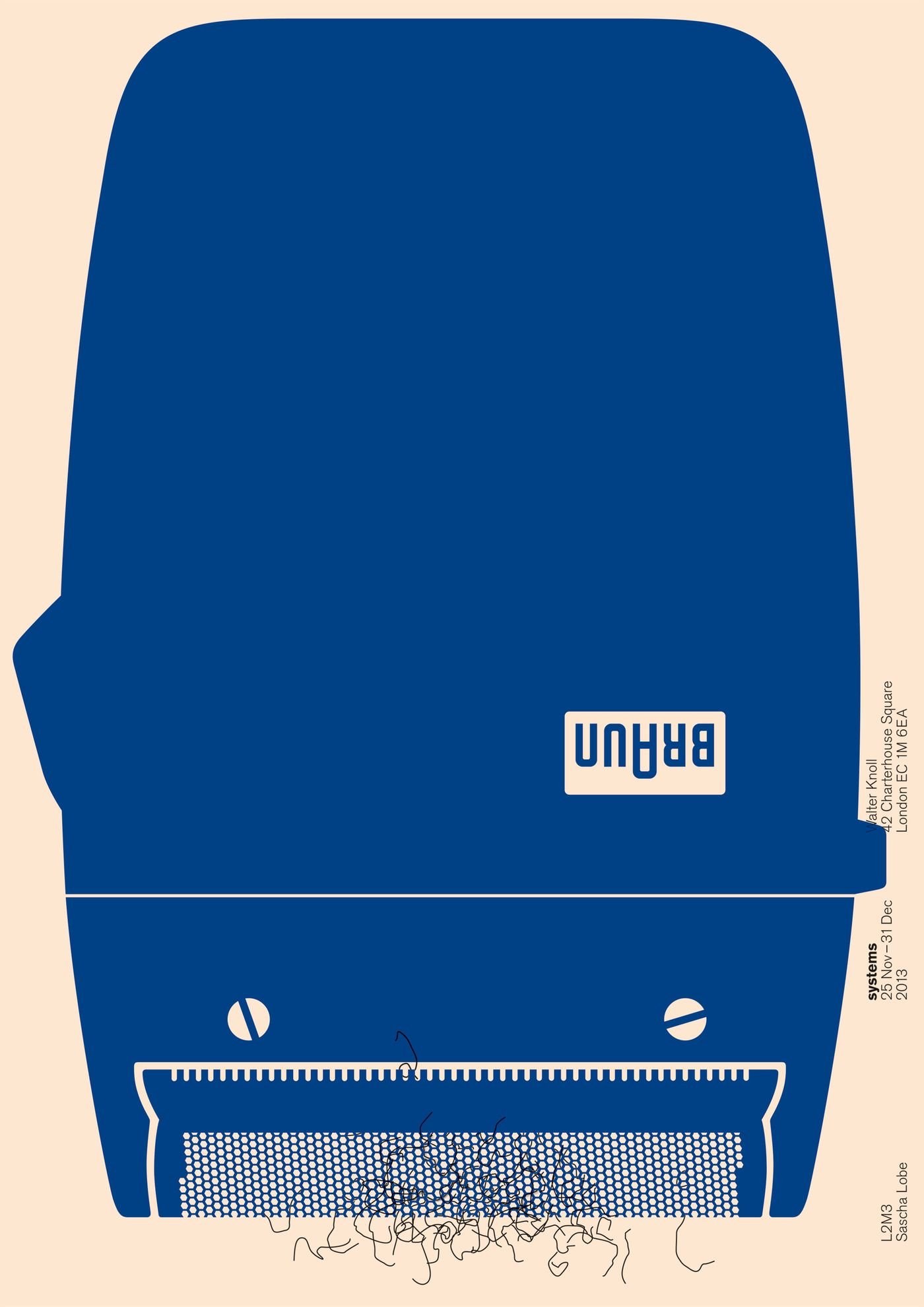
''Joseph Beuys. Parallel Processes'' by studio L2M3.
What new materials did you utilize for the project? As Typefaces and corporate identities have ''product life cycles'' as well, What do you think is the life span of the created work?
We didn’t use any new materials, per se. What we did was to conduct a meticulous archival research. I think Mr. Bayer would be delighted with how beautifully his visions are now a polymorphic typeset that can be applied on any possible canvas – be that digital or analogue. You see, the Bauhaus-Archiv had hoarded an incredible amount of archival resources over the years to recreate a contemporary corporate identity/corporate design necessary for its use today. Notably it needs to be repeated that the Bauhaus-Archiv did not have an official logo, i.e. corporate design until now. I wanted to commemorate the heritage of Bauhaus, consolidate the resources already available and rectify the term corporate design by working on a modern corporate design, one that communicates the essence of Bauhaus albeit polished both technically and aesthetically for the daily use of an institution that competes in the fields of cultural education, art development and entertainment. In terms of its life span, I would say that it will be applicable in many decades to come as our system allows expansions and can be updated easily.
And the last question for you: what personal attributes do you believe have specifically helped you in this assignment?
I believe in a holistic approach in all aspects of life and that is also my mission when working on client projects – I’d say that I work like an architect in this aspect. We were looking for a strong conceptual fundament for the corporate identity of the museum beyond visual solutions. While working on the Bauhaus project, we were able to explore and fine-tune our acquired qualities, namely that of a ''curator'' or ''archivist'' which we are accustomed to with all of our other museum and exhibition clients. We studied, researched, analyzed, categorized, collected, adapted and expanded what we encountered in the Bauhaus’ and the newly created letter set by ourselves. As designers we should be constantly learning in order to produce adequate solutions, shouldn’t we? After all doesn’t input equal output?