The Natural Meets the Man-Made in Foolscap Studio’s Tribute to Canberra
Words by Yatzer
Location
Canberra, Australia
The Natural Meets the Man-Made in Foolscap Studio’s Tribute to Canberra
Words by Yatzer
Canberra, Australia
Canberra, Australia
Location
Walking through Canberra, the entirely planned modernist Australian capital, complete with a large artificial lake, you tend to forget that about a century ago there was nothing here except verdant hills and eucalyptus forests, or as locals call it “the bush”. Founded in the early 20th century and mostly build after WWII to a mid-century architectural aesthetic, Canberra is a modern metropolis engulfed by a natural landscape of wild beauty. The city’s split personality, where the natural co-exists with the man-made, was the inspiration behind the design of “Highroad”, an all-day café, bar and restaurant at Canberra’s inner-north by Melbourne-based Foolscap Studio. Harmoniously combining raw and natural materials with refined details and a sense of sophistication, the designers have created a welcoming venue where Canberrans can feel right at home day and night.
Through the use of contrasting materials, textures and forms, the design calls for a hybrid environment that reflects both the concrete, steel and glass urban context and the lush natural habitat that surrounds it. Taking advantage of the renovation process, the building’s concrete columns have been stripped of any decorative cladding and have been left exposed as has the brickwork that lines the window-filled facades. These elements evince a raw grittiness that is elegantly juxtaposed with the plaster cornice that adorns the coffer ceilings and the smooth timber panelling cladding the walls at the back of the space.
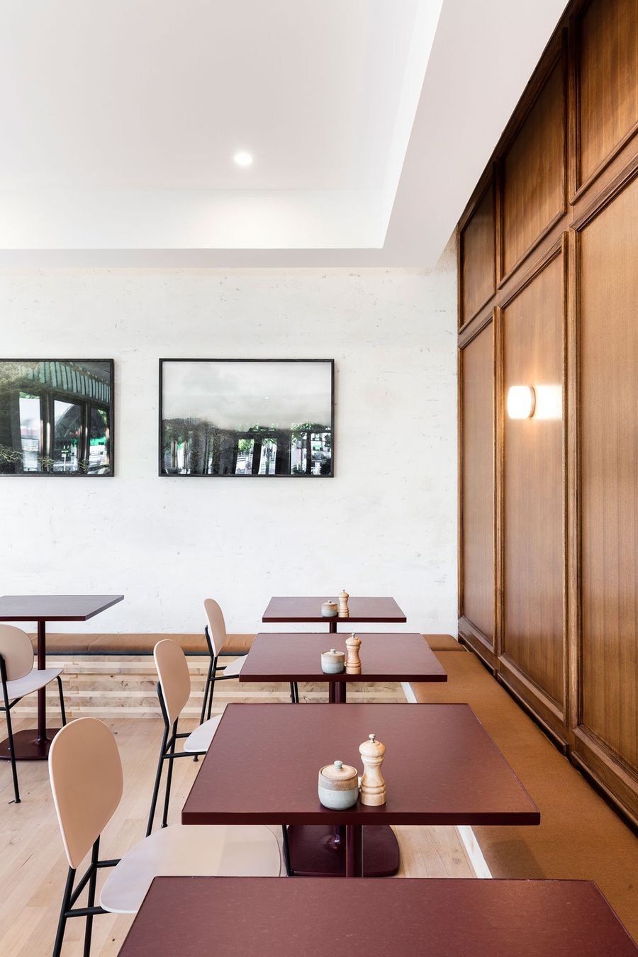
Photo by Tom Ferguson.
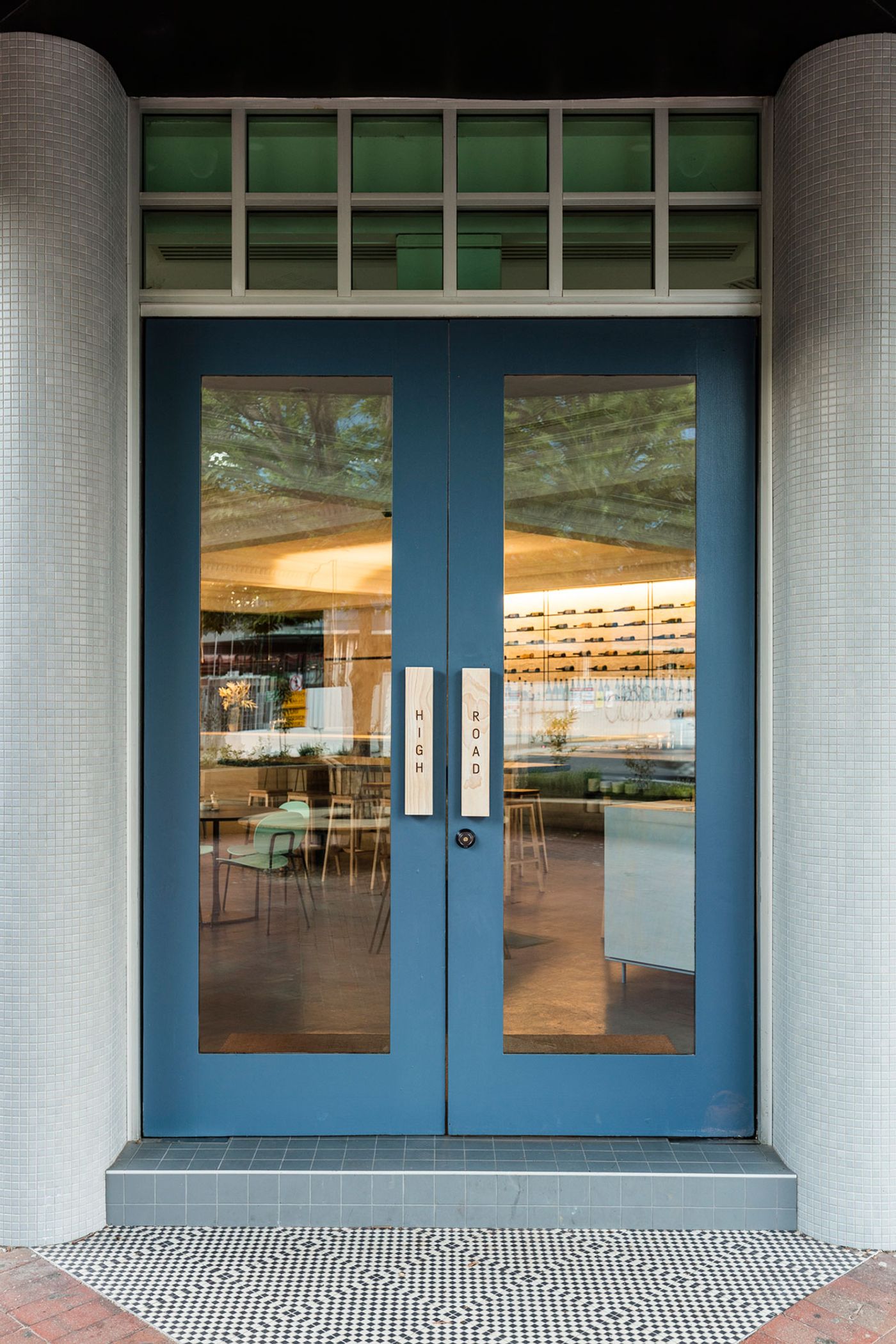
Photo by Tom Ferguson.
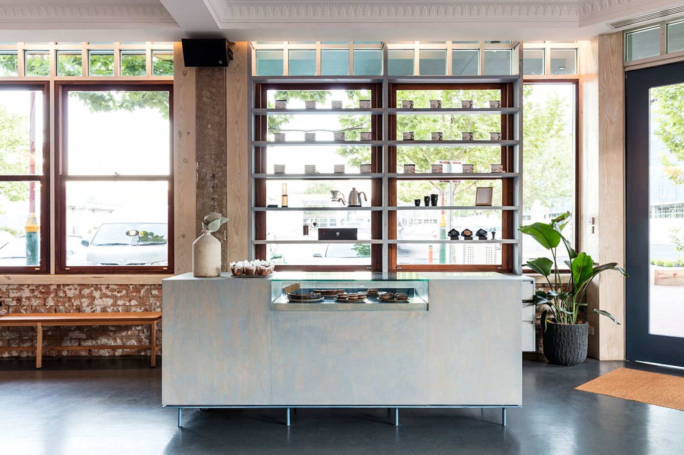
Photo by Tom Ferguson.
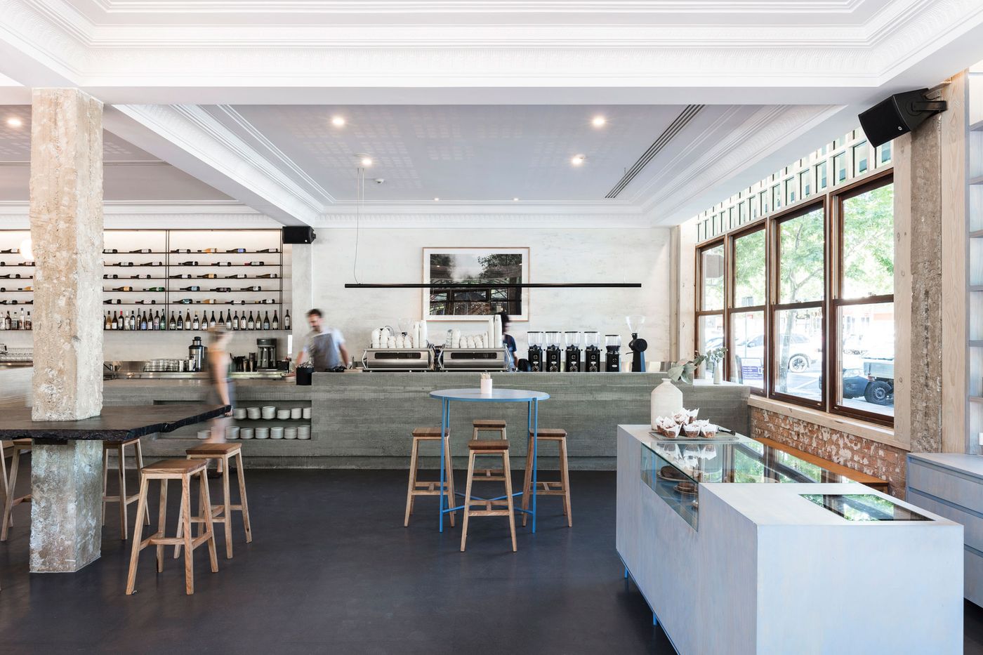
Photo by Tom Ferguson.
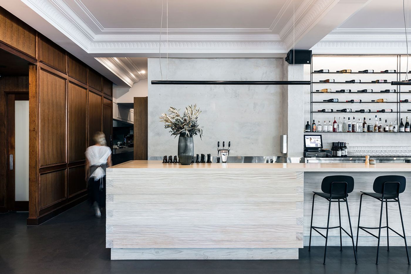
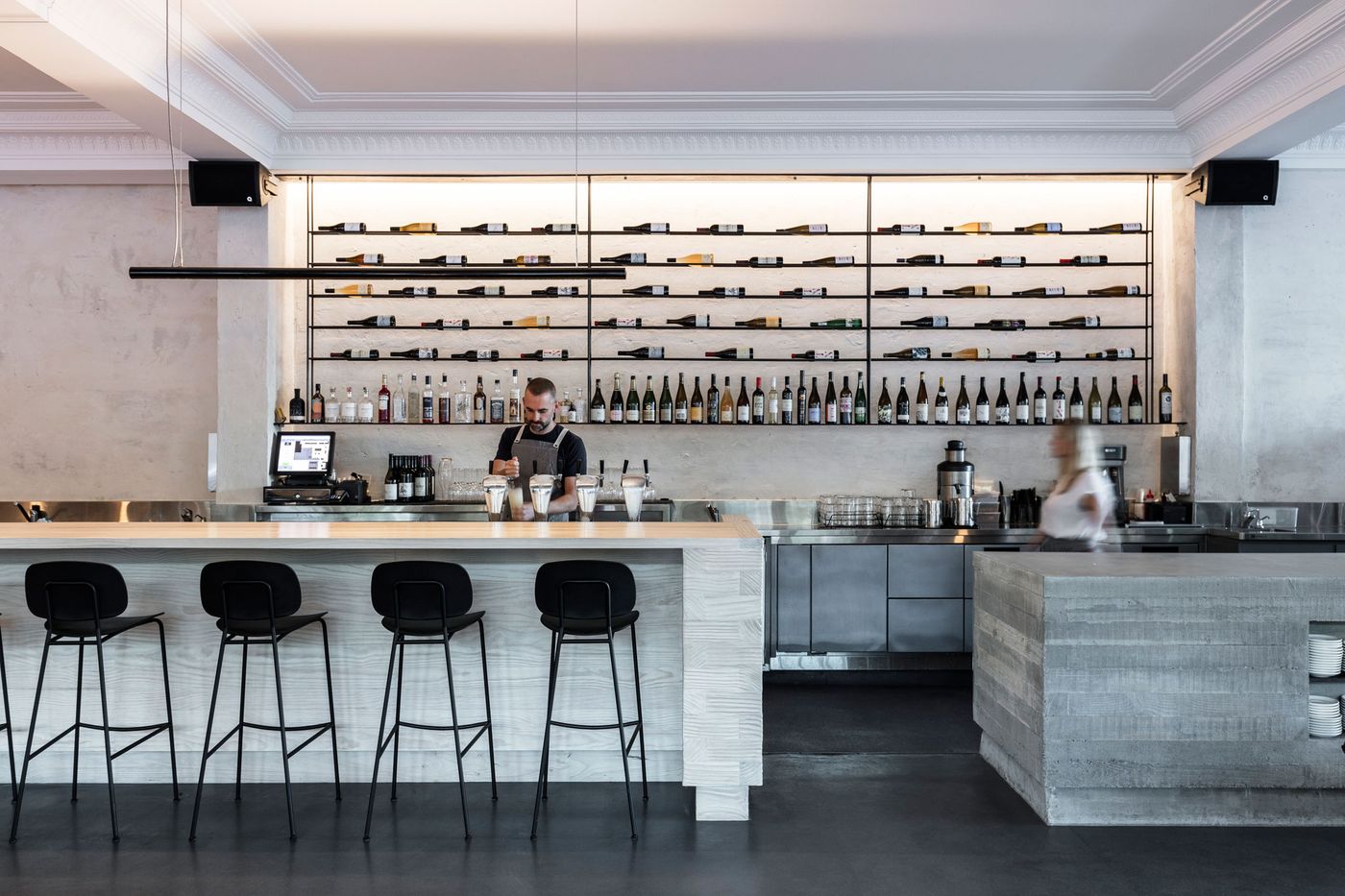
Nowhere is the balanced tension between the natural and the man-made more evident than in the design of the long bar counter that runs across the entire length of the space. On the one side, a slender block of concrete that has been poured in-situ serves as the coffee counter whilst also standing as a visual reference to the nearby Dickson Library by Italian, Canberra-based esteemed architect Enrico Taglietti. Built in 1968, its angular geometry, board patterned off-form concrete walls and horizontal roof planes are indicative of the Late Twentieth-Century Organic style that had a lasting impact on Canberra’s architecture.
The cubist volume of the coffee counter is evocatively mirrored by the bar counter on the other side, albeit in a softer incarnation through the use of sandblasted solid pine whose horizontal strips reverberate the concrete’s board pattern. Sandblasted pine was also used for window trims, which combined with the exposed concrete columns, echo the bar’s hybrid aesthetic.
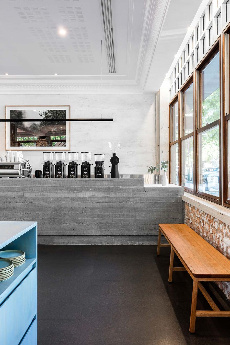
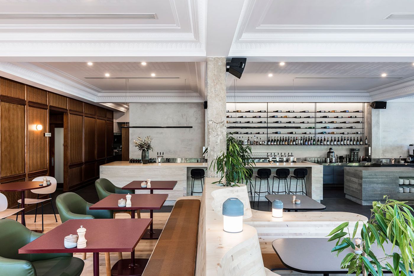
Photo by Tom Ferguson.
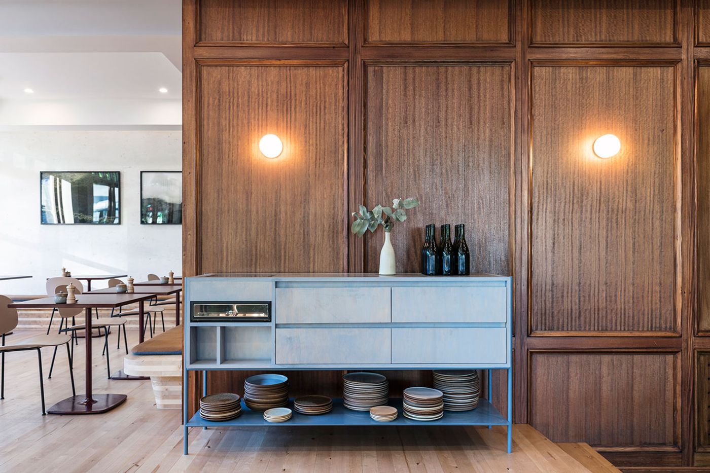
Photo by Tom Ferguson.
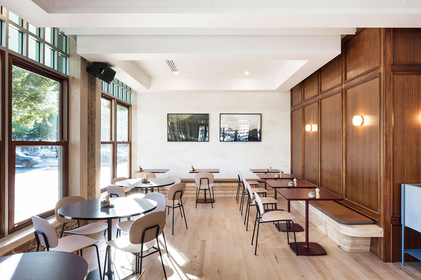
Photo by Tom Ferguson.
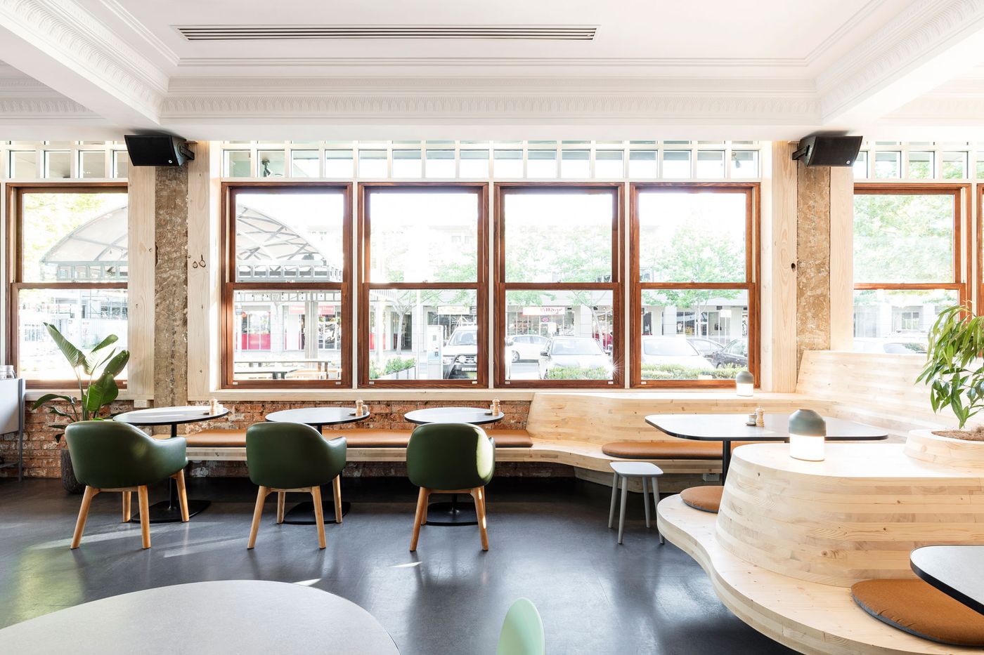
Photo by Tom Ferguson.
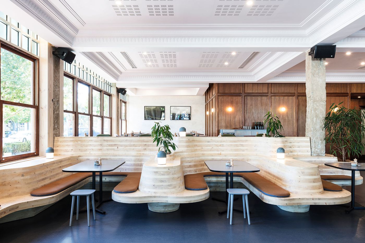
The venue’s centrepiece is undoubtedly the sculptural banquette that organically unfolds across the space drawing patrons in, and morphing into a raised area in the back. Made out of cross laminated timber that has been shaped into a series of curvaceous booths, the contours of the installation are inspired by the mountainous topography that encircles the city. Accompanied by slender tables with rounded corners, baby blue stools and potted plants, an idiosyncratic interior landscape is thus formed that softly embraces guests.
The smooth suppleness of the wooden banquette is playfully juxtaposed with the jagged harshness of the charred timber communal table across the space, whose black surface seems to taunt the blondness of the timber curves. Meanwhile the introduction of dusty pink, maroon, pale teal, green and grey stained timber for tables and chairs balances the rawness of the exposed concrete and natural wooden surfaces as do the bespoke blue-stained timber waiter stations, complete with blue powder-coated metal detailing. Ultimately, it’s a demanding balancing act overall that Foolscap Studio has artfully executed as a nod to the unique Canberran personality.
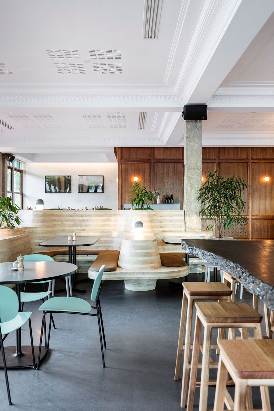
Photo by Tom Ferguson.
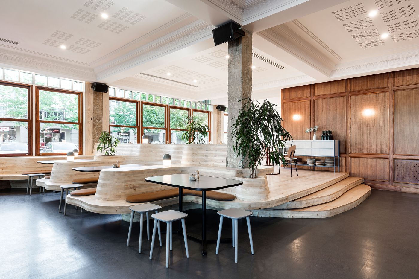
Photo by Tom Ferguson.
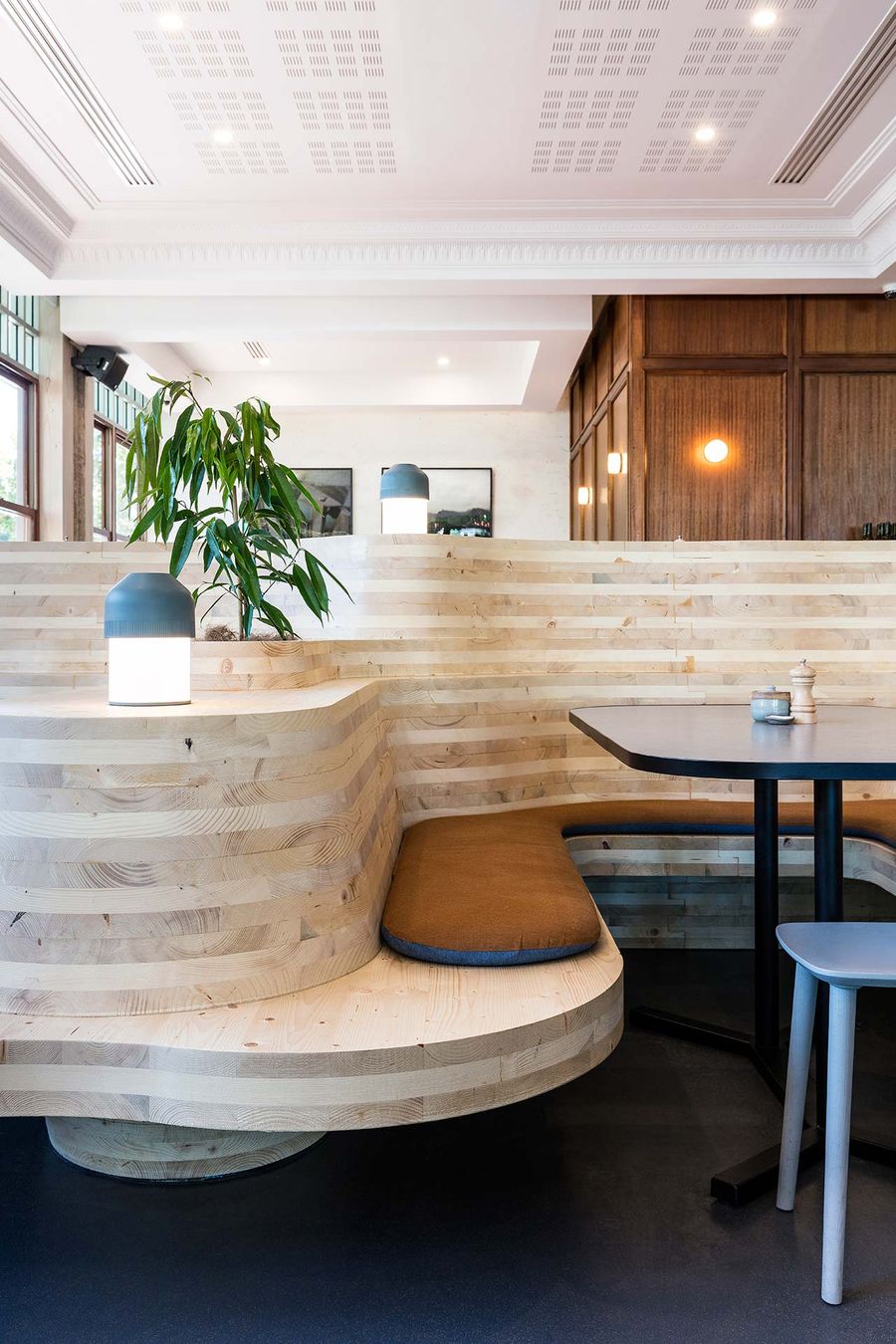
Photo by Tom Ferguson.
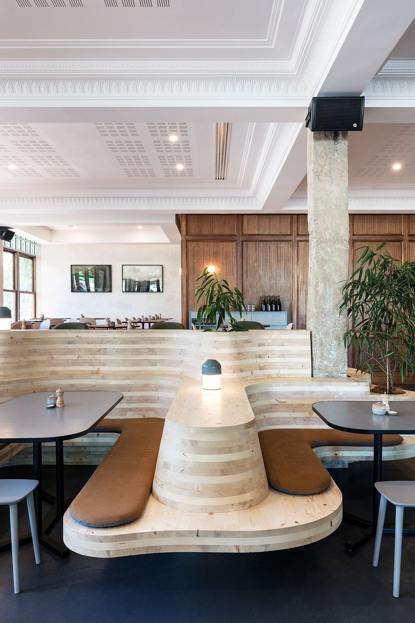
Photo by Tom Ferguson.

Photo by Tom Ferguson.
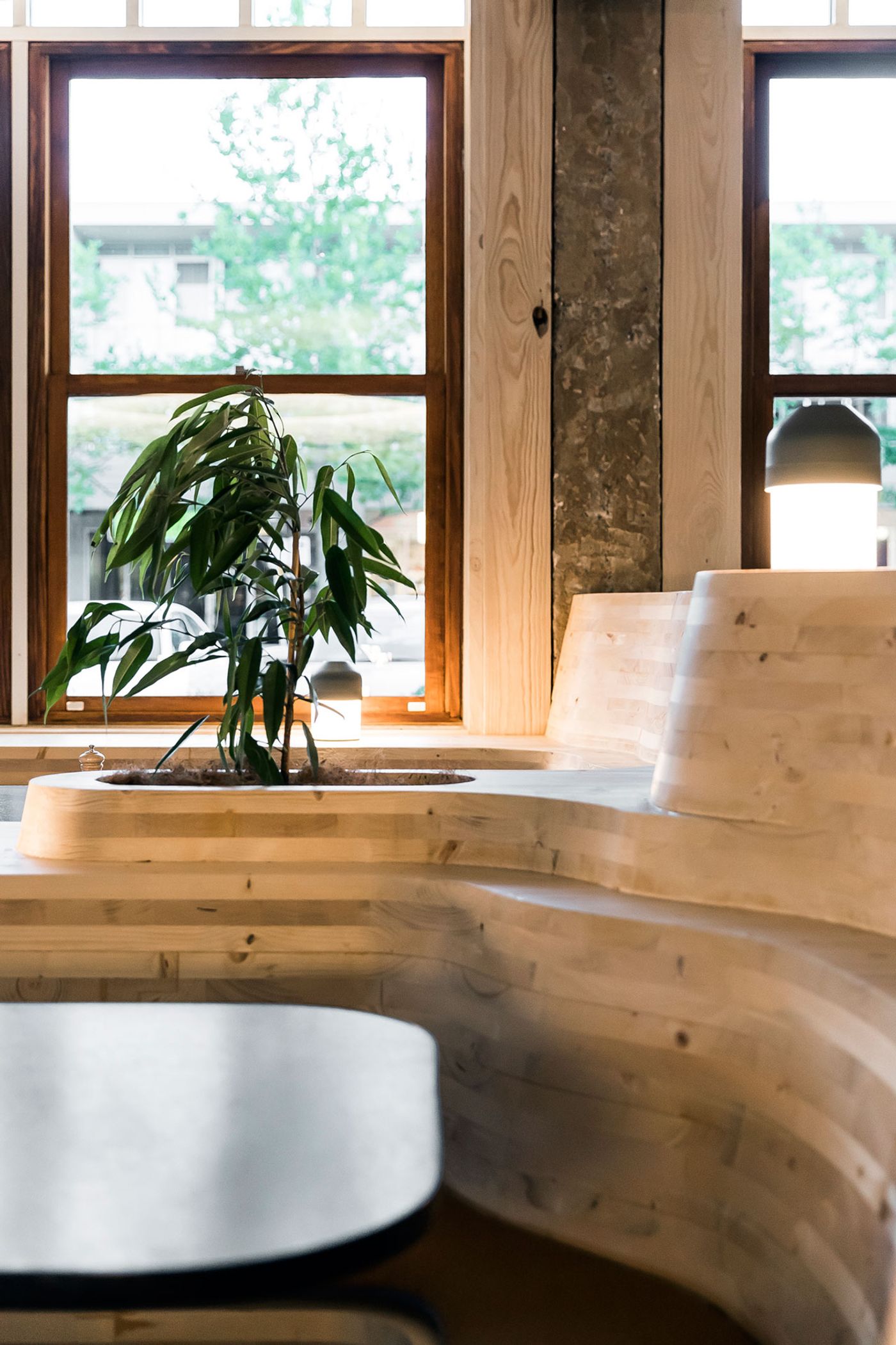
Photo by Tom Ferguson.

Photo by Tom Ferguson.
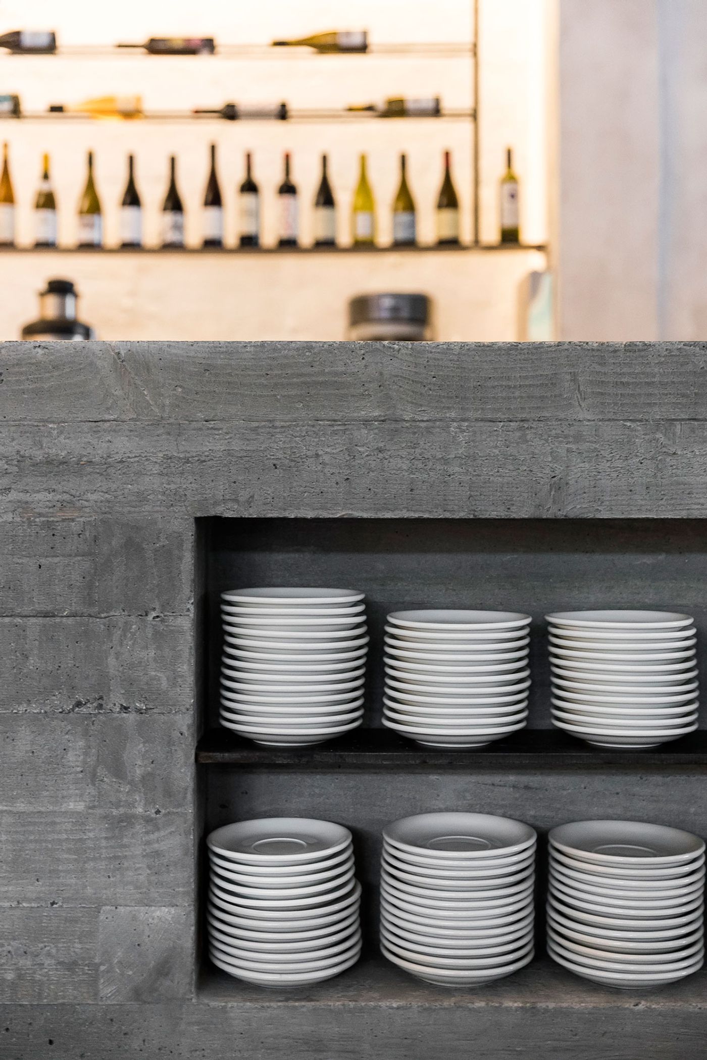
Photo by Tom Ferguson.
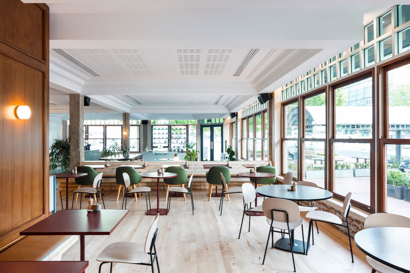
Photo by Tom Ferguson.
