Making More with Less: The Modest Exterior of a Family House in Portugal Belies Richly Layered Interiors
Words by Yatzer
Location
Penafiel, Portugal
Making More with Less: The Modest Exterior of a Family House in Portugal Belies Richly Layered Interiors
Words by Yatzer
Penafiel, Portugal
Penafiel, Portugal
Location
Located in Penafiel, a small town in the north of Portugal, this low-slung family house by local architect Pedro Miguel Santos was designed in response to a set of conflicting requirements: the owners regularly entertain guests, expect their children’s bedrooms to enjoy peace and quiet, along with the need for ample living space with a reduced budget. At the same time, a busy street and a neighbouring multi-storey residence informed the house’s introverted massing. The result is a modest, unassuming residence whose low profile, opaque exterior belies spacious, tall and light-filled interiors characterised by a sense of minimalist elegance and warmth.
The house turns its back to the busy road to the north, orientated to the south in order to ensure privacy and noise reduction as well as maximise the influx of natural lighting. Despite its single-storey configuration, the building sports a dynamic exterior designed as it is as a composition of various sized cubic volumes. The brutalist exterior, made all the more sculptural by the complete absence of openings, reflects height variation in the interior but also takes into account the property’s inclined terrain

Photo by Alexander Bogorodskiy.
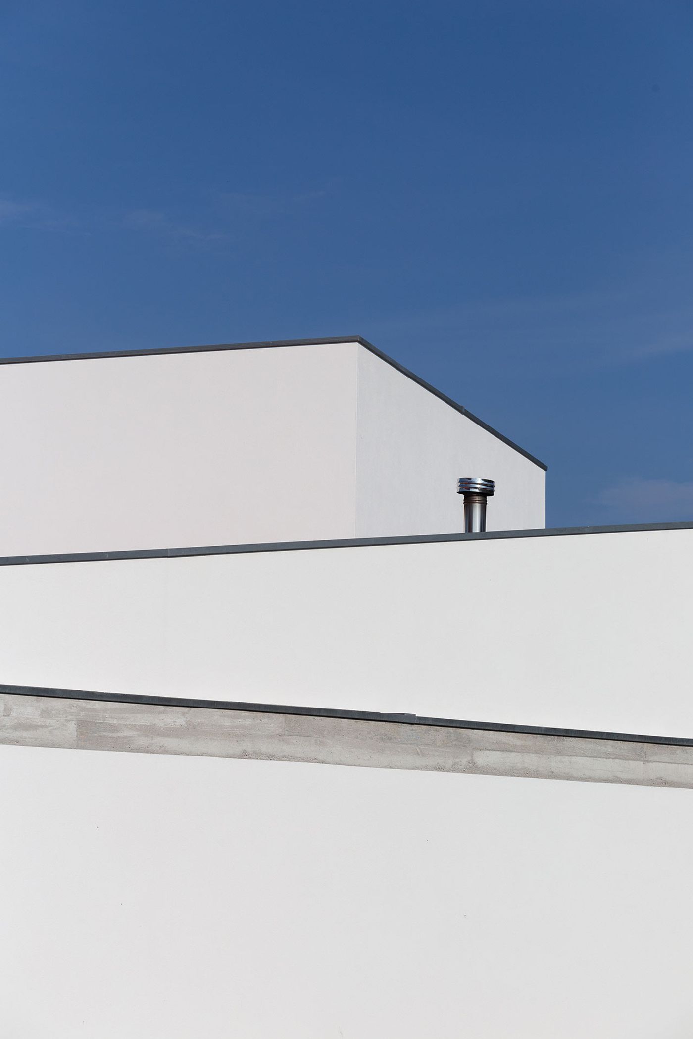
Photo by Alexander Bogorodskiy

Photo by Alexander Bogorodskiy.

Photo by Alexander Bogorodskiy.
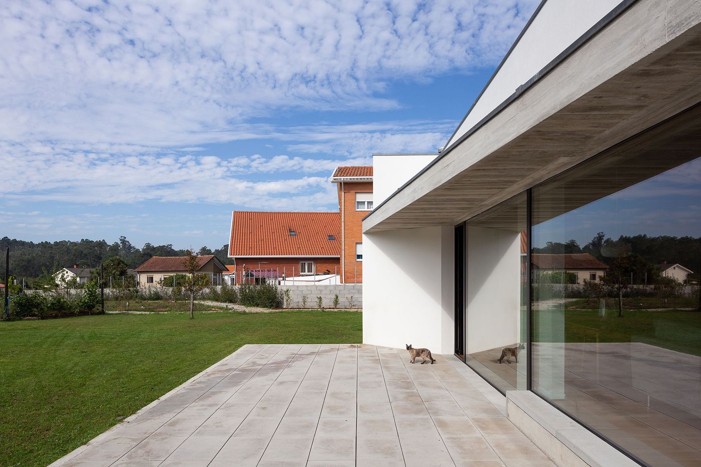
Photo by Alexander Bogorodskiy
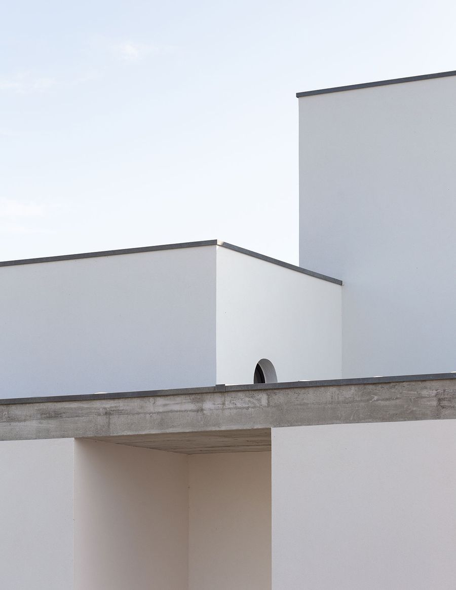
Photo by Alexander Bogorodskiy

Photo by Alexander Bogorodskiy.
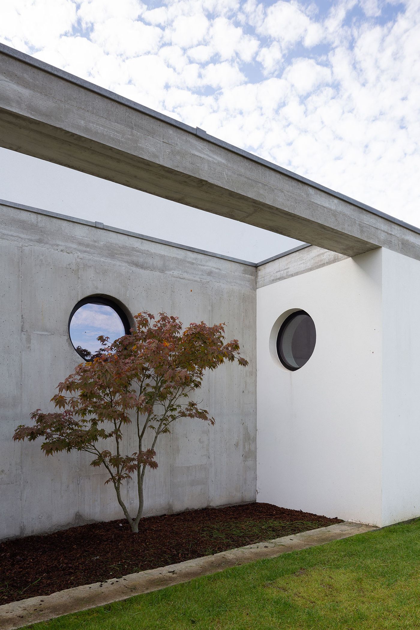
Photo by Alexander Bogorodskiy
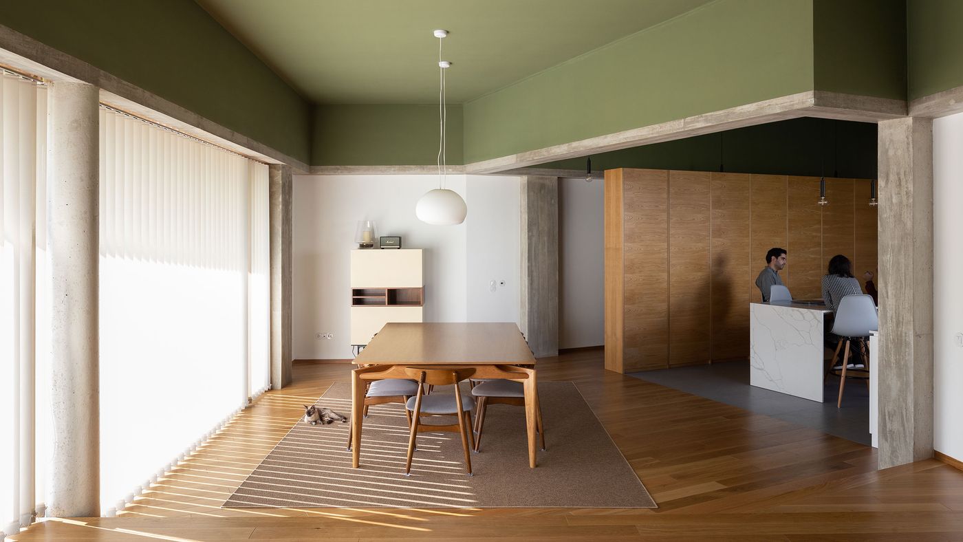
Featuring a U-shaped floor plan, the house has been thoughtfully configured to discreetly separate communal and private areas without compromising natural lighting, views or openness. On the north side, the bedroom wing opens up onto the courtyard created by the U-shape floor plan, while the dining and living wing on the other side looks out onto the garden on the south. Connecting the two, the entrance and kitchen volume has been conceived as an intermediate space with views of both the courtyard, courtesy of an elongated window running the length of the counter, and the back garden through the dining area. Set on a lower level to accommodate the sloping terrain, the kitchen is a spatial buffer between the living area where the owners entertain their guests, and the bedrooms where the children sleep.

Photo by Alexander Bogorodskiy.
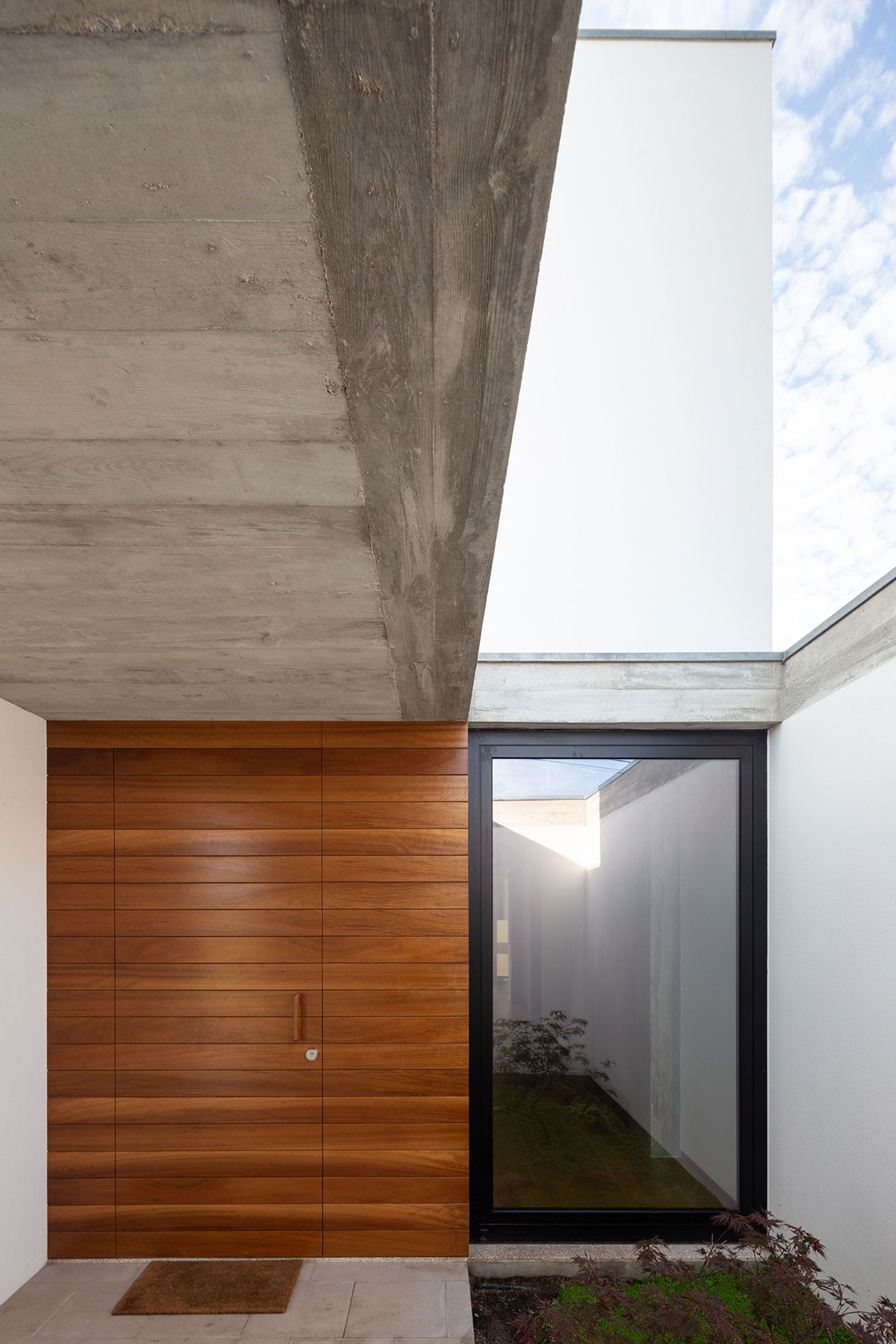
Photo by Alexander Bogorodskiy
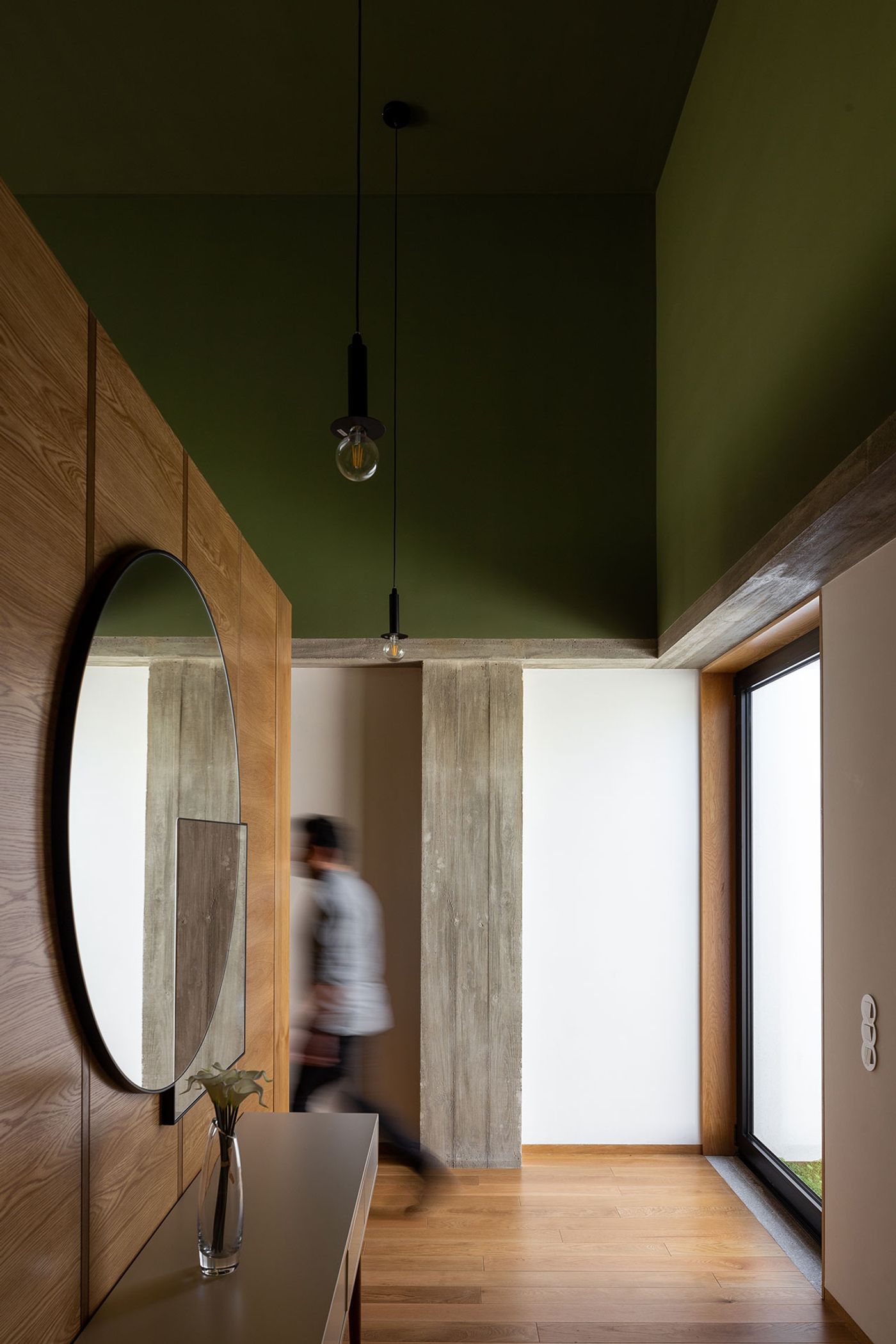
Photo by Alexander Bogorodskiy

Photo by Alexander Bogorodskiy.

Photo by Alexander Bogorodskiy.

Photo by Alexander Bogorodskiy
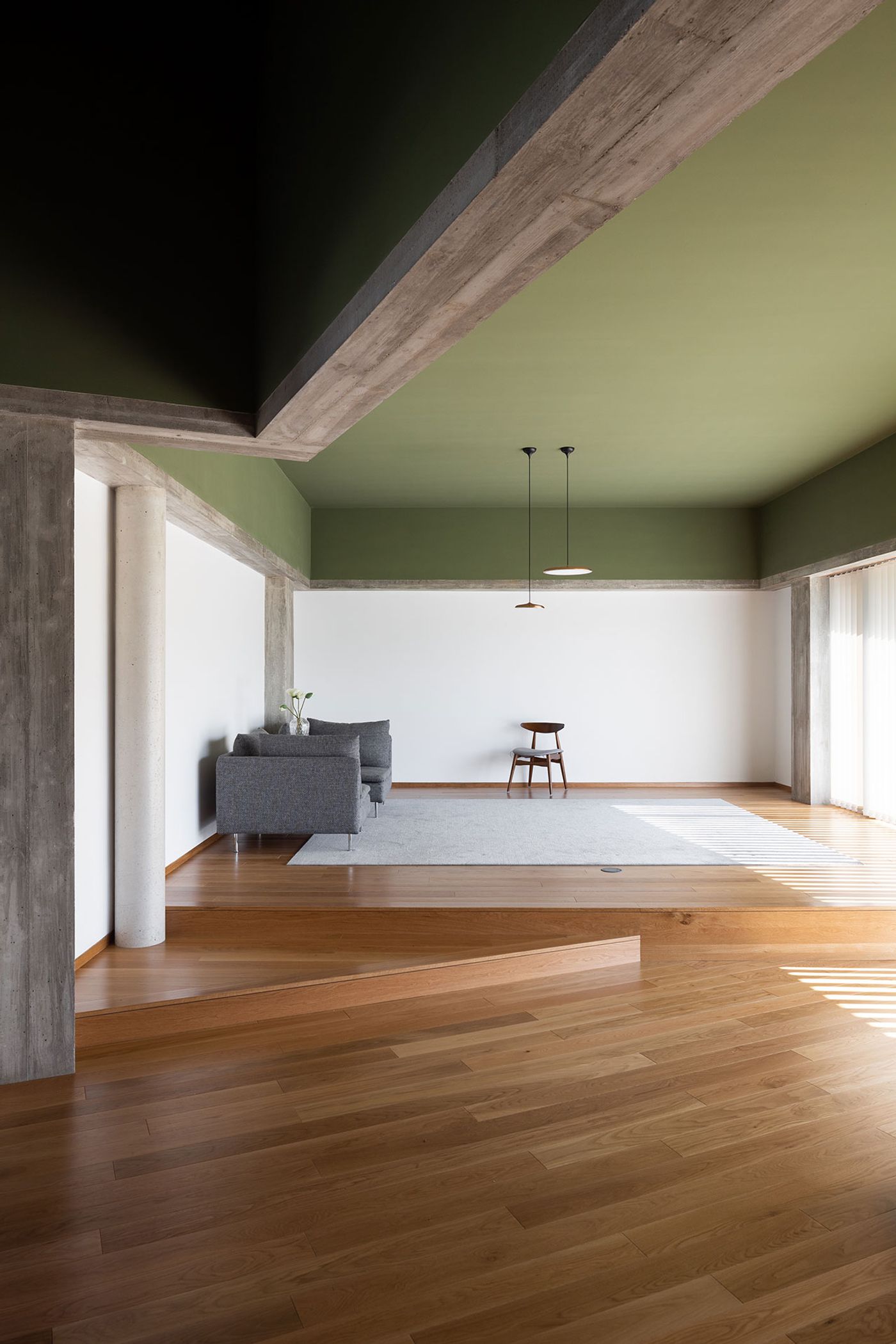
Photo by Alexander Bogorodskiy
Dictated by the project’s low budget, the reinforced concrete structure and masonry walls make for a middle-of-the-road, commonplace building shell and yet the architect has imbued the interior with a more complex materiality, without any additional costs, by letting the concrete columns and beams remain exposed. The concrete structure acts as a visual divider: while the wall sections below the beams are painted white, those above are painted in an olive green in the communal areas and a dark brown in the private quarters, respectively. Since the rooms vary in height, such colour zoning not only jazzes up an otherwise muted palette of white, grey and natural wood, but also ensures visual continuity since the height of the lower white sections is the same throughout the house. The colour scheme also conveys a sense of human scale even in the tallest spaces like the kitchen whose considerable ceiling height is counterbalanced not only by the wall’s colour segmentation but also by the L-shaped cupboard-cum-partition structure that matches the height of the walls’ lower white sections. Coupled with the elegant minimalism of the interior design, the house is a paradigm of making more with less.
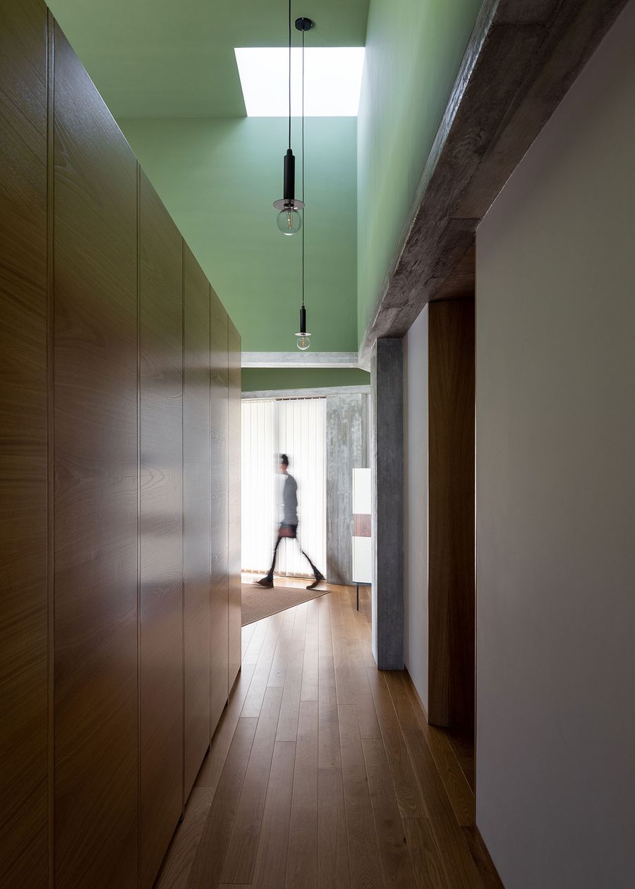
Photo by Alexander Bogorodskiy

Photo by Alexander Bogorodskiy

Photo by Alexander Bogorodskiy

Photo by Alexander Bogorodskiy

Photo by Alexander Bogorodskiy
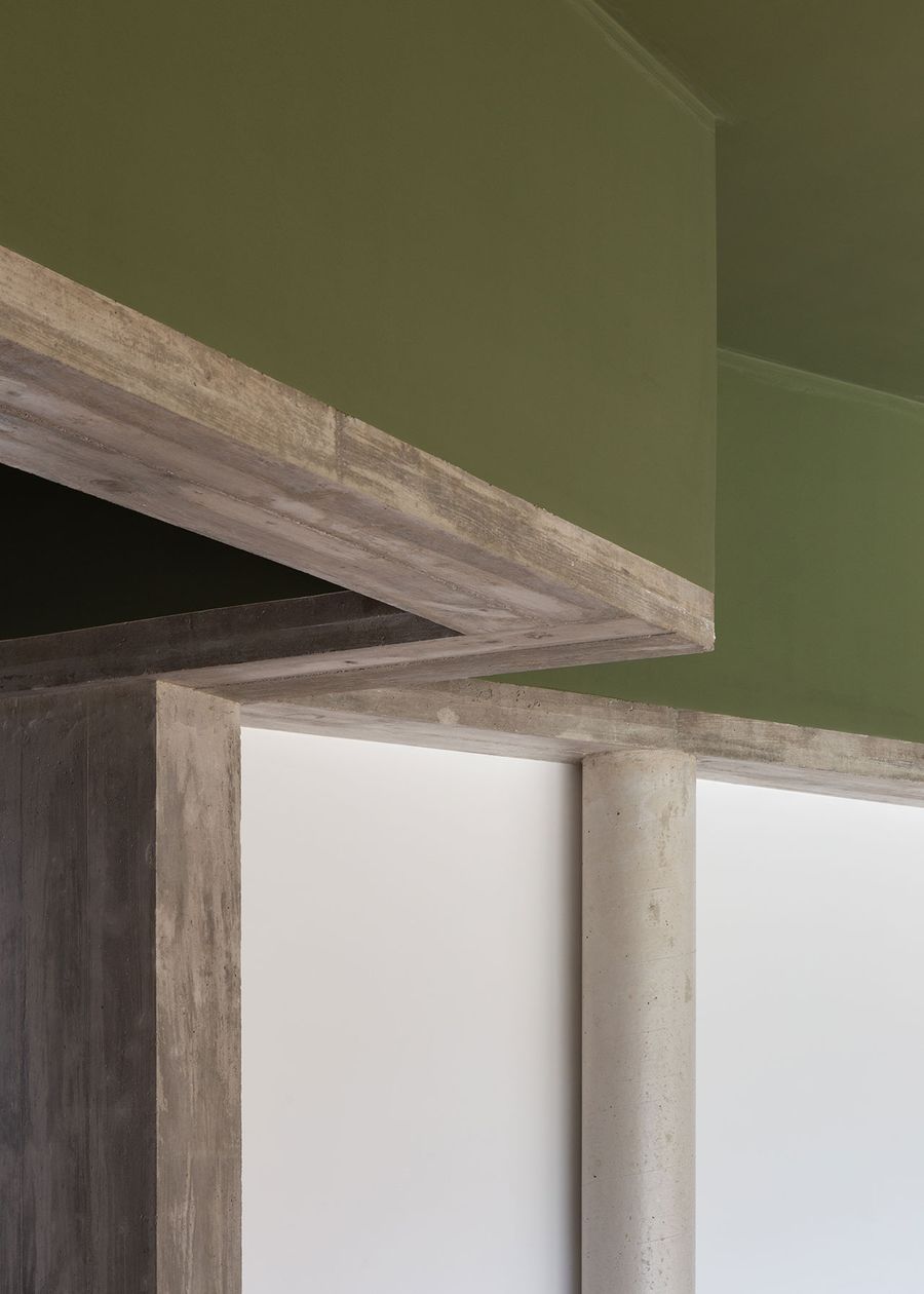
Photo by Alexander Bogorodskiy

Photo by Alexander Bogorodskiy

Photo by Alexander Bogorodskiy
Photo by Alexander Bogorodskiy