
White House: a Hutong House Renovation in Beijing by Arch Studio
Words by Eric David
Location
Beijing, China
White House: a Hutong House Renovation in Beijing by Arch Studio
Words by Eric David
Beijing, China
Beijing, China
Location
Part of a new generation of architects who have taken a stand in favour of preserving, both in scale and character, Beijing’s historic urban fabric instead of replacing it with concrete blocks, Arch Studio has renovated this unassuming house in the city’s Dongcheng District into a modern family residence.
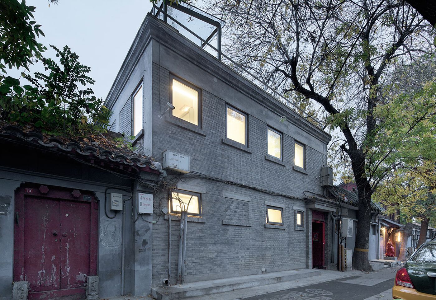
Photo by Xia Zhi.
The two-storey grey brick house is located in a small hutong —a traditional Chinese alleyway or courtyard shared by several houses— and consists of living spaces on the ground floor, two bedrooms on the first floor and a study in the basement. The architects, who have also renovated the nearby Tea Café, have taken care to restore the building’s façades to their original state but completely redesigning the interior, rendering it all - from floor to ceiling - in white. Traditionally, these hutong dwellings have but a few windows to ensure privacy and are therefore dark. Consequently, this monochromatic, all-white approach, together with the demolition of several internal walls, has resulted in larger spaces and a better-lit, flowing environment.
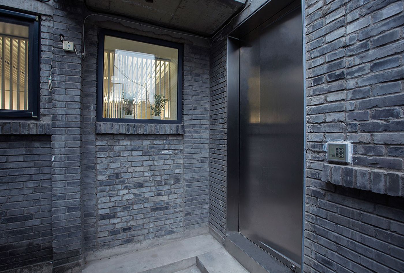
Photo by Zhang Linhan.
Pivotal, both figuratively and literally, in the refurbishment of the house was the removal of parts of the existing floor and the introduction of a new stairwell that connects all floors. Crowned by a glass vitrine on the roof level and again painted all in white, the staircase acts as a light-well funnelling daylight all the way down to the basement. The balustrades are made out of perforated steel to optimise daylight penetration while the brick wall on the back of the stairs is kept bare to hint at the building’s past. The result, as Arch Studio principal and founder Han Wenqiang describes it, is that “people may feel like walking in the sky”.

Photo by Wang Ning.
To maximise the sense of openness, the designers have used grids of vertical wooden slats throughout the building for various purposes: as partitions or screens instead of solid walls allowing daylight circulation, as sliding doors for the numerous built-in bookcases that the owners requested to house their large book collection, and across ceilings as a continuation of the vertical screens and doors. The result is an environment that, despite its strict minimalist approach, is both rich in texture and soothing in its tranquility.

Photo by Linhan Zhang.

Photo by Xia Zhi.
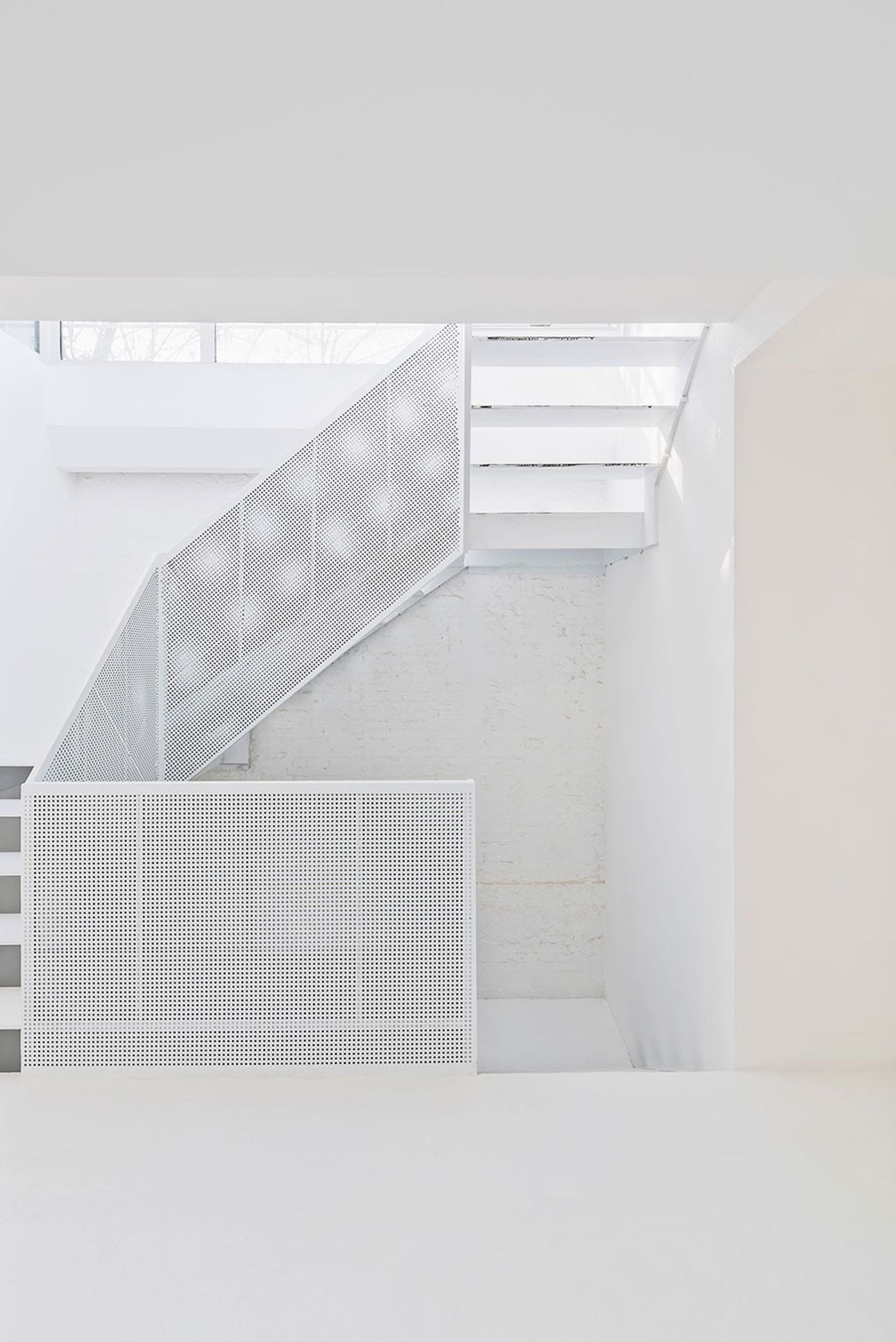
Photo by Wnag Ning.

Photo by Linhan Zhang.
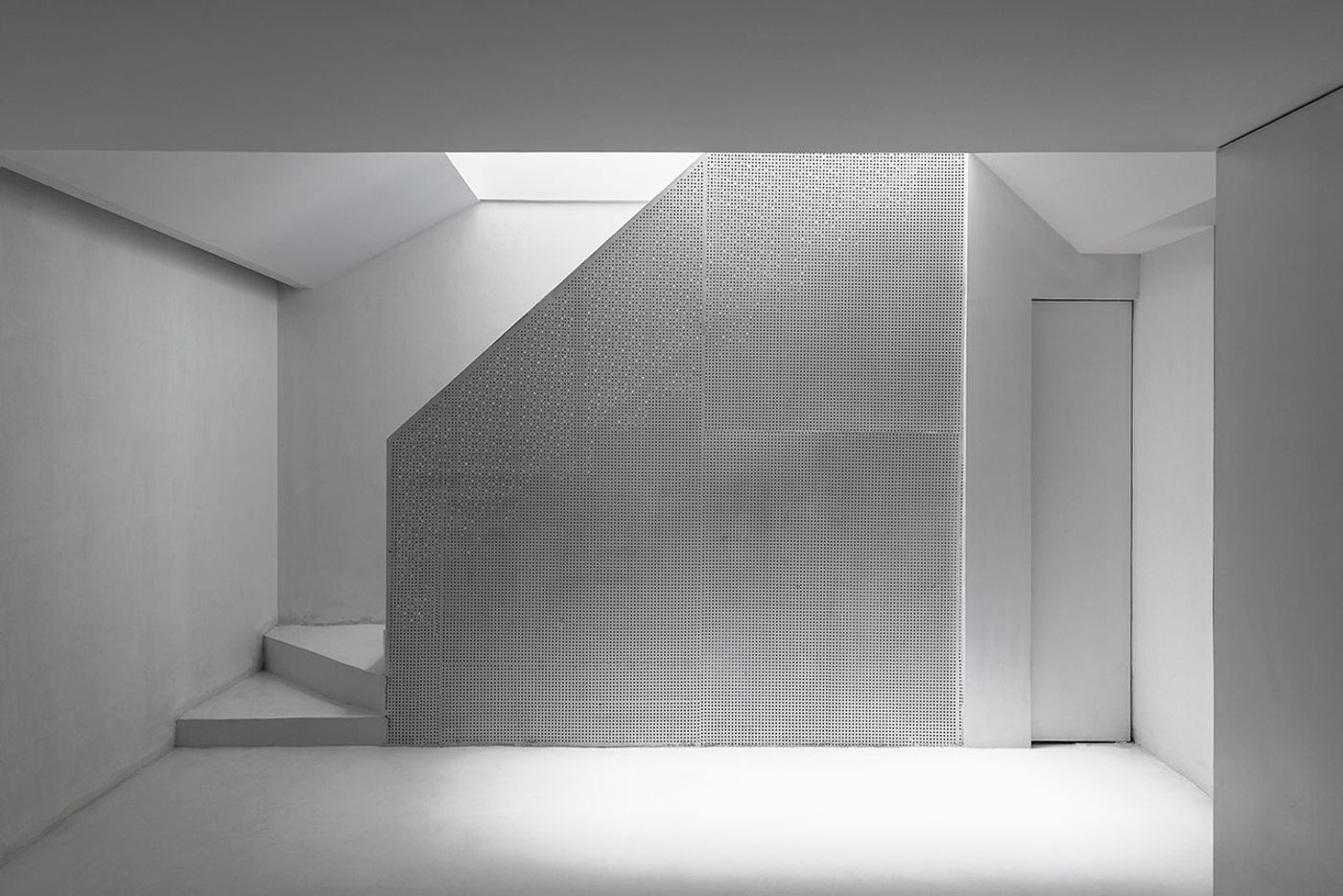
Photo by Wang Ning.
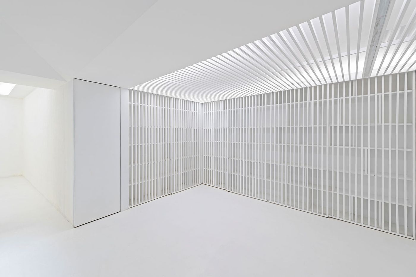
Photo by Wang Ning.
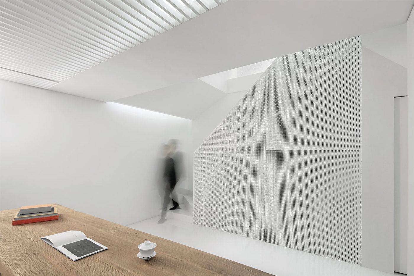
Photo by Xia Zhi.

Photo by Xia Zhi.
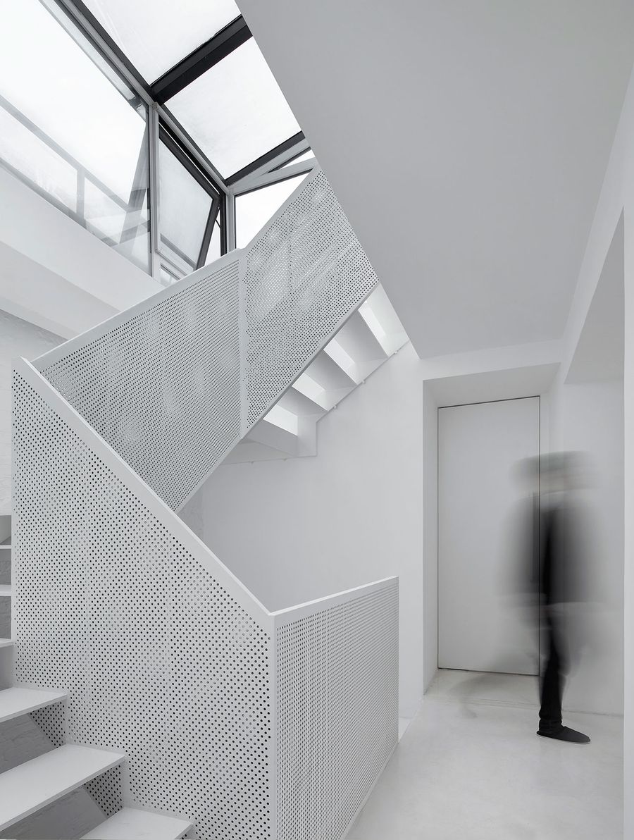
Photo by Xia Zhi.
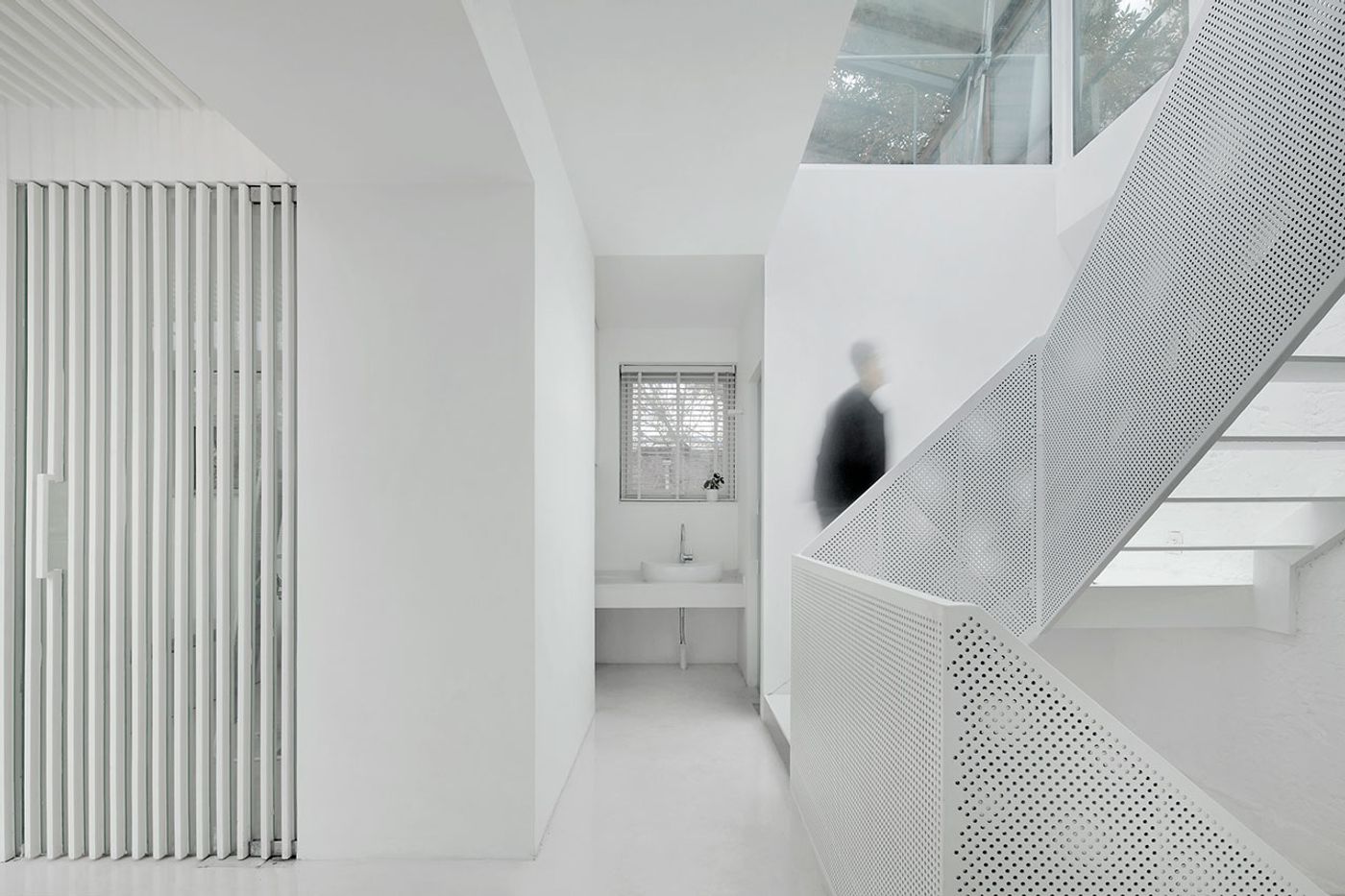
Photo by Xia Zhi.
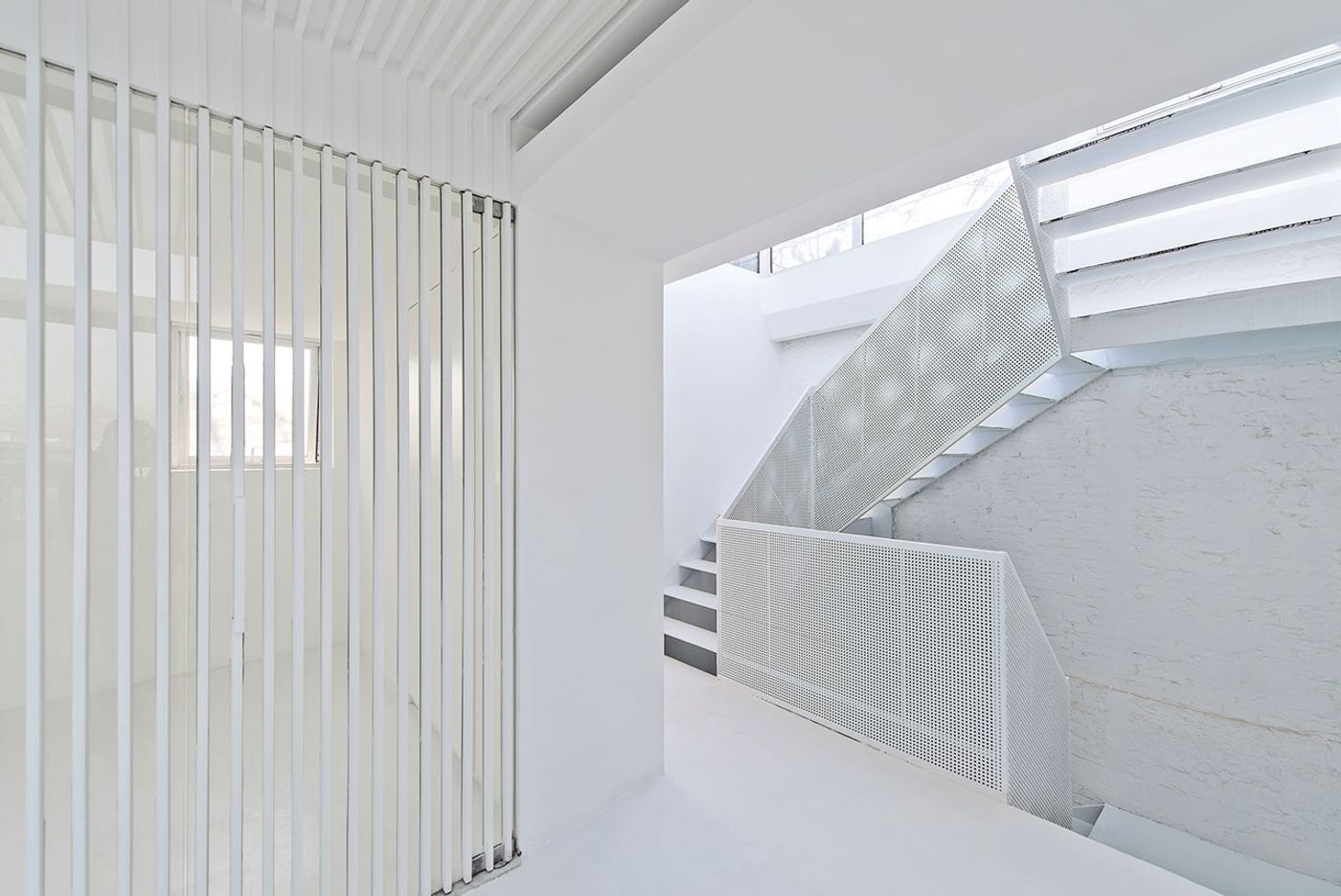
Photo by Wang Ning.
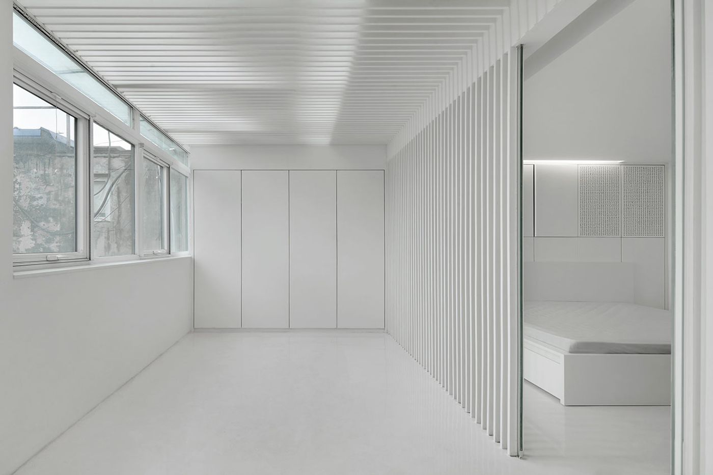
Photo by Xia Zhi.
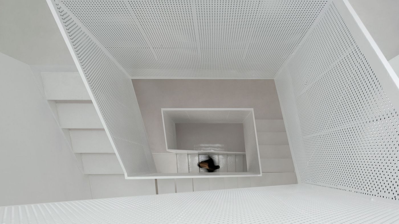
Photo by Xia Zhi.
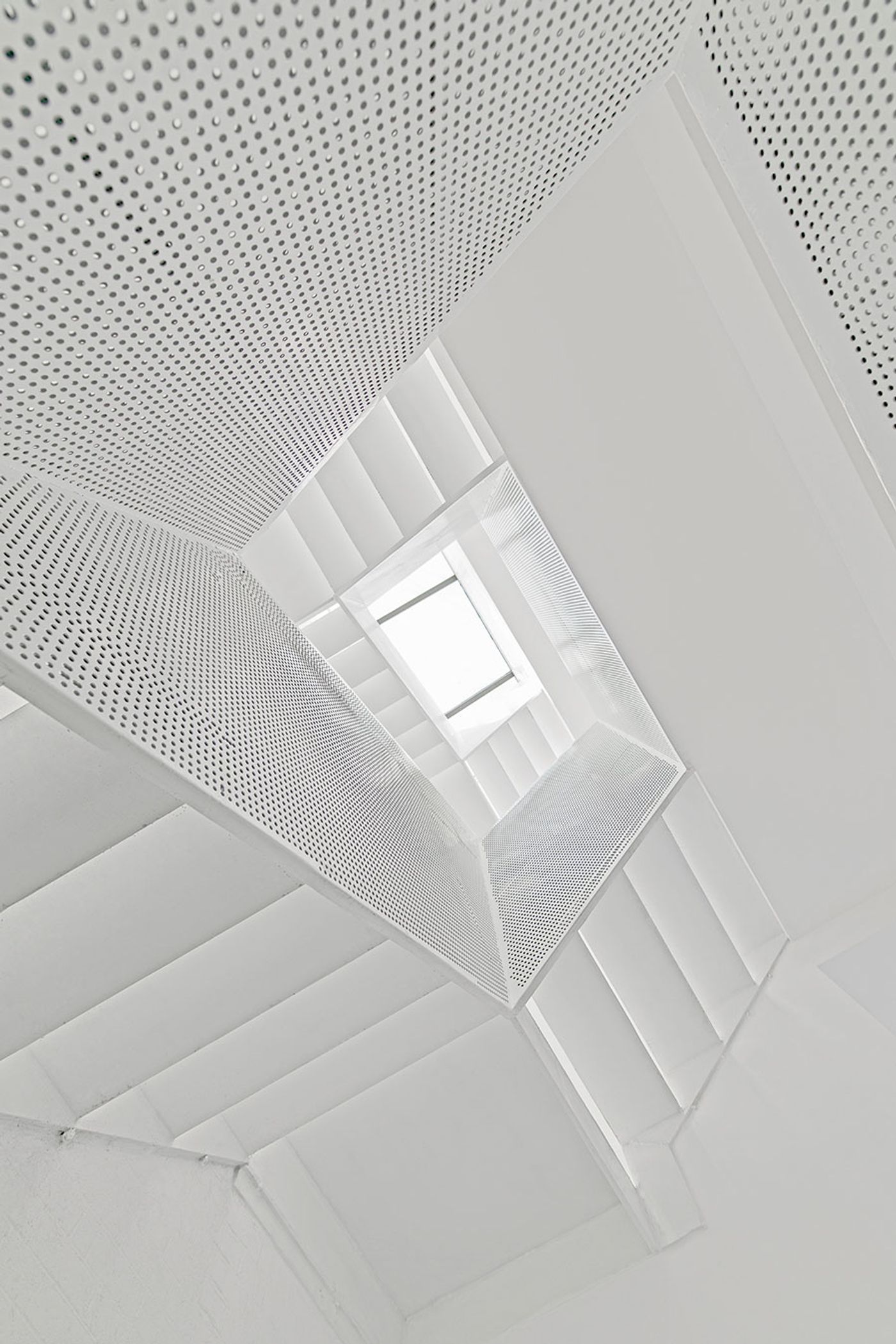
Photo by Wang Ning.
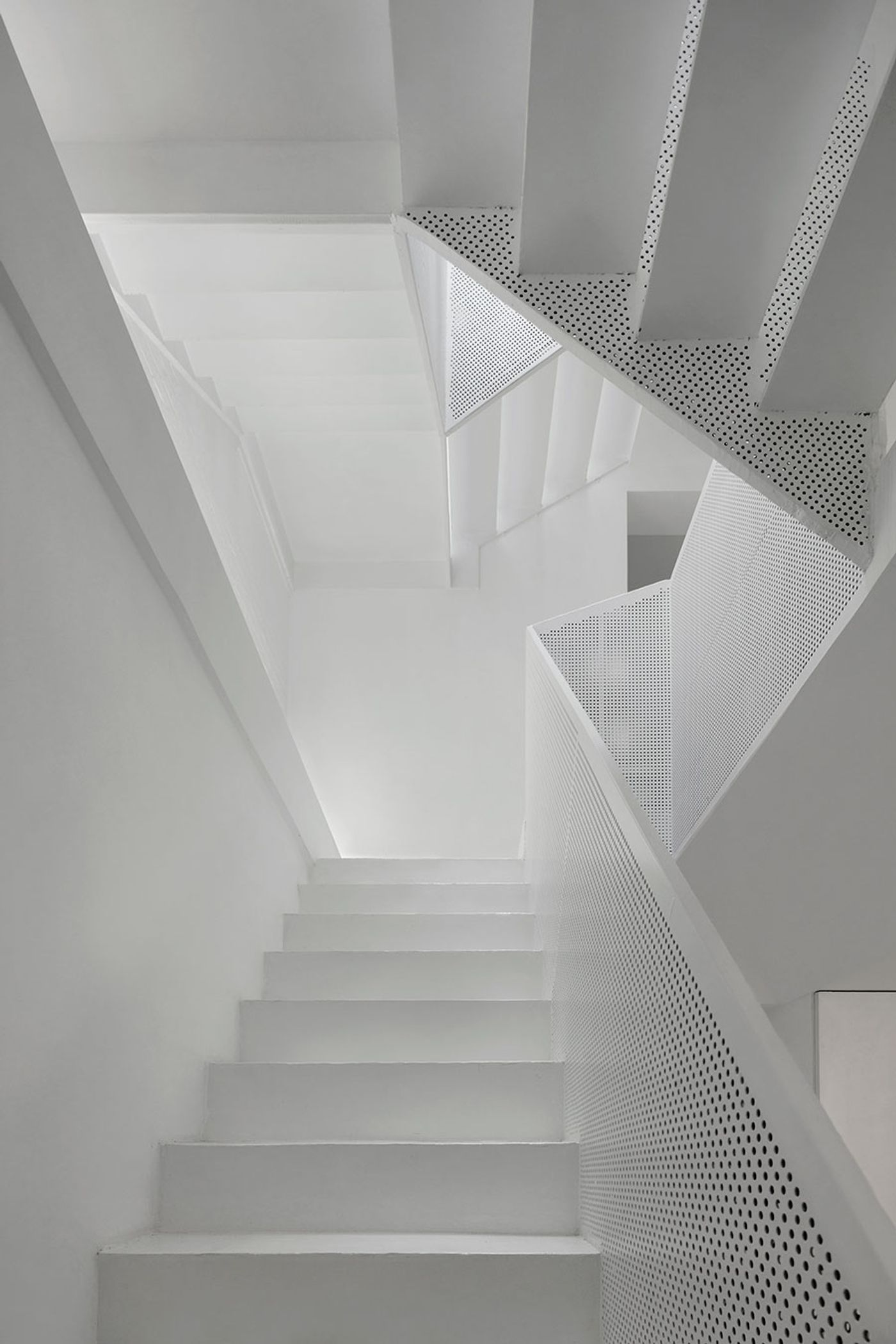
Photo by Xia Zhi.

Sectional Elevation Plan © ARCH STUDIO.
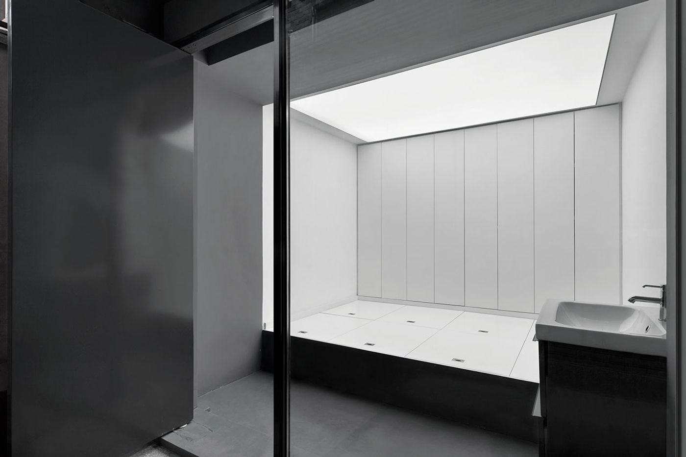
Photo by Xia Zhi.
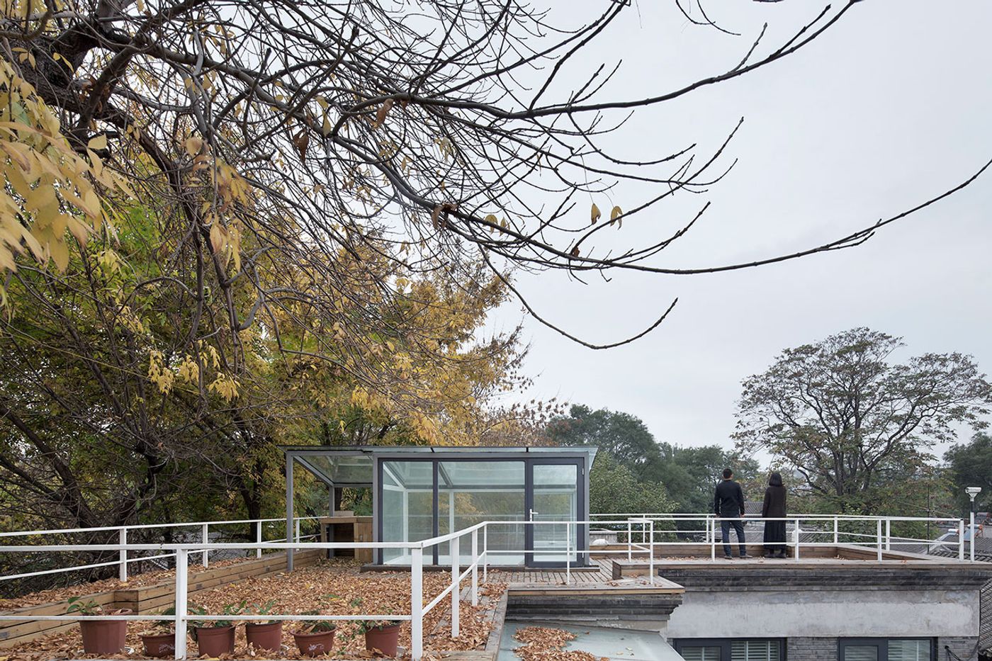
Photo by Xia Zhi.